We Make Visual - Self Promotion
2013
Designed by Nathan Somers at We Make Visual
Industry: Commercial
Tags: Illustration
Website: wemakevisual.ie
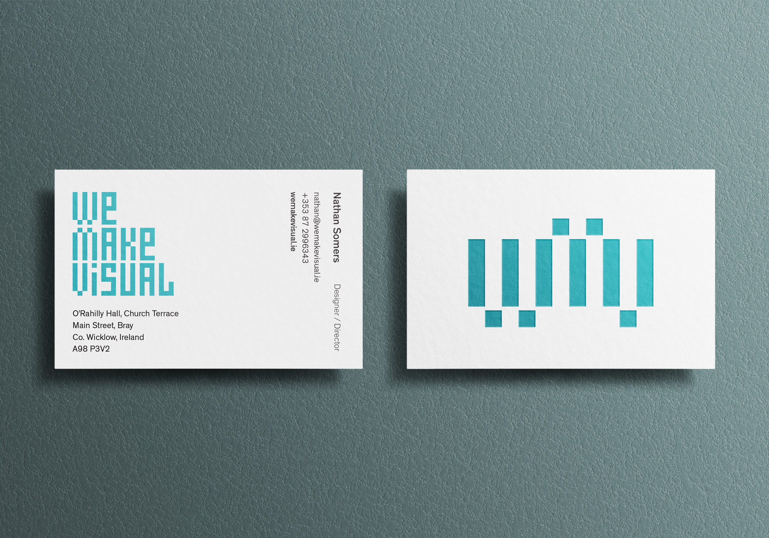
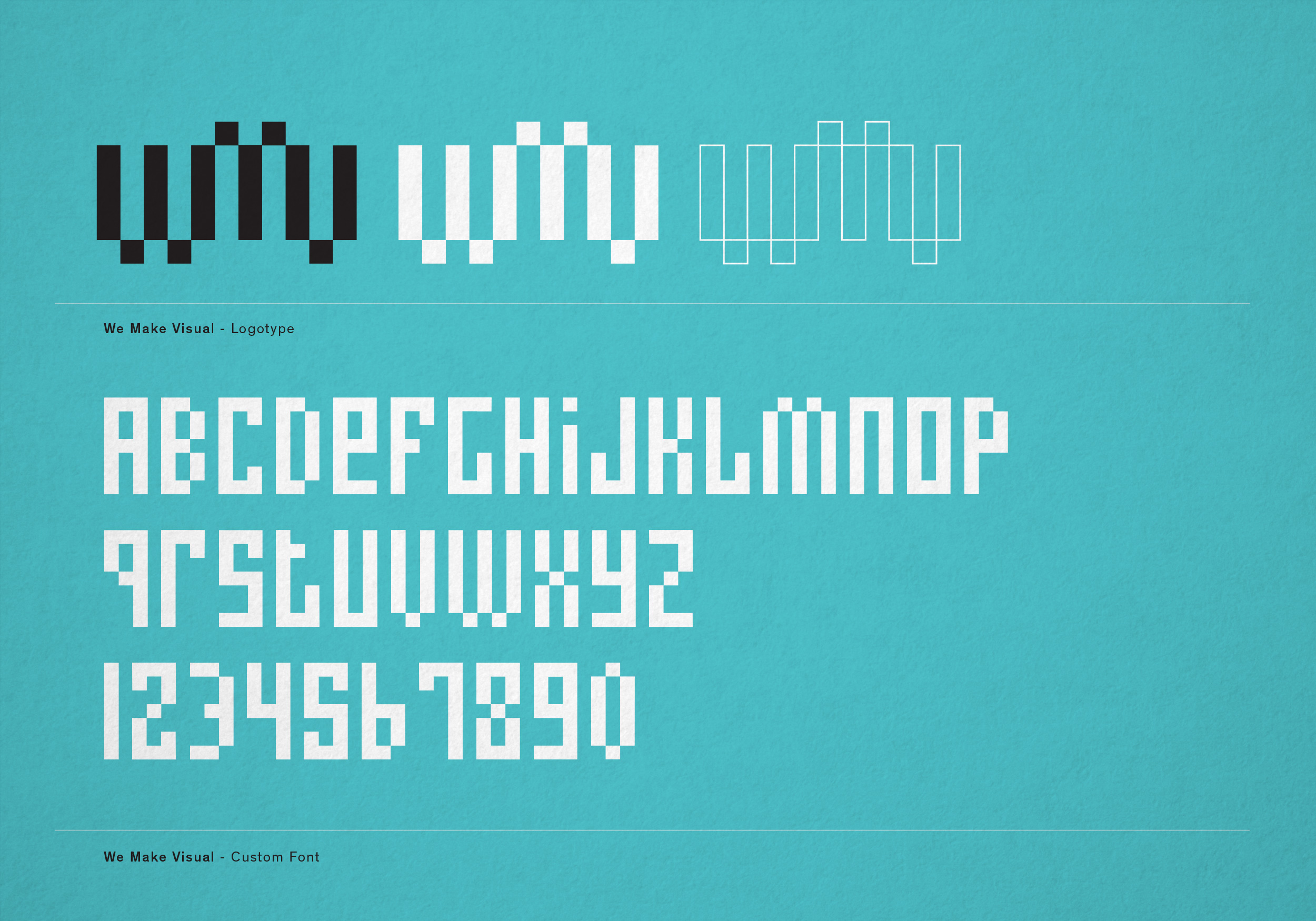
All identities pose a challenge and none more so then one to represent your own company. We wanted to create a minimal graphic symbol to represent the We Make Visual brand. We wanted something timeless that defined us but in some respects kept an ambiguity in which our various creative directions could flourish.
We settled on a monogram that spanned the space between logomark and logotype that references the building blocks on which the visual communications we create are built: the pixel. In tandem with the logo, we created a custom font based on the graphic sensibility of the identity. A display font that could be used in conjunction with the graphic.
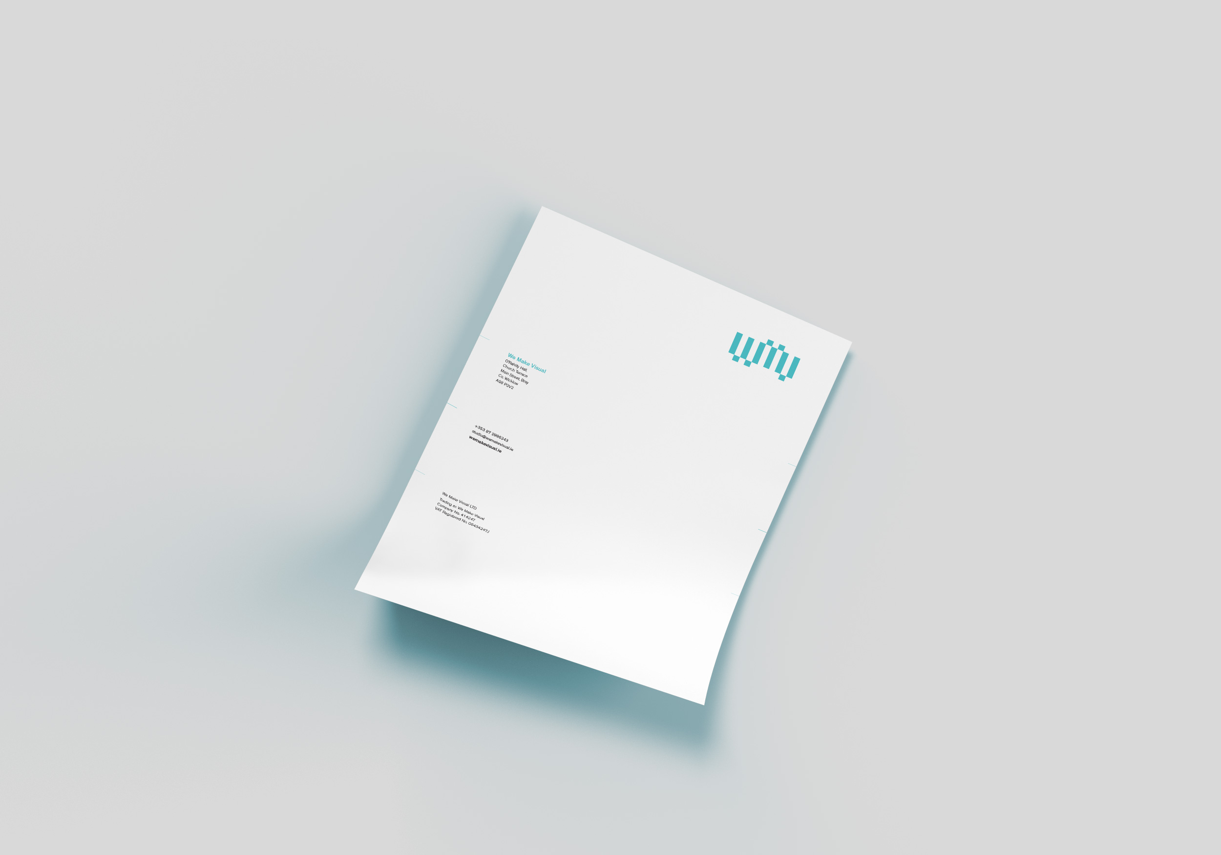
For our business card, we wanted to keep the clean minimal look and feel we also wanted the materials to add another dimension to the identity. We opted for a triplex bonded card where a stencilised version of the identity was motion laser-cut from the top sheet revealing our brand colour underneath. Our letterhead follows through style wise, clean and concise with the branding colour printed full on the reverse.
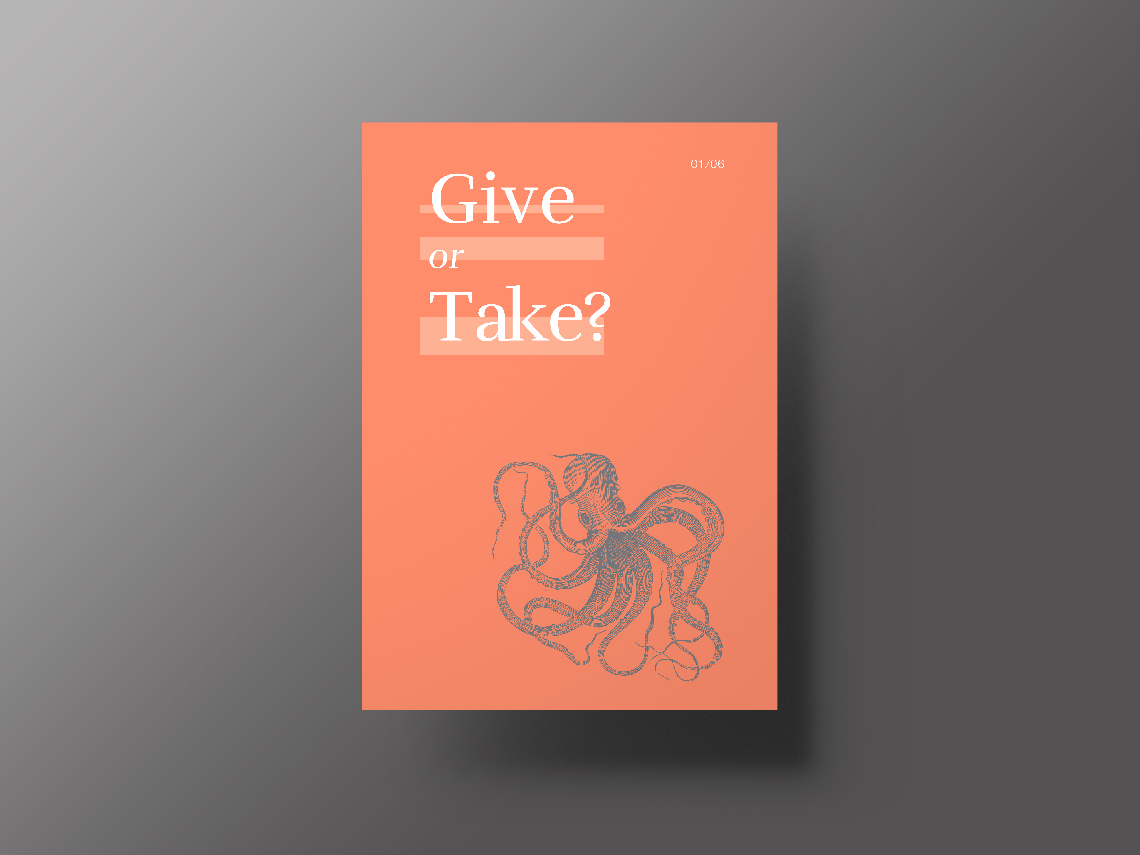
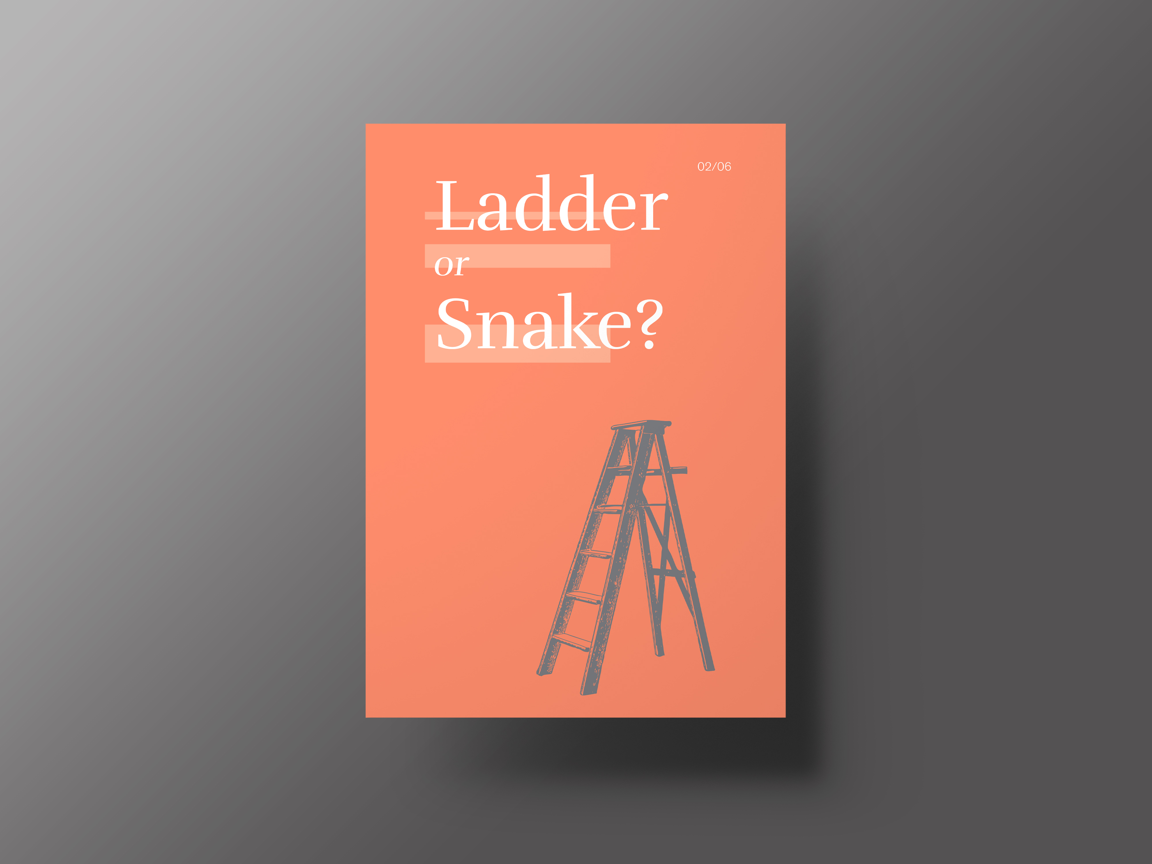
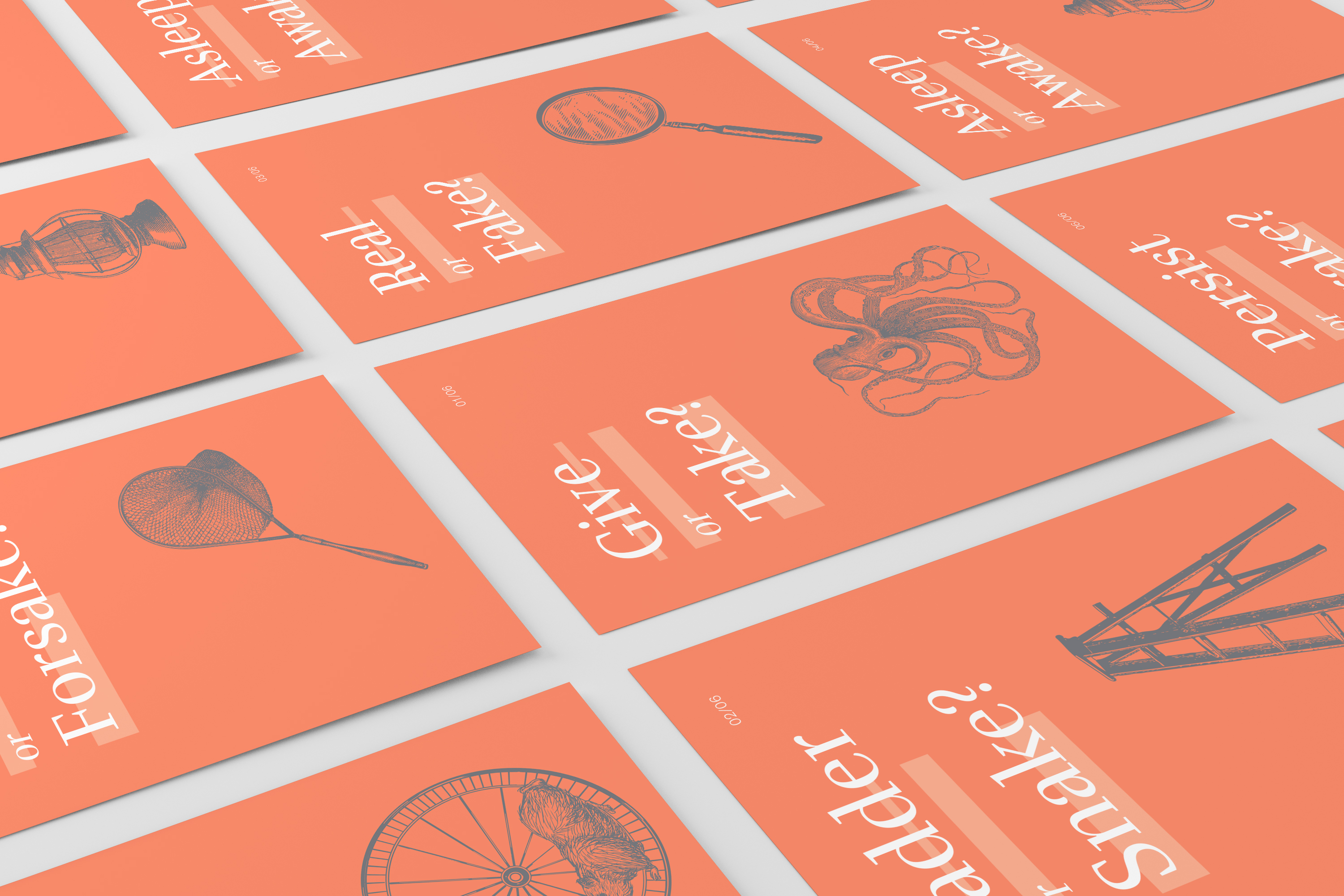
As an initial promo for the company, we wanted to create something that people could use themselves. We created a set of six postcards under the theme of - small card, big ask - Each card poses a 'big' life question to the viewer, the visuals were created to spark the conversation in their own minds and how each question related to their own situation.
