TUHF Brand Identity
Designed by Catherine Robertson, Mary Doherty and Alessandra Ravida at Red Dog
Categories: Identity
Industry: Charitable
Tallaght University Hospital Foundation (TUHF) is the core philanthropic arm of Tallaght University Hospital (TUH). While TUHF is aligned with TUH, it is an independent entity with its own brand identity and values.
We were tasked with creating an identity for TUHF that would speak to its core audiences of TUH staff, fundraising groups within a radius of the Hospital, local and overseas corporate donors and members of the general public.
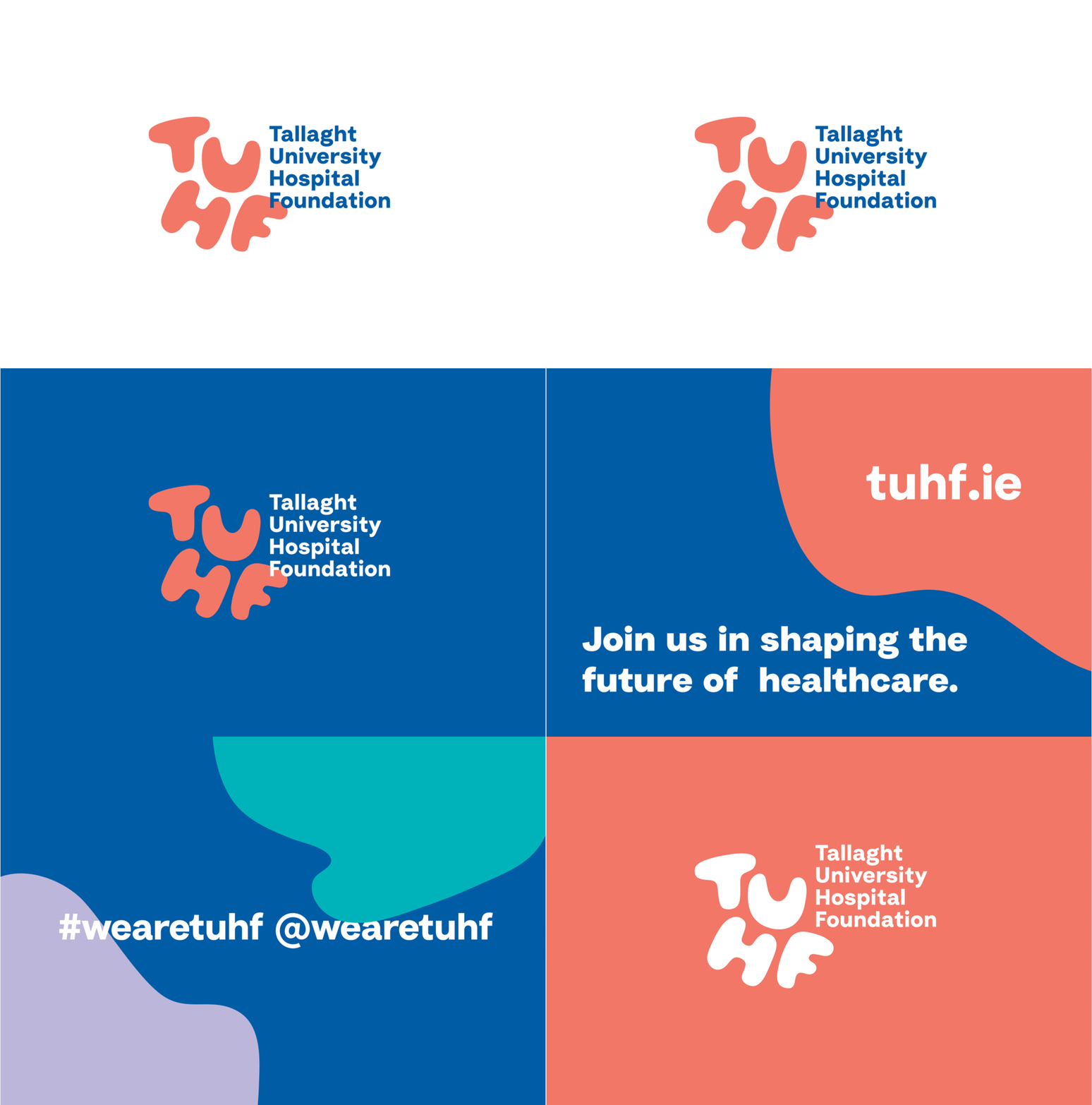
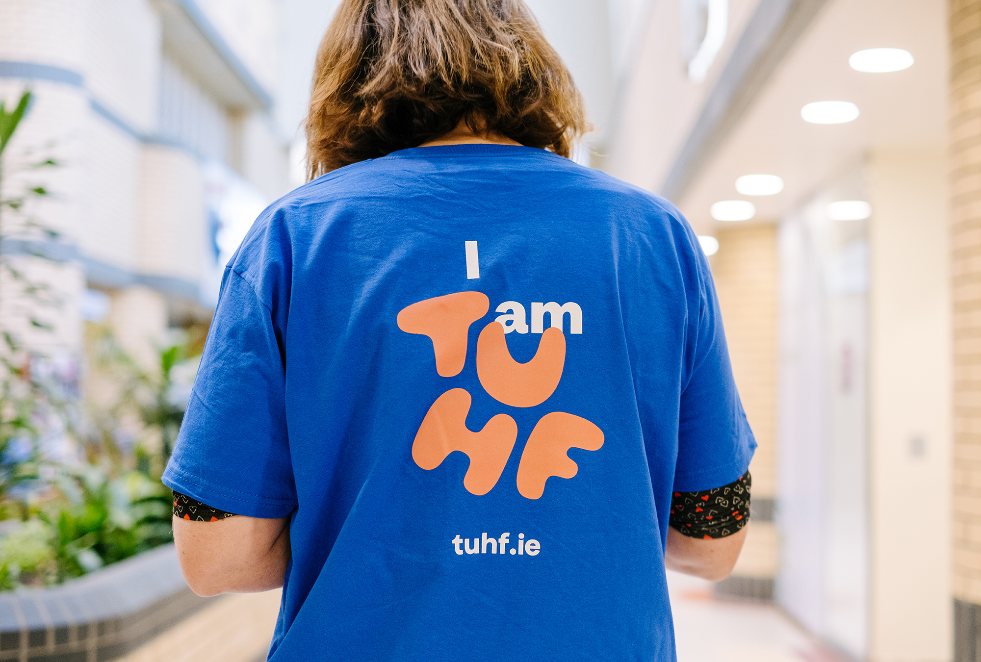
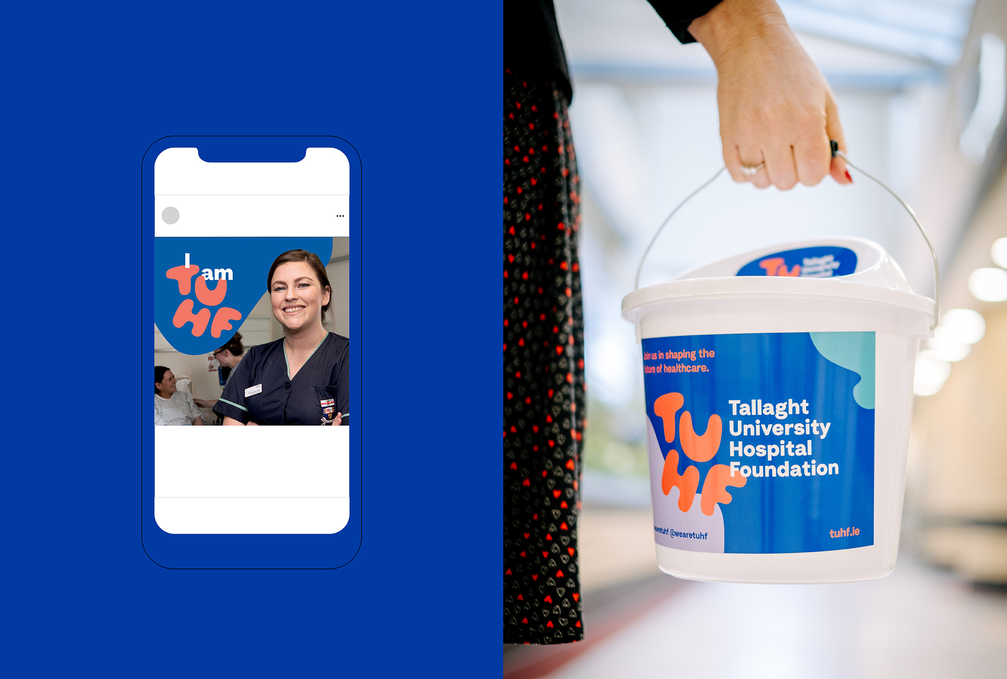
Our first action was to define the brand strategy through competitive analysis and a workshop session with key stakeholders. These sessions revealed that at the heart of TUH is the sense of pride its staff have for their Hospital, their work and their community. This led us to base the identity around the acronym 'TUHF' as it describes their brand personality and could be designed as a badge of pride and honour.
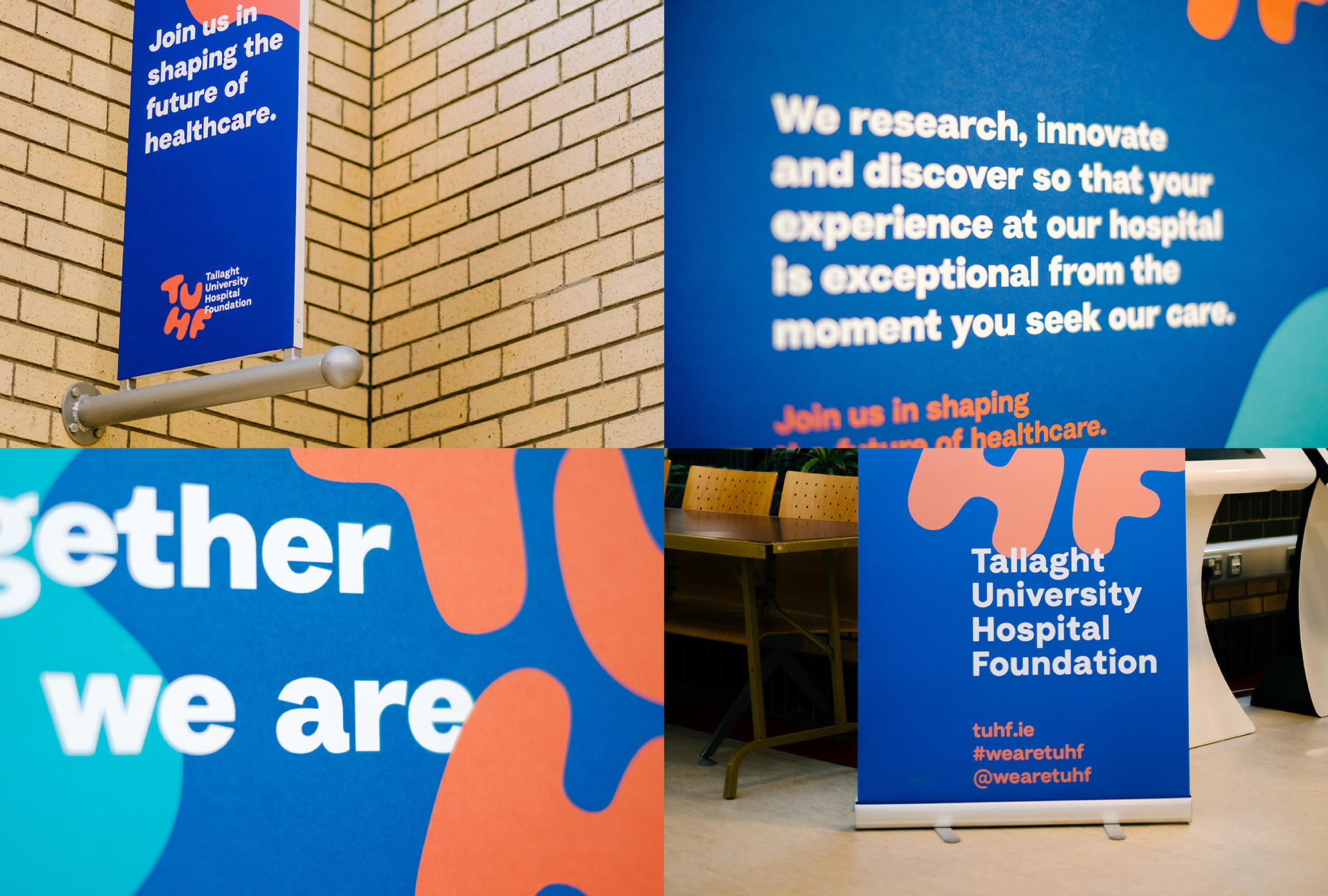
The result is a bold identity that combines a loose and fun typographic solution that's full of energy with a supporting type treatment that has a nod to professionalism and research.
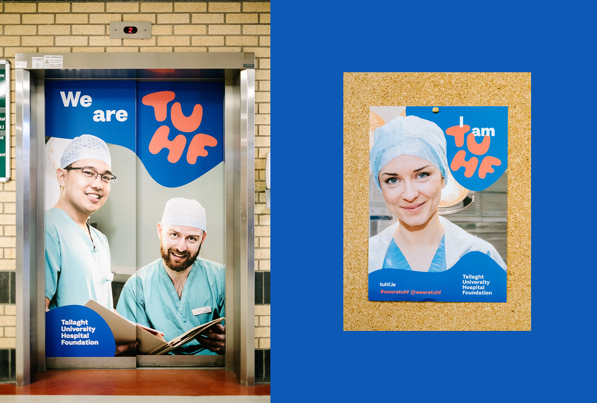
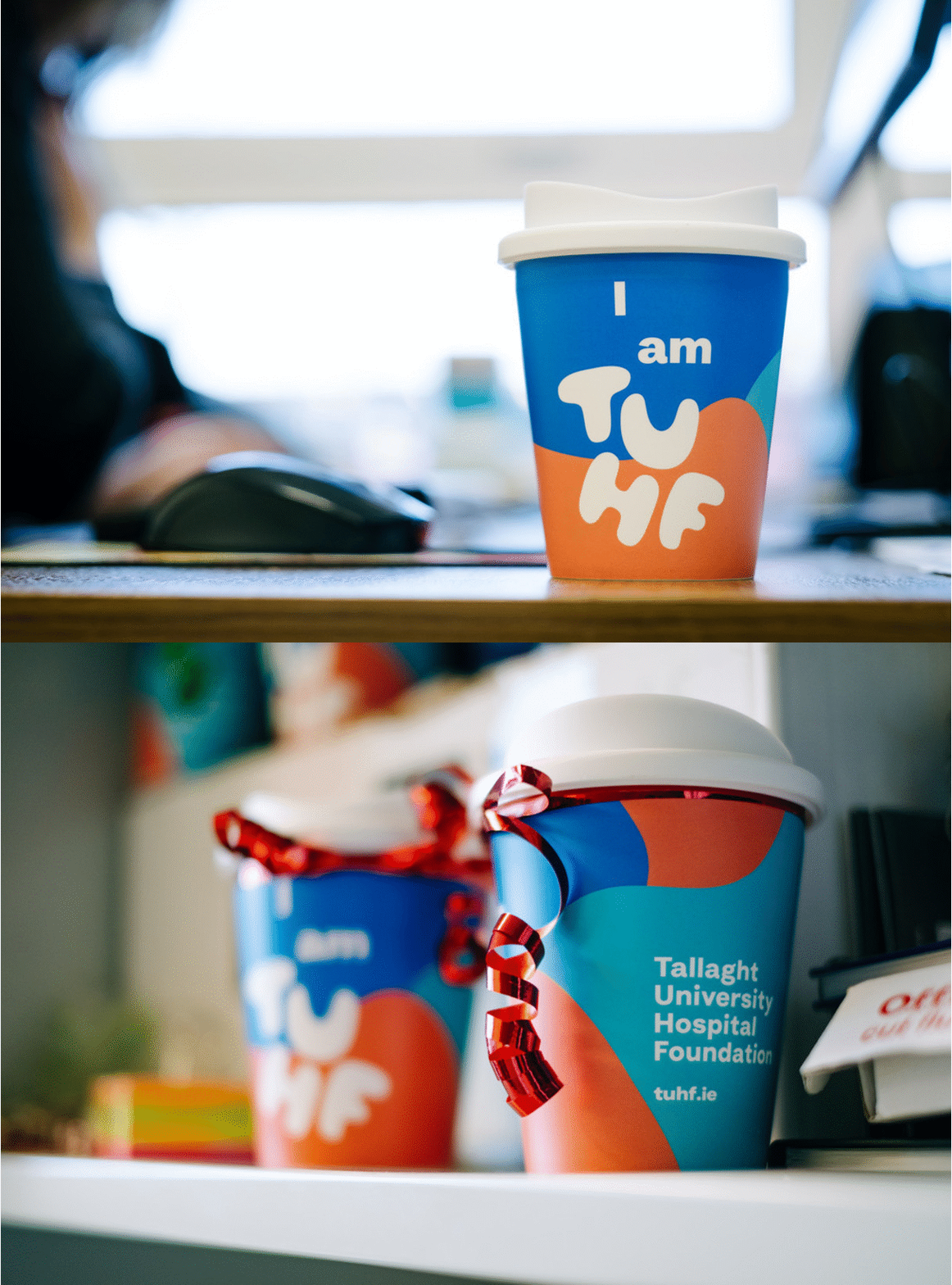
The primary and secondary colour palette ensures that TUHF will cut through from like-minded charities and lend itself well to merchandising and their primary means of communicating - mostly via digital channels. A 'hands asset' was also created that highlights the 'connections and gestures' that make TUHF what it is. This asset is used across deliverables such as the website, banners in the Hospital and within social content.
The visual language has huge potential and can be flexed as required – dialled up for events and dialled down for more corporate activity.
