The Waste Land iPad
Designed by Hilary Kenna
iPad Publisher: Touch Press Ltd, UK.
Website: touchpress.com/titles/thewasteland/
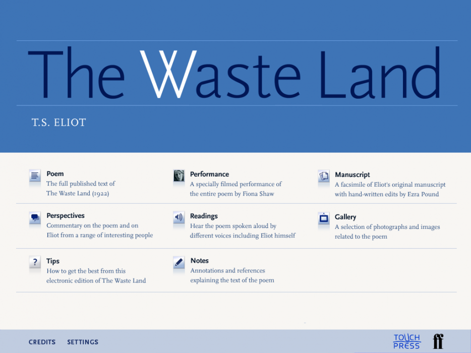
The iPad App of T.S. Eliot’s epic poem, The Waste Land (1922), enabled publisher Faber & Faber to launch into the digital market and republish some of its classic texts to new audiences.
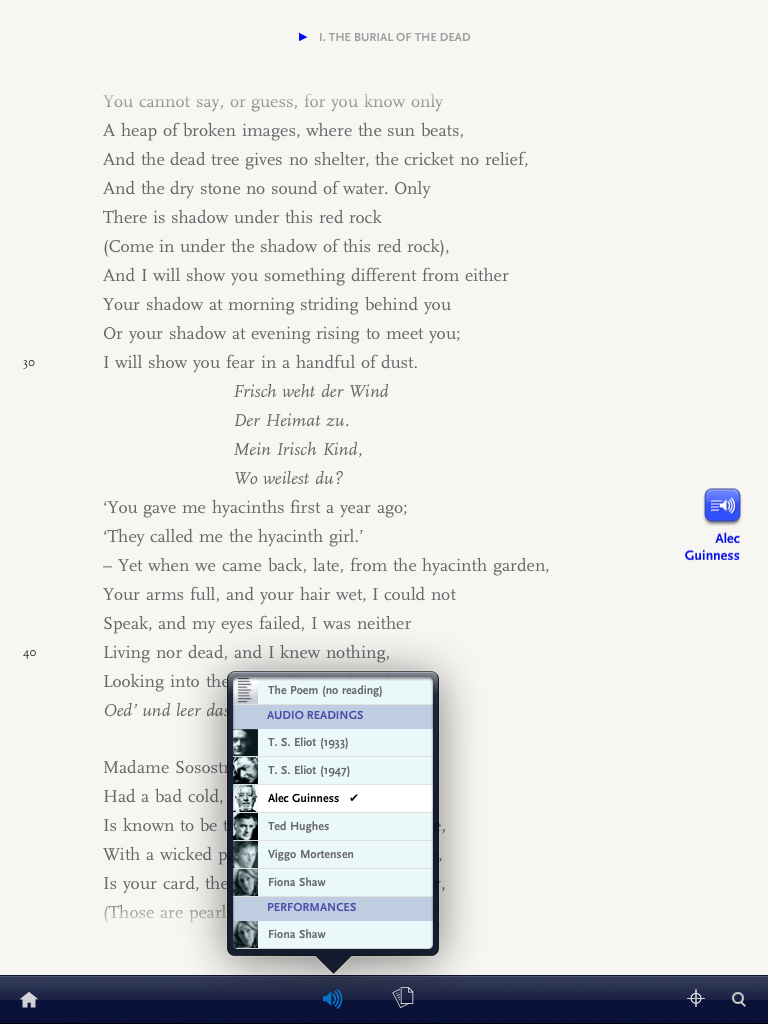
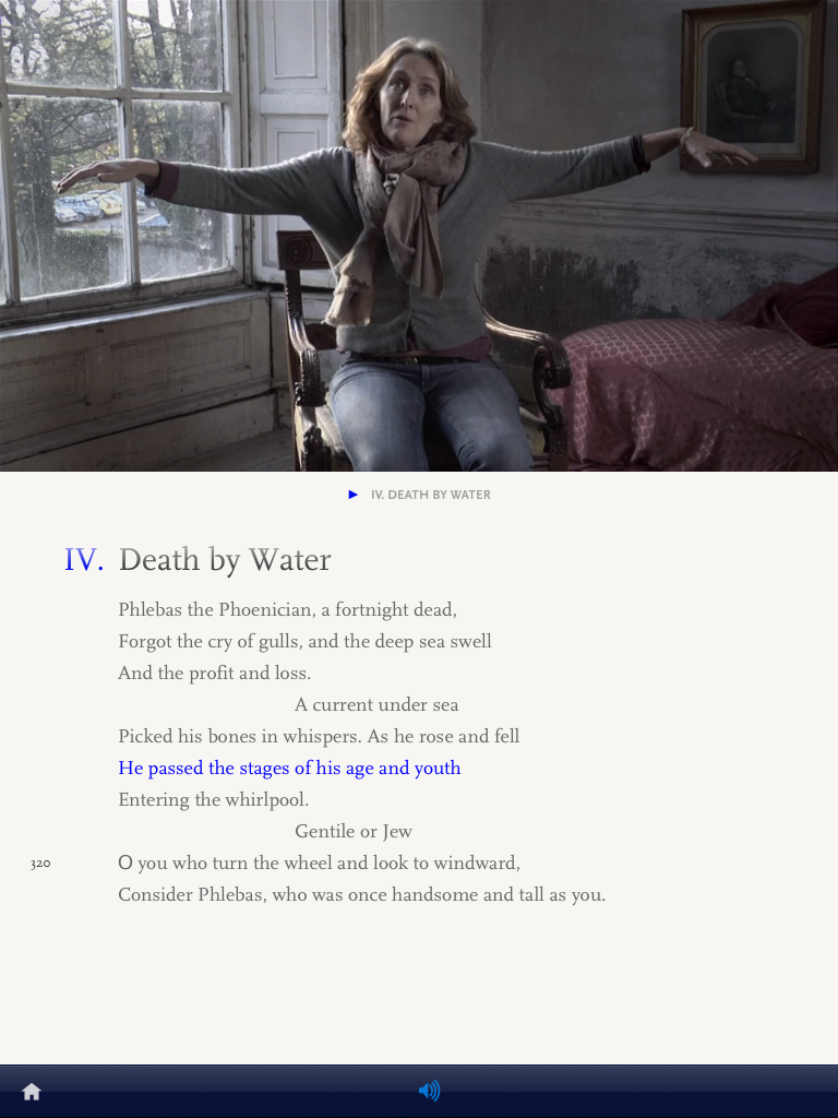
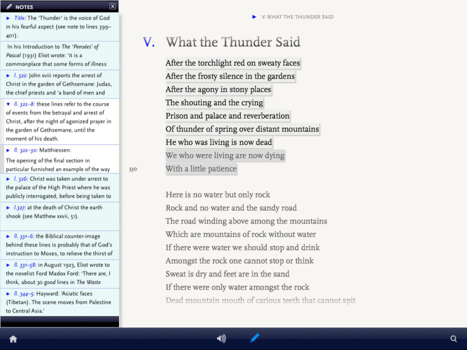
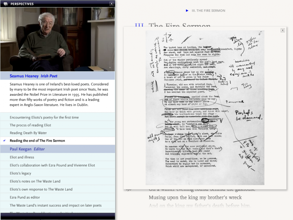
The Waste Land app showcases how carefully crafted interactivity and rich media could revolutionise the reading and understanding of literature and be used to explore every facet of a poem – from its inception to its interpretation.
The central vision of keeping the poem in its purest form at the heart of the interactive reading experience was the key driver for creating a spare and unobtrusive yet deeply functional user interface, and legible typographic design.
Scala, which is used throughout the app, was chosen for its modern classic look and feel, and for its good screen legibility due to straight serifs and low contrast strokes.
The composition was required to work in both horizontal and vertical orientation as it changes dynamically if the reader turns the ipad.
The design and colour palette of interface elements and overlays are muted so as not to interfere with the already demanding nature of Eliot’s text.
The app has received over 200 positive international media reviews including an editorial in the NYT and recommendation by Stephen Fry.
