The Laudato Si Challenge, Identity
2011
Designed by Bob Gray at Red&Grey
Strategic Direction: Paul Hughes
Strategic Direction: Thomas Ermacora
Categories: Identity
Industry: Charitable
The Laudato Si’ Challenge has been established to inspire creativity worldwide and improve the lives of one billion of the most vulnerable people. The Challenge’, supported by the Vatican, aims to become a multi year initiative convening of the best ideas through a rigorous and tested process. The goal is to support the development of high impact social businesses offering ways to address critical problems of our time.
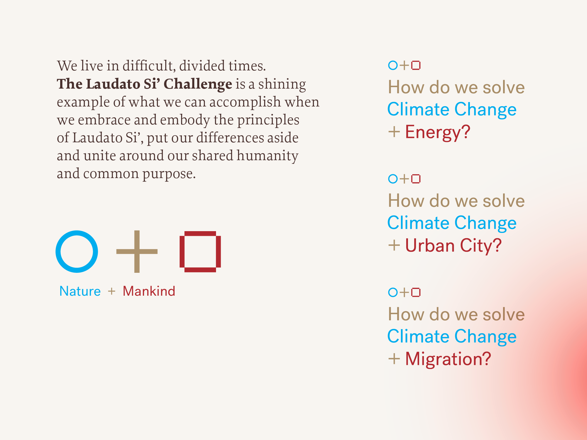
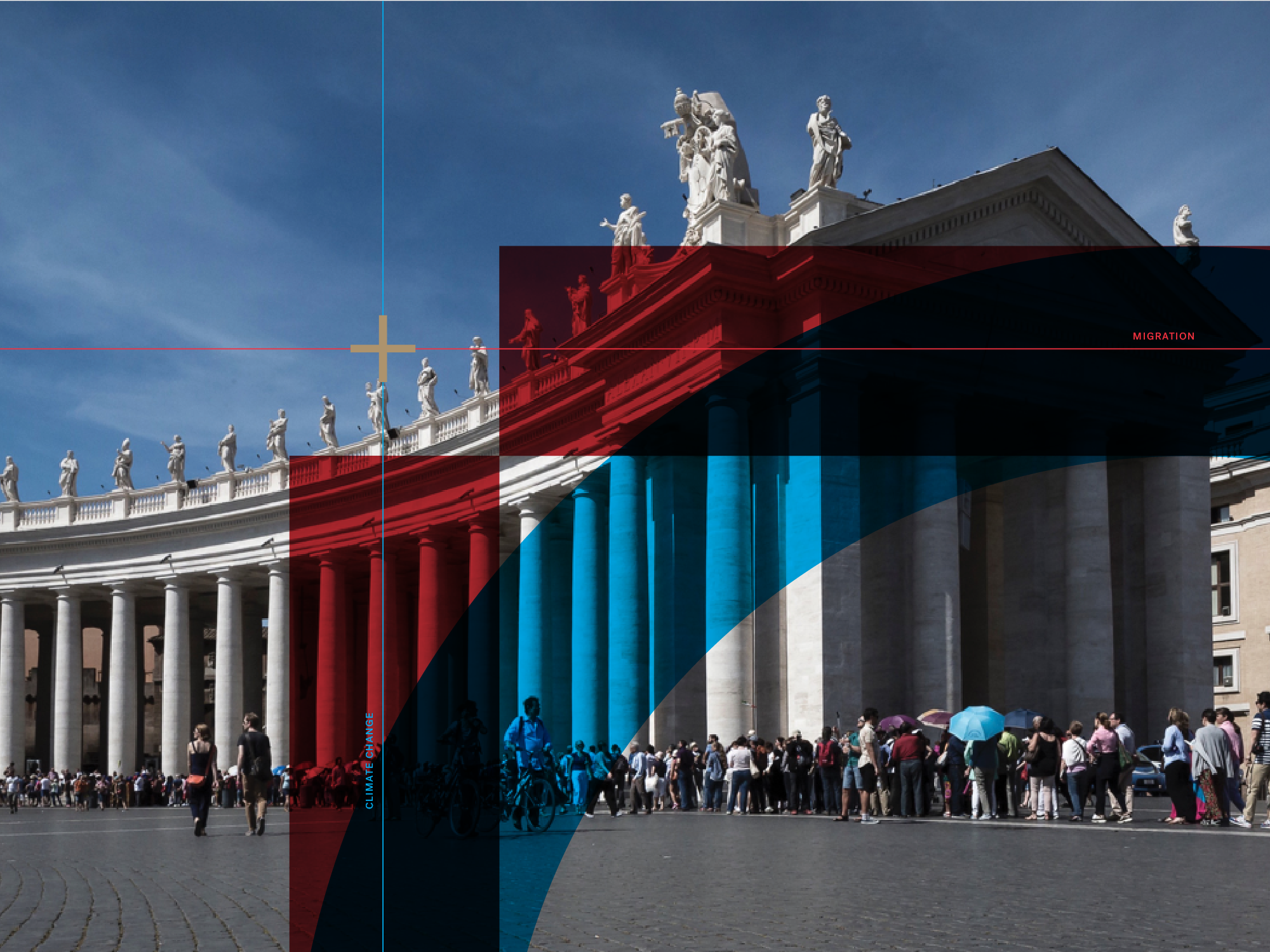
Nature, Mankind and Liturgy together form the central theme of the Challenge’s identity system. These have been drawn in many forms including a circle, square and cross, lines of longitude and latitude, colours, vignettes, statistics and photographs that balance the organic and the man-made. Along with the logotype, designed to always be a part of a paragraph of text, this sophisticated system gives us the opportunity to adapt over time and place.


