The George - GCN Magazine
Since 1985, The George bar and club has formed an important role as a safe place of celebration, joy and happiness for those within the LGBTQ+ community.
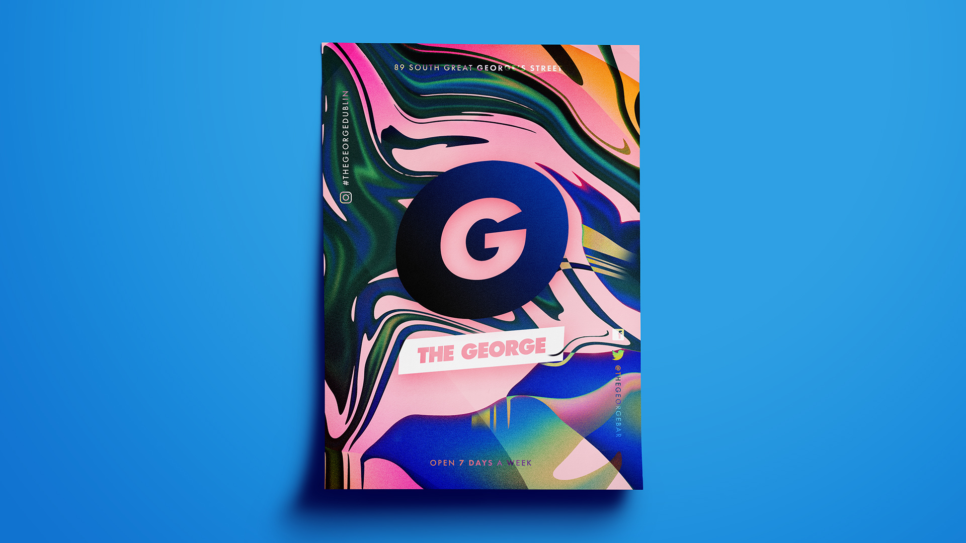
This brief was created to give The George a fresh new look and feel throughout it's promotional material in order to represent a more fluid community. The aim of this print advertisement for GCN Magazine was to give the brand a refresh in order to show just how far this iconic bar and club has come throughout it's 33 year old lifespan.
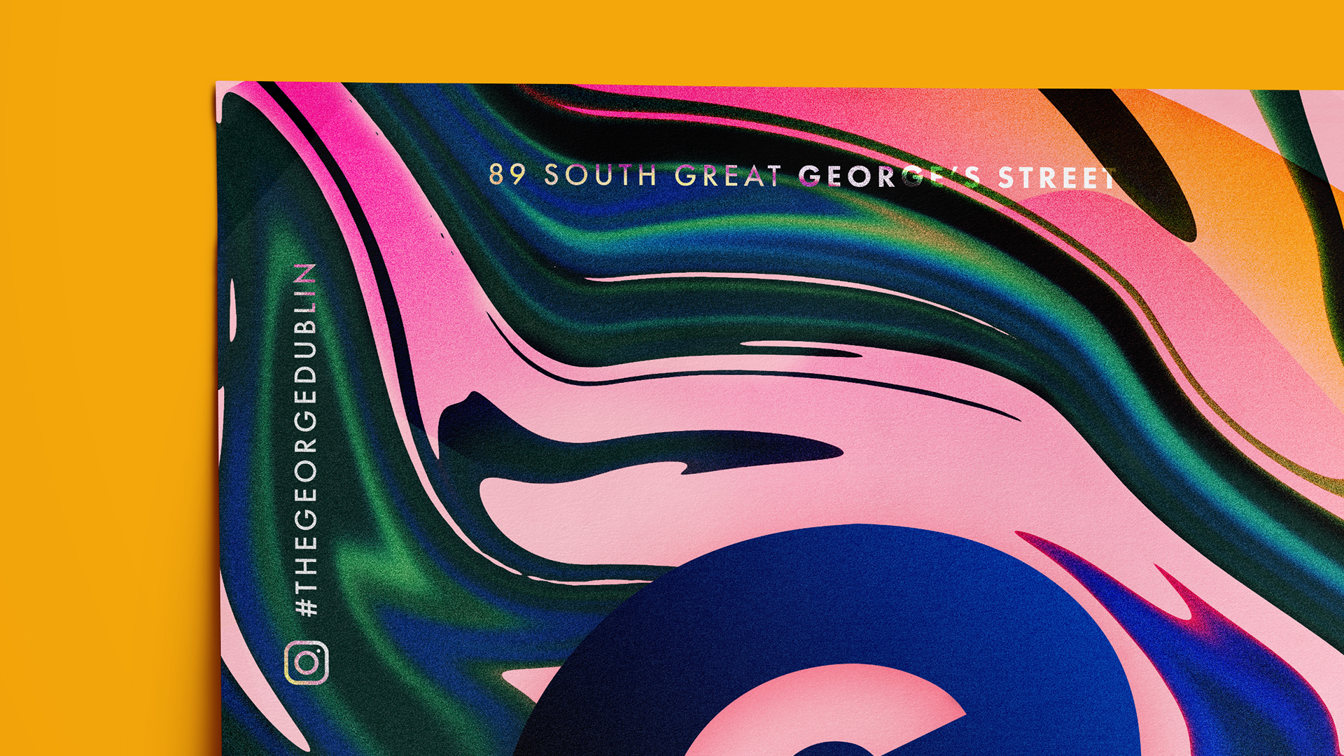
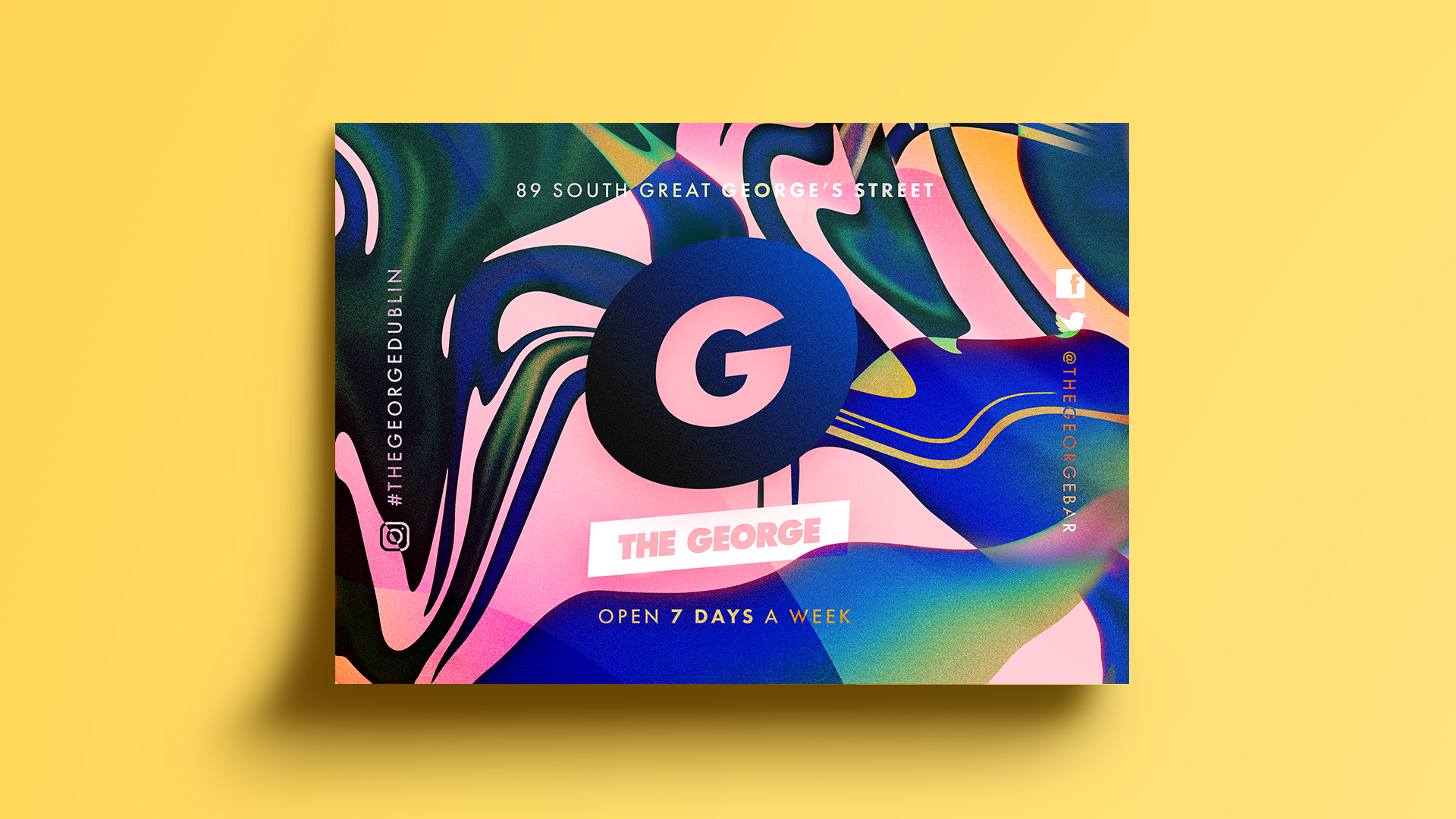
The paint-like abstract shapes represent those within the LGBTQ+ community, as well as their allies who come to celebrate in this iconic bar and club. The design embodies the idea of a 'coming together' for those who truly want to be who they are within this safe haven.
The bright blend of fluid colours symbolise the many personalities of those who come here, allowing them to have fun being their true selves. The use of abstract colour keeps it simple yet vibrant with a touch of energy and recreation that represents the fluidity which The George is most celebrated for throughout Ireland.


