The Ark Environment and Wayfinding
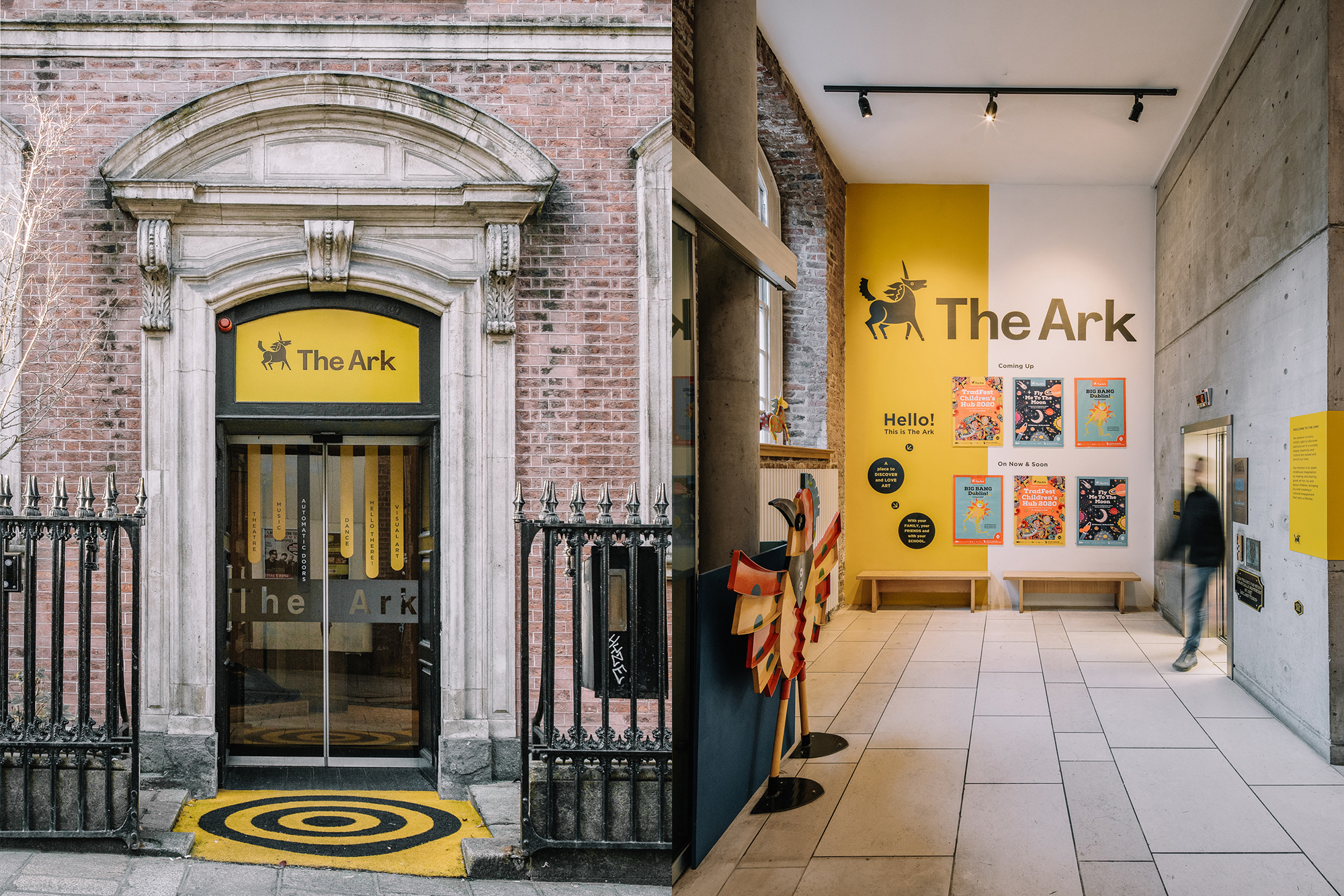
The Ark, in Dublin’s Temple Bar, is a dedicated cultural centre for children. They provide opportunities for children, along with their families, or with their school, to discover and love art.
As design partner, we were asked to look at the environmental design of the building, to provide a wayfinding system that would resonate with all visitors to the Ark. The solution had to come from a child-centred perspective.
This was an opportunity to expand upon recent branding work for all of The Ark's printed communications, a design approach that uses frames, layers, and folds to create a sense of fun and engagement.
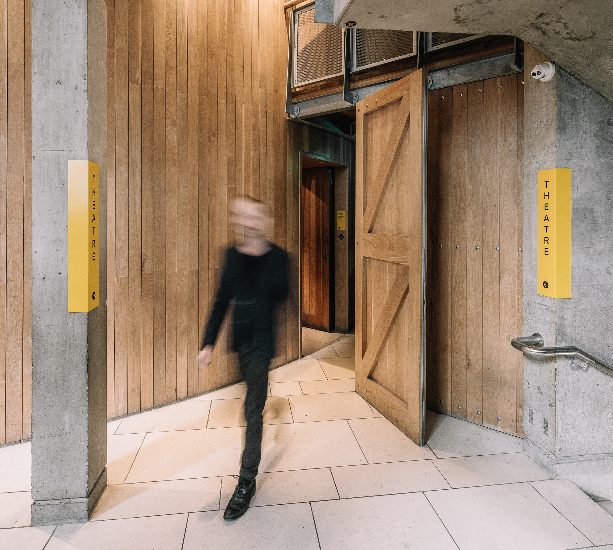
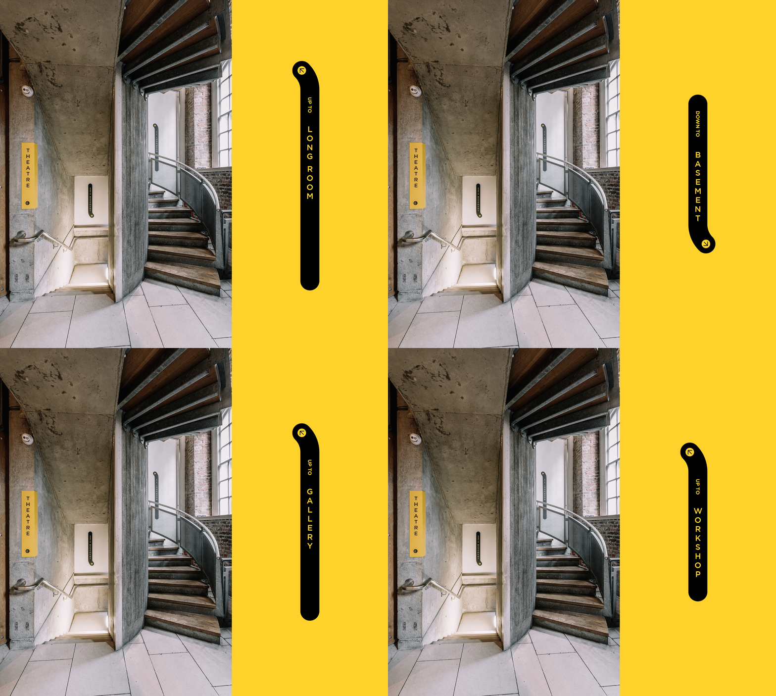
The wayfinding connects five floors, bringing visitors through a reception area, a theatre, a gallery space and a workshop. The building is narrow and tall with varied building materials and architectural features. The wayfinding reflects this, following the patterns of the architecture, respectful but prominent.
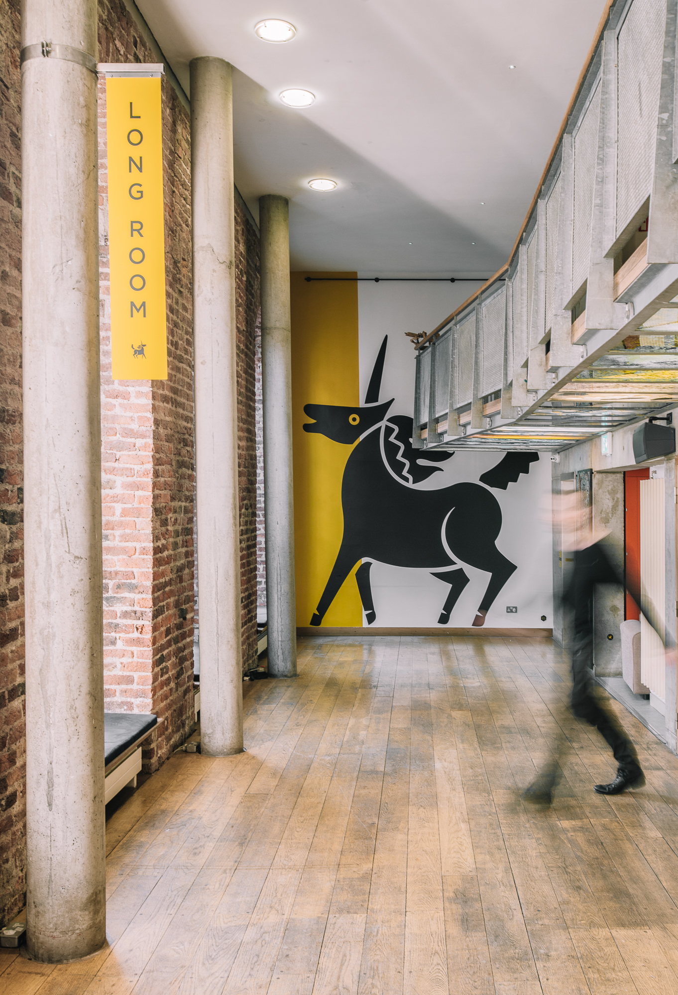
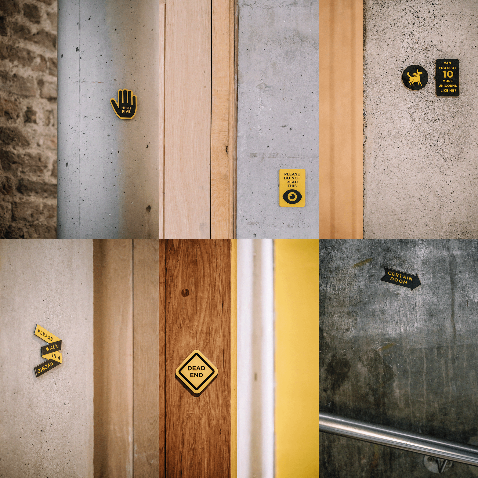
There is a verticality to each design element, reaching up, turning, folding around the architecture. Highlighted columns create an entrance to The Theatre and frame The Gallery. And there is humour, a giant unicorn towers above The Long Room, and throughout the building, small signs hide in the corners.
