Solas
Designed by Dirk Heynen at Greenhouse
Creative Director: Richie Ryan
Categories: Packaging
Industry: Commercial
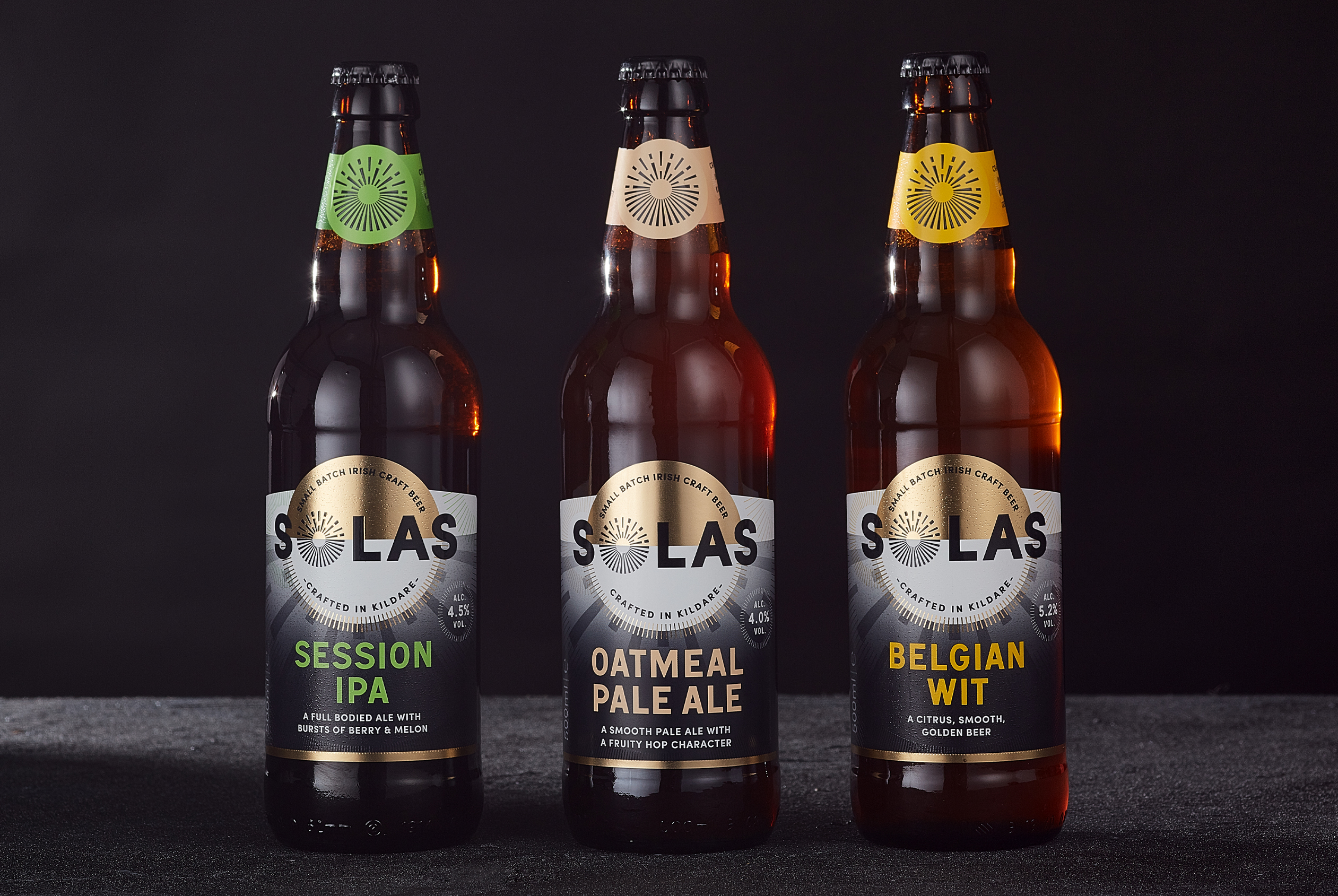
The highly prolific Rye River Brewery engaged us to revive their brand, which needed a strong update to bring it in line with some of their other brands within their portfolio. Solas, the Irish word for “light” is a range of beers produced by Rye River specifically for Tesco in Ireland.
The word itself was an excellent cue for us when it came to producing ideas for the range. While the previous design was unique, it didn’t really expand on the idea of light as a concept and lacked a bold contemporary look.
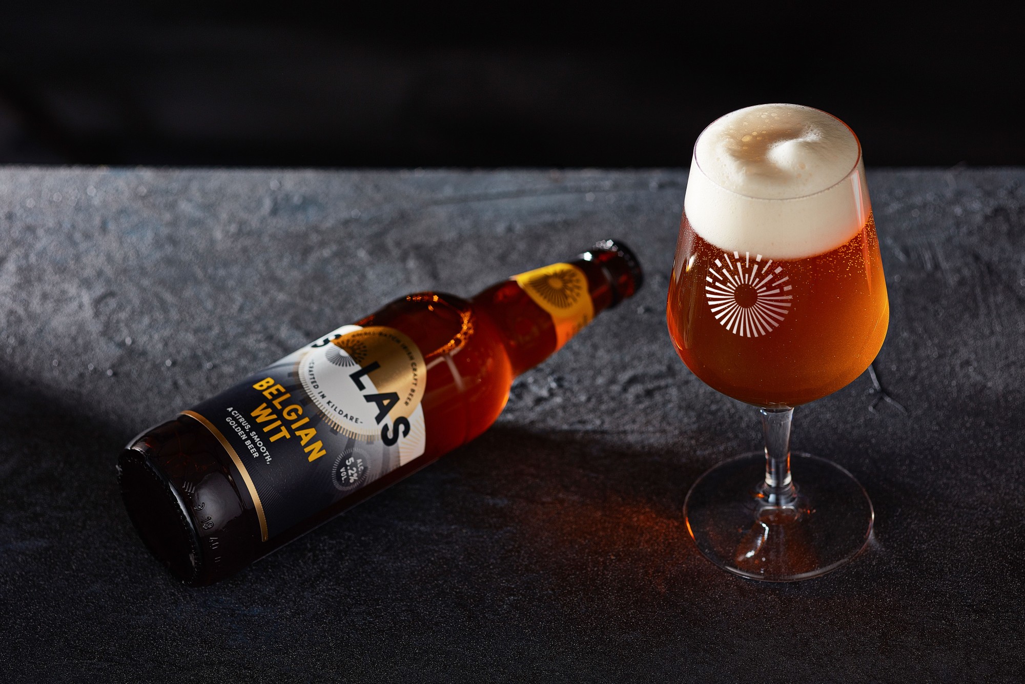
The new reinvention of the Solas range then, is a visually striking, highly impactful visual representation of light. From the central sun on the horizon line to the broken rays of light emerging from it, all achieved on an abstract geometric background.
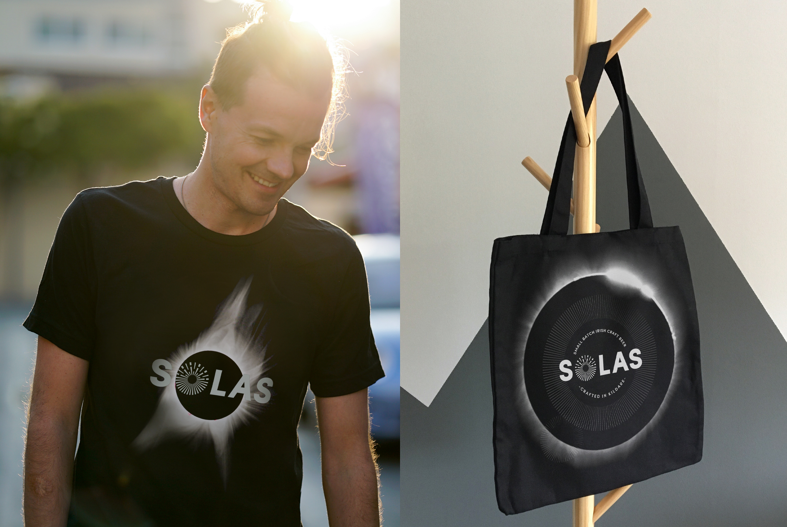
The Solas Identity also contains sun ray iconography within the ‘o’ of the word which makes it a highly ownable element of the brand.
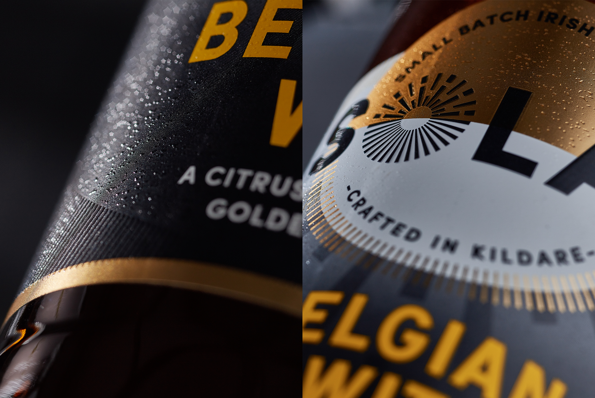
This combined with the gold foil detailing and the raised tactile varnish to add a premium tactility to the label, ensure a very sophisticated craft beer brand for the Brewery.


