Rye River Limited Edition Release Beers
Designed by David Walsh at Greenhouse
Lead Creative, Design Concept, Range Development & Illustrations: David Walsh
Brand Mark: Dirk Heynen
Creative Director: Richie Ryan
Categories: Packaging
Industry: Commercial
The Rye River Brewing Co. has established itself as an expert brewer of craft beers, traditionally with a strong focus on larger volume craft beers. Their solid foundation, expertise and passion paved the way for a more experimental, small batch limited edition range. The challenge was to consider a system that would work for small volume batches, where order volumes for cans - the preferred brewers format - are usually very high and typically involve full labelling or shrink wrapping.
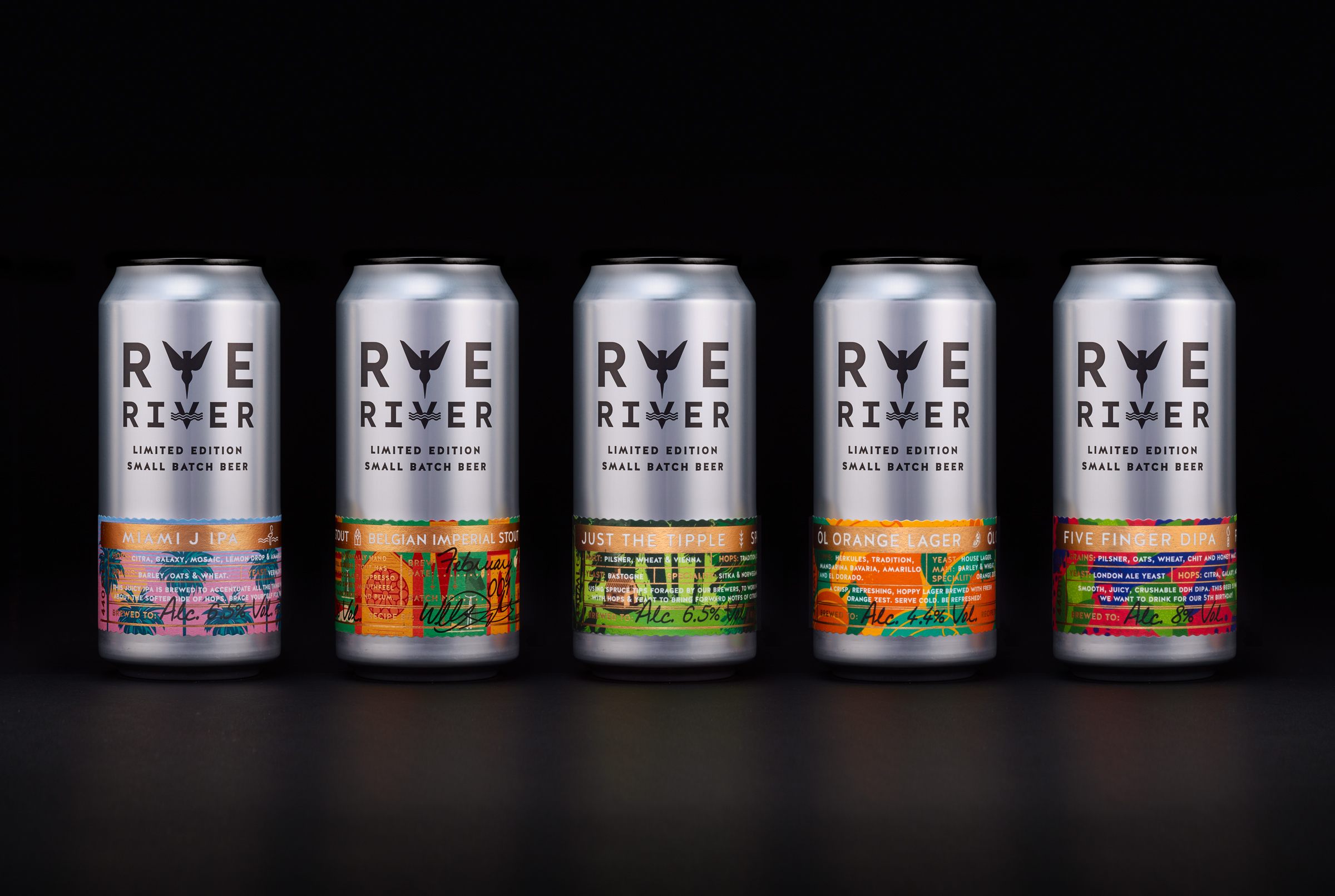
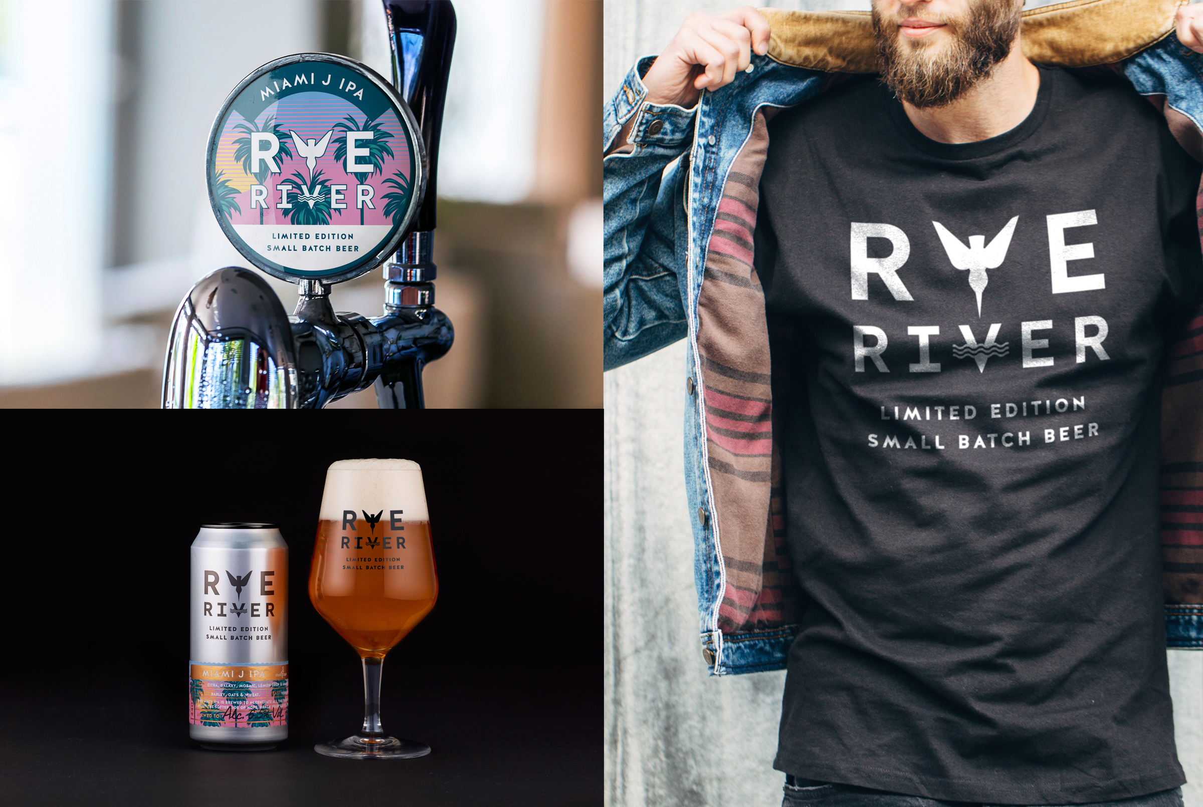
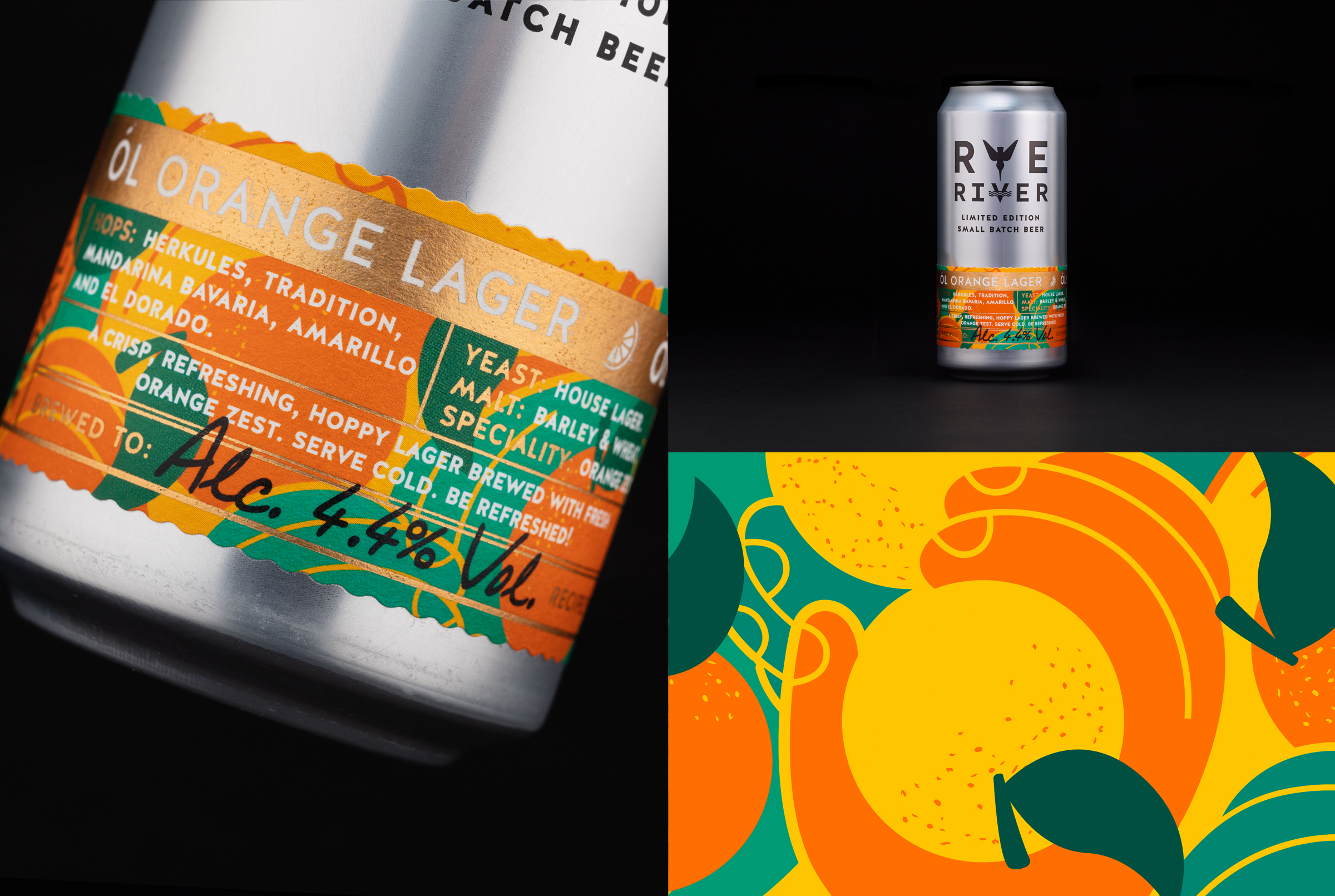
The collection consists of specialist, premium beers, designed to be tried and savoured, each with their own intriguing flavour profile and identity. A distinctive label system was devised by Greenhouse, capturing the spirit of each beer, as eclectic and vibrant as the range. The monochromatic base can design is impactful and bold in its simplicity, stamped with a newly developed brand mark portraying a diving kingfisher (a popular sight on Irish waterways) and finished with a contrasting black top.
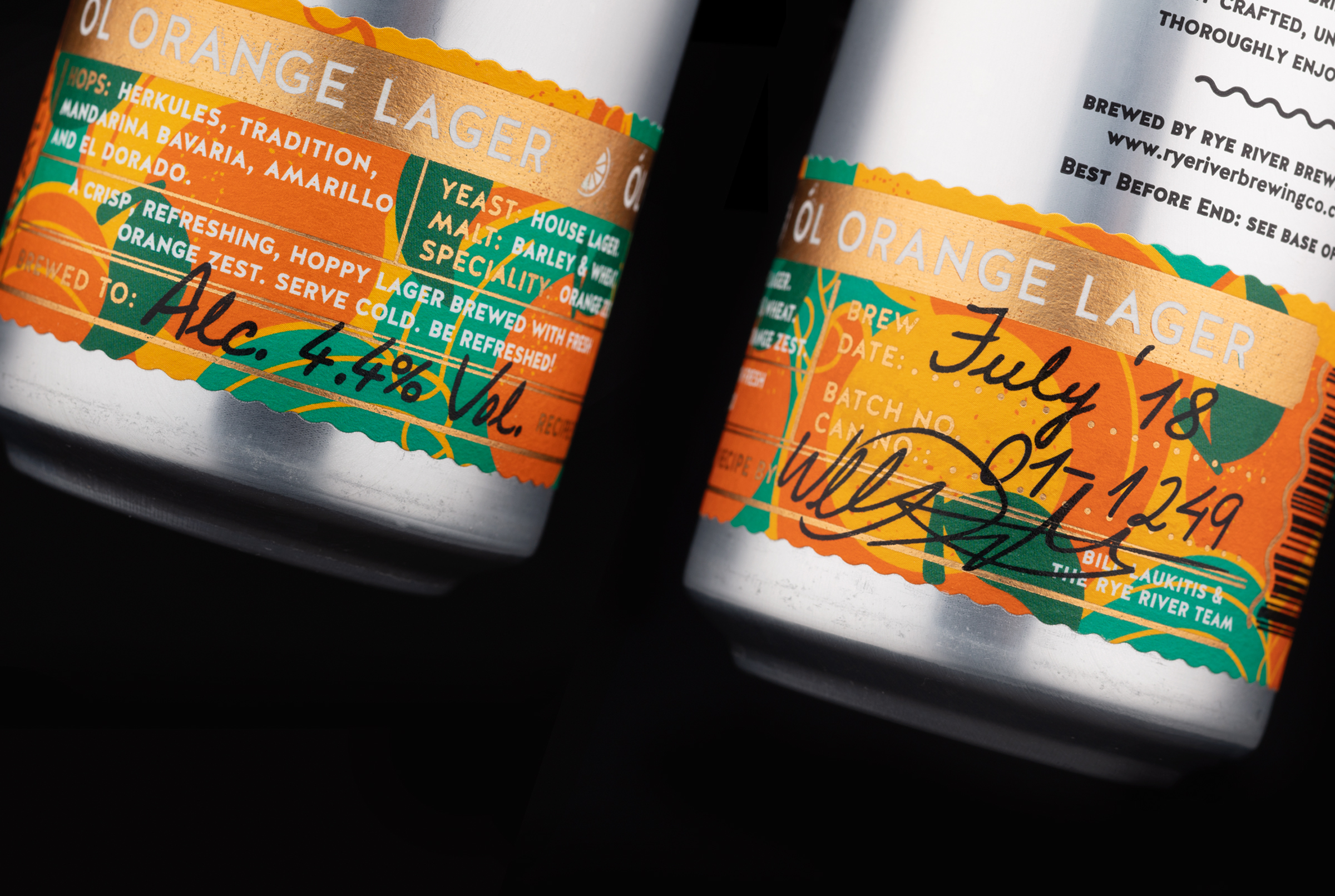
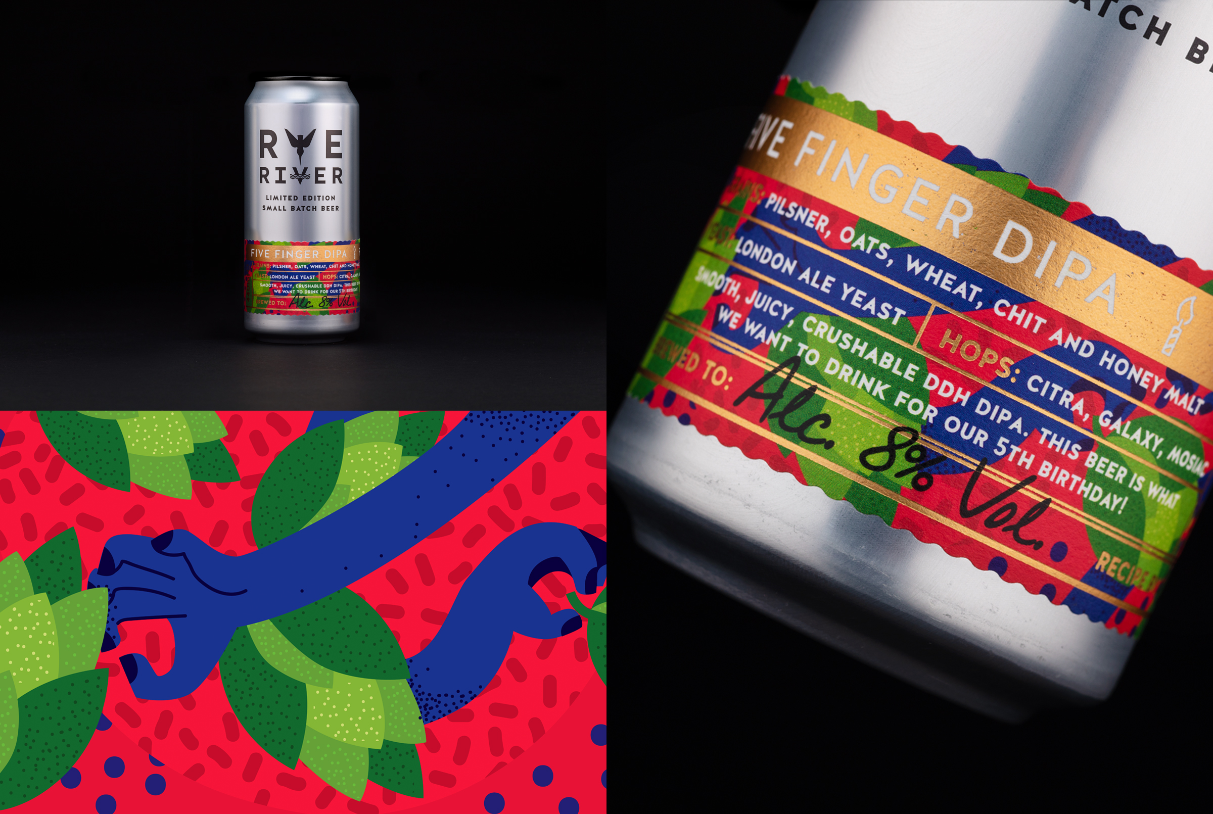
The tall, silver cans work across the range and are offset by the colourful, foiled labels, uniquely placed towards the base and offering true differentiation. The set of lower labels are comprised of layers of coloured illustrations and text, each telling finer details of the story and personality of the beers with the inspiration for each illustration being derived from the unique aspect of each beer. Collaborating with Rye River Brewing Co., the end result is something exclusive and premium that we as beer connoisseurs and packaging obsessives alike have enjoyed immensely!
