Polski Bread Packaging Design
2011
Designed by Clare Lynch (Creative) at Clare Lynch Creative
Categories: Packaging
Tags: Illustration
Website: behance.net/gallery/60782919/Polski-Bread-Packaging
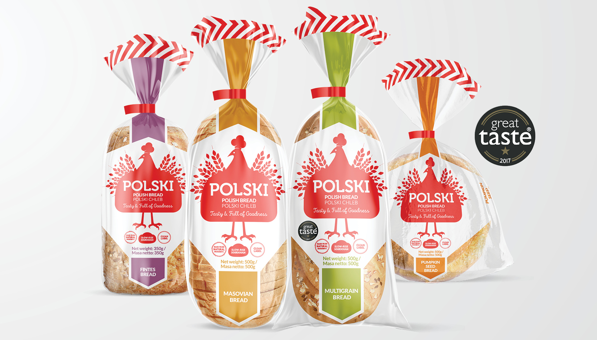
POLSKI Bread was created by authentic Polish bakery Inter Europol, exclusively for Tesco consumers. Known for their taste, purity, and authenticity, they're the largest clean-label bakery in Poland, producing real slow-rise sourdough bread and other bakery products using traditional stone-baking methods for over 30 countries worldwide.
The brief was to design a new packaging brand for a range of Polish bread to be launched in Tesco stores across the UK. The main target audience is consumers who love Polish food, therefore it was important to ensure that the branding made a clear, instant connection to Poland, for strong shelf stand-out.
Some factors considered to answer this brief include:
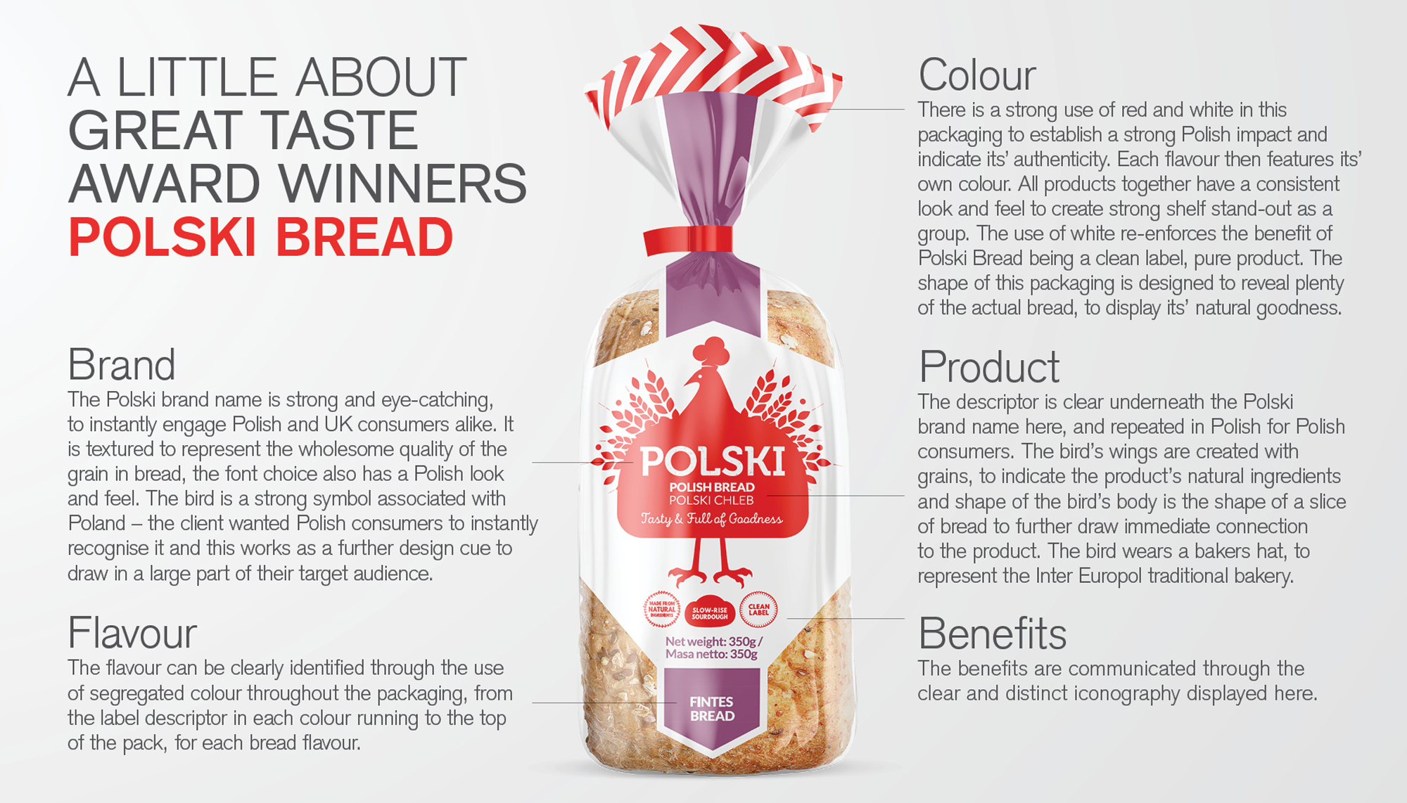
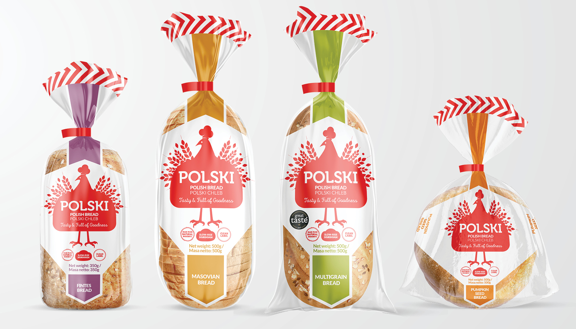
– Using the colour palette of the Polish flag (with colour variants per flavour) / the use of white to represent its' clean label benefit.
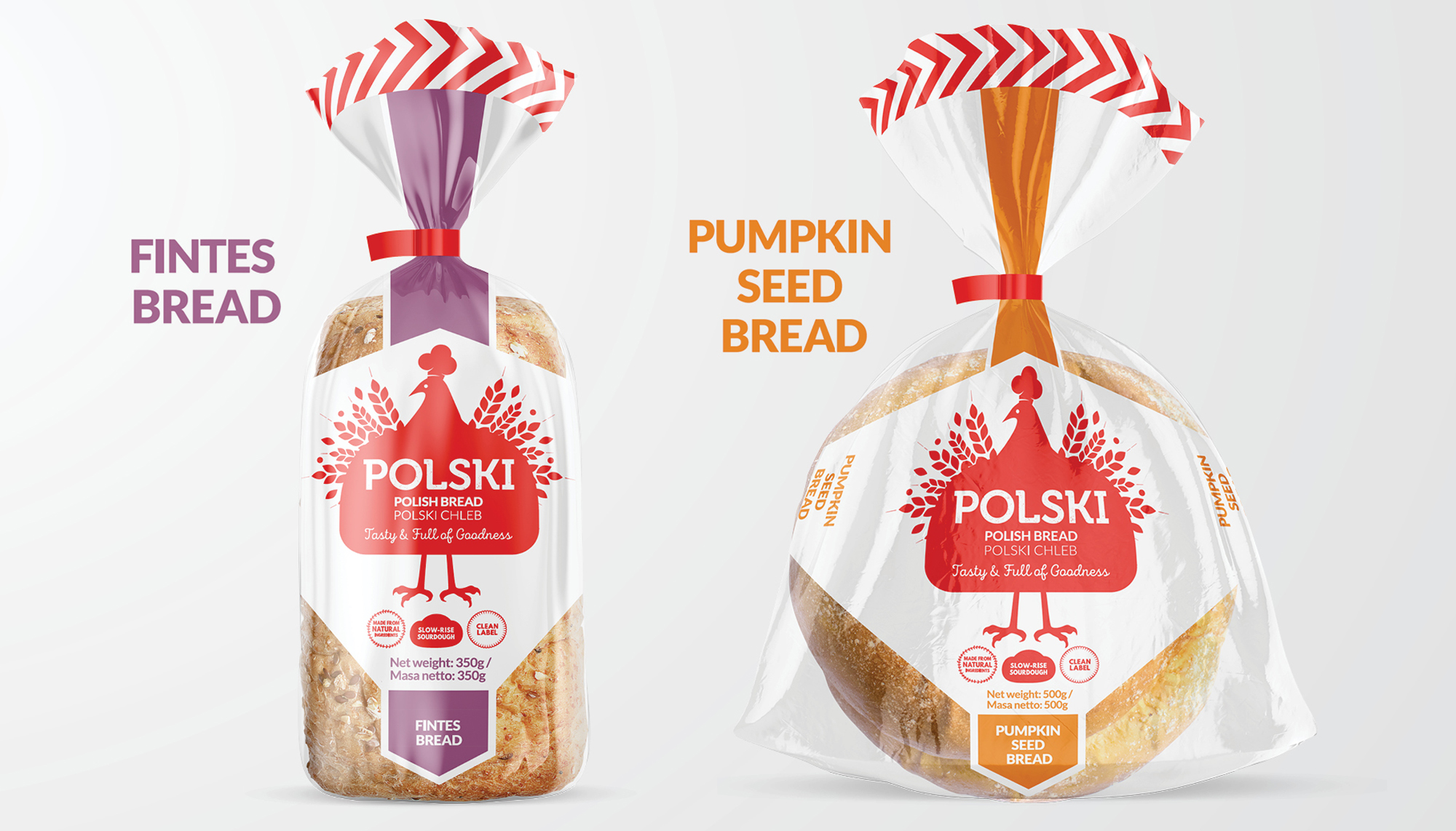
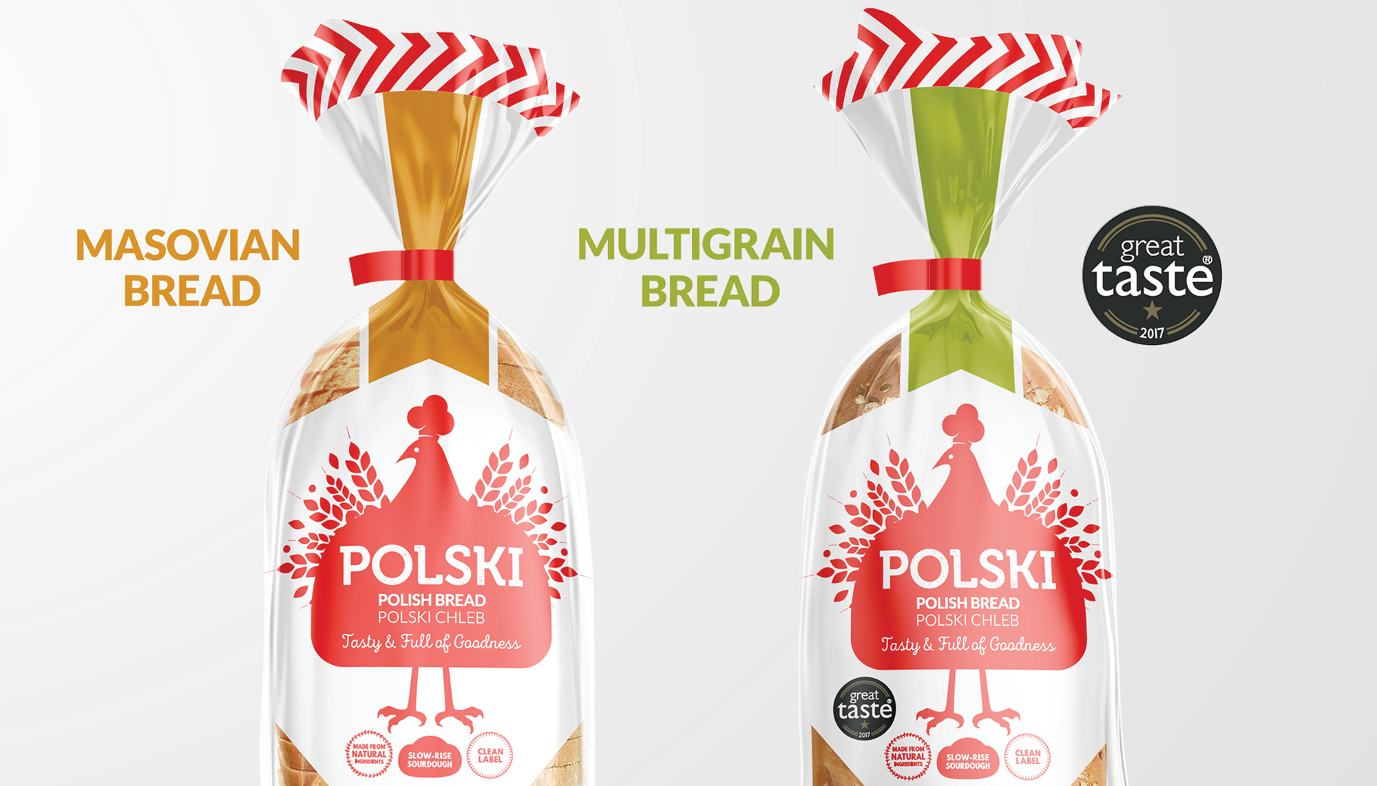
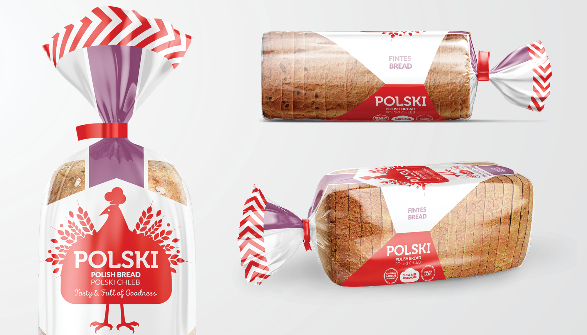
– Packaging shape designed to reveal the bread's natural goodness.
– Featuring the Polish bird mascot – with wings formed from grain, a bread-shaped body and a baker's dough-shaped hat.
– Simplified folk-art style 'Wycinanki' illustration.
– Traditional Polish typography in a modern style, containing an earthy, grain texture signifying the bread's wholesomeness.
– Consistency across four different shaped packs, for strong brand impact.
The result is engaging design, carefully tailored to their target audience.
