Orbidal Brand Identity
2012
Designed by Mary Doherty, Susan Carberry and Alan Murphy
Illustration: Mark Conlan
Categories: Identity
Industry: Corporate
Tags: Illustration
Tenderscout, a multi-award winning tendering SaaS solution, is the world's most advanced tender discovery, qualification and bid platform. With bold ambitions to grow revenues to €50m by 2025, Tenderscout found itself at a critical transition point as it moved from being an up-and-coming start-up into an established business. As part of this transition, Tenderscout, expressed the need for a new identity to give itself the credibility to compete for multinational
business globally.
Our first project task was to do competitive analysis (always useful!) and design/facilitate brand workshop sessions with their team. Immediately it was clear that the name - Tenderscout - was no longer fit-for-purpose. The word "tender" is a Western European colloquialism. Beyond Europe, the global term for this process is bid/contract bidding. We embarked on a lengthy naming process before a new name – Orbidal – was approved.
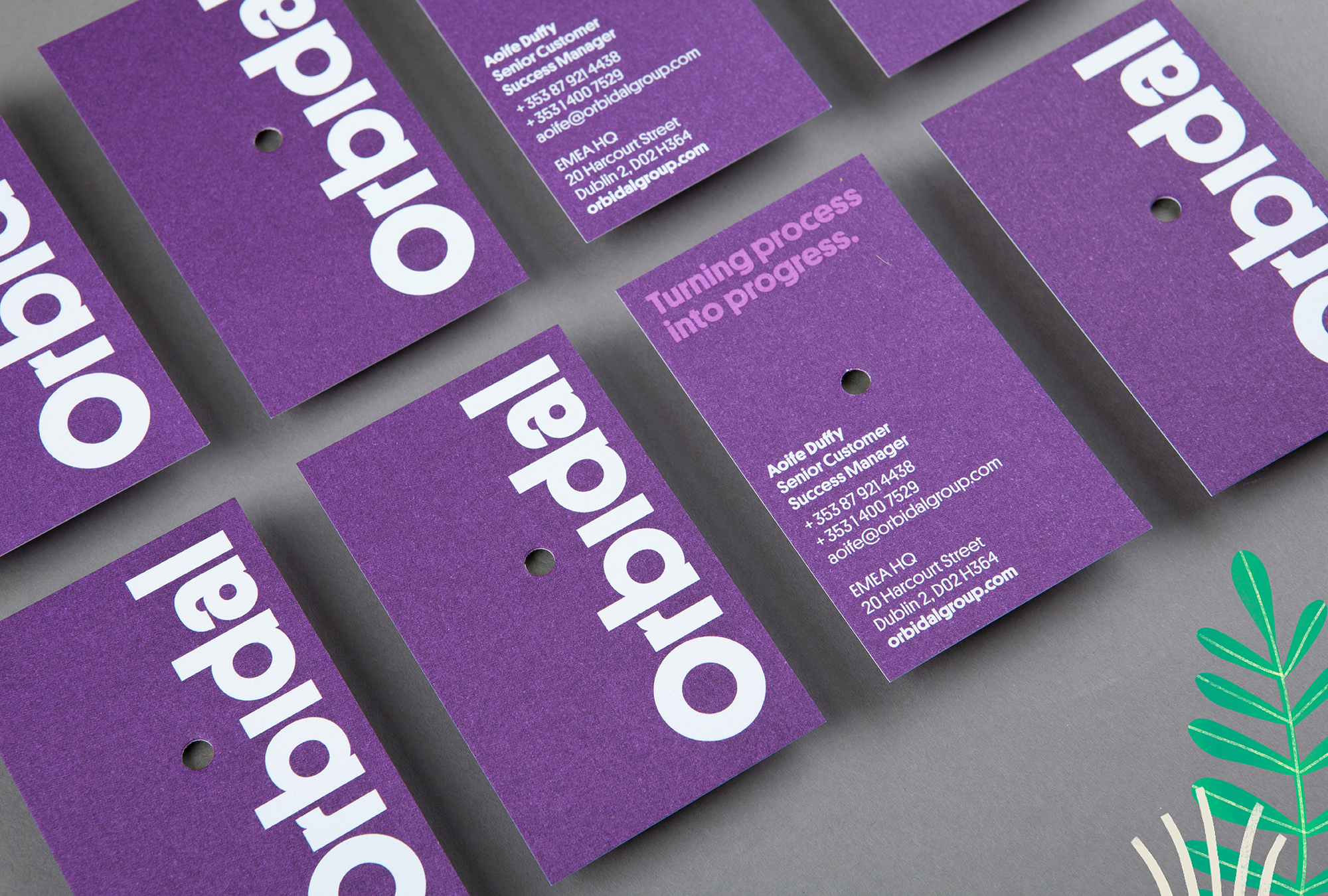
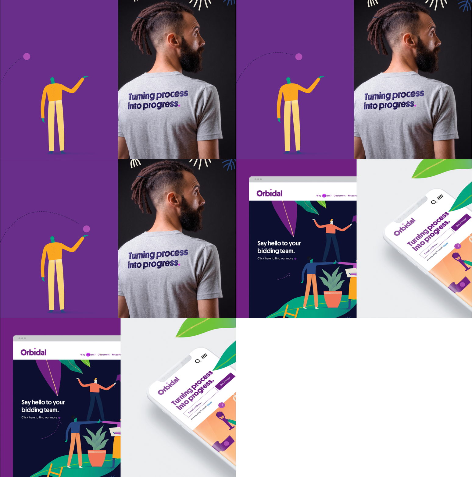
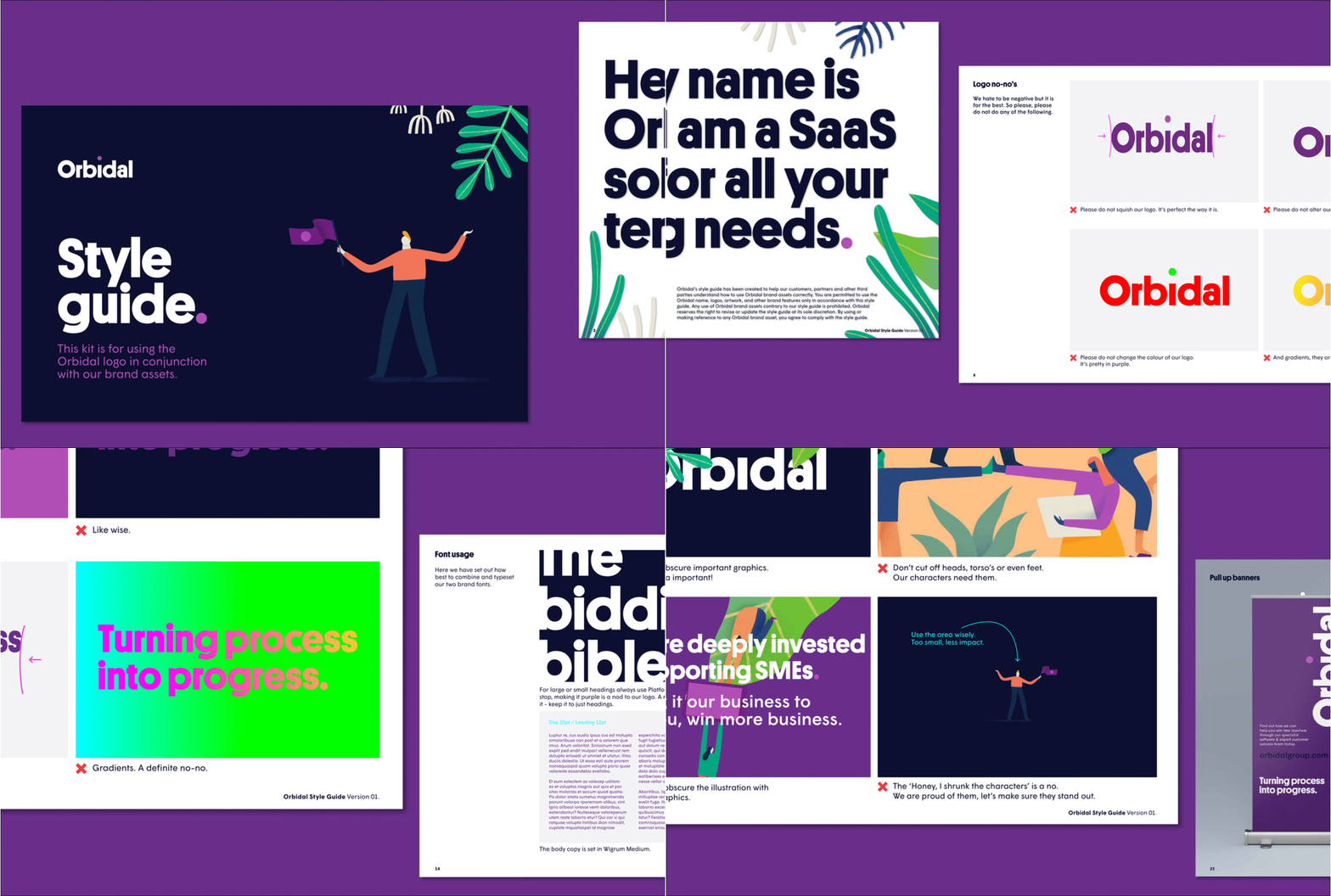
The next step was to express the new name and positioning through great design. A new logotype emerged quite quickly, giving Orbidal a simple yet very bold mark which applies incredibly well digitally – which is crucial for an SaaS solution company.
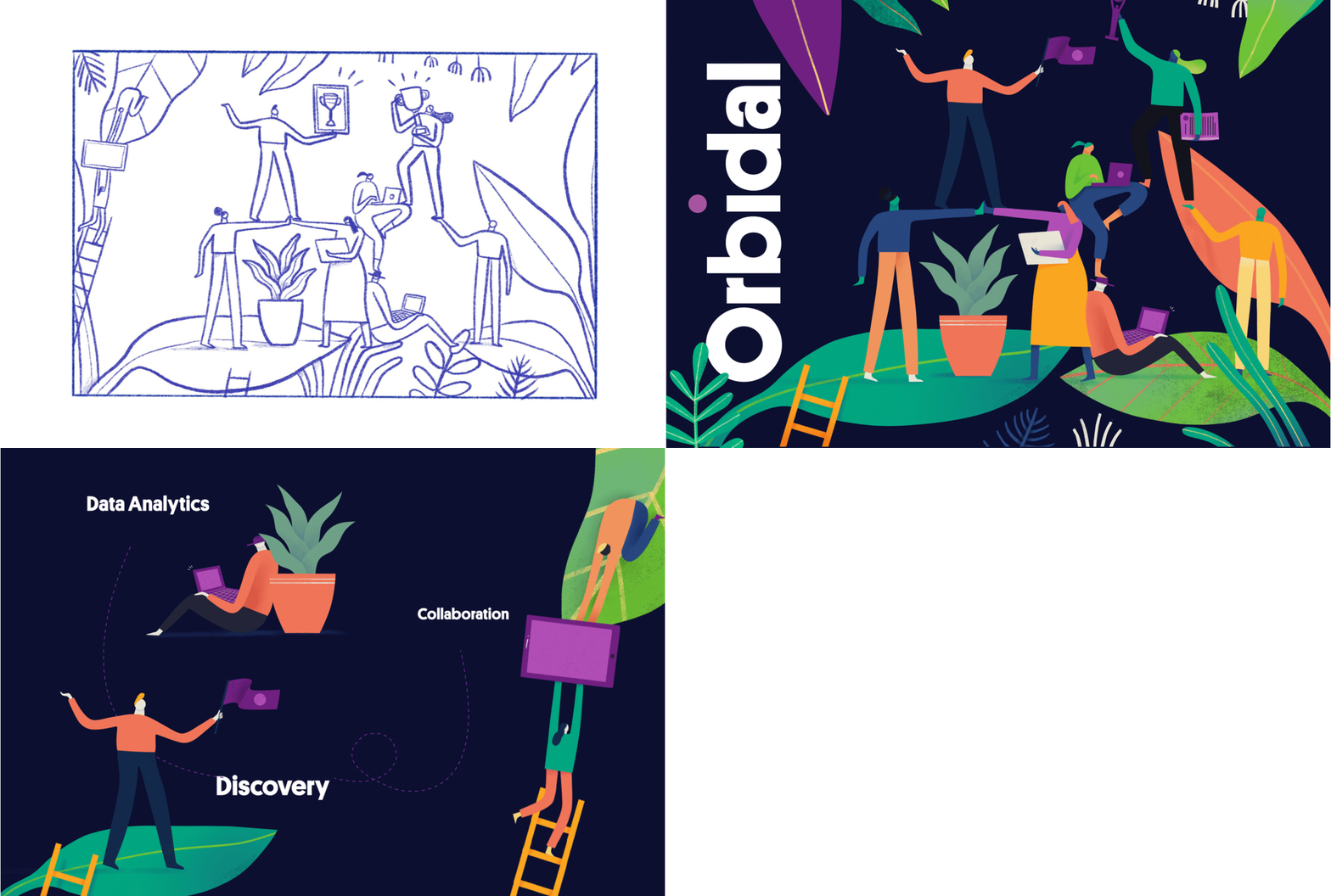
To bring the identity to life, we collaborated with Mark Conlan on a series of beautifully crafted illustrations. While a lot of the iconography that's typically used by Orbidal's competitors can seem off-the-shelf and impersonal, we worked with Mark to introduce a human touch to the identity. The style focuses on creating a narrative through the strong use of character and composition, empowered by whimsical yet emotionally relevant situations. Meanwhile, the rich and vibrant colour palette completes an identity for a market place that is supported through collaboration, discovery and determination.


