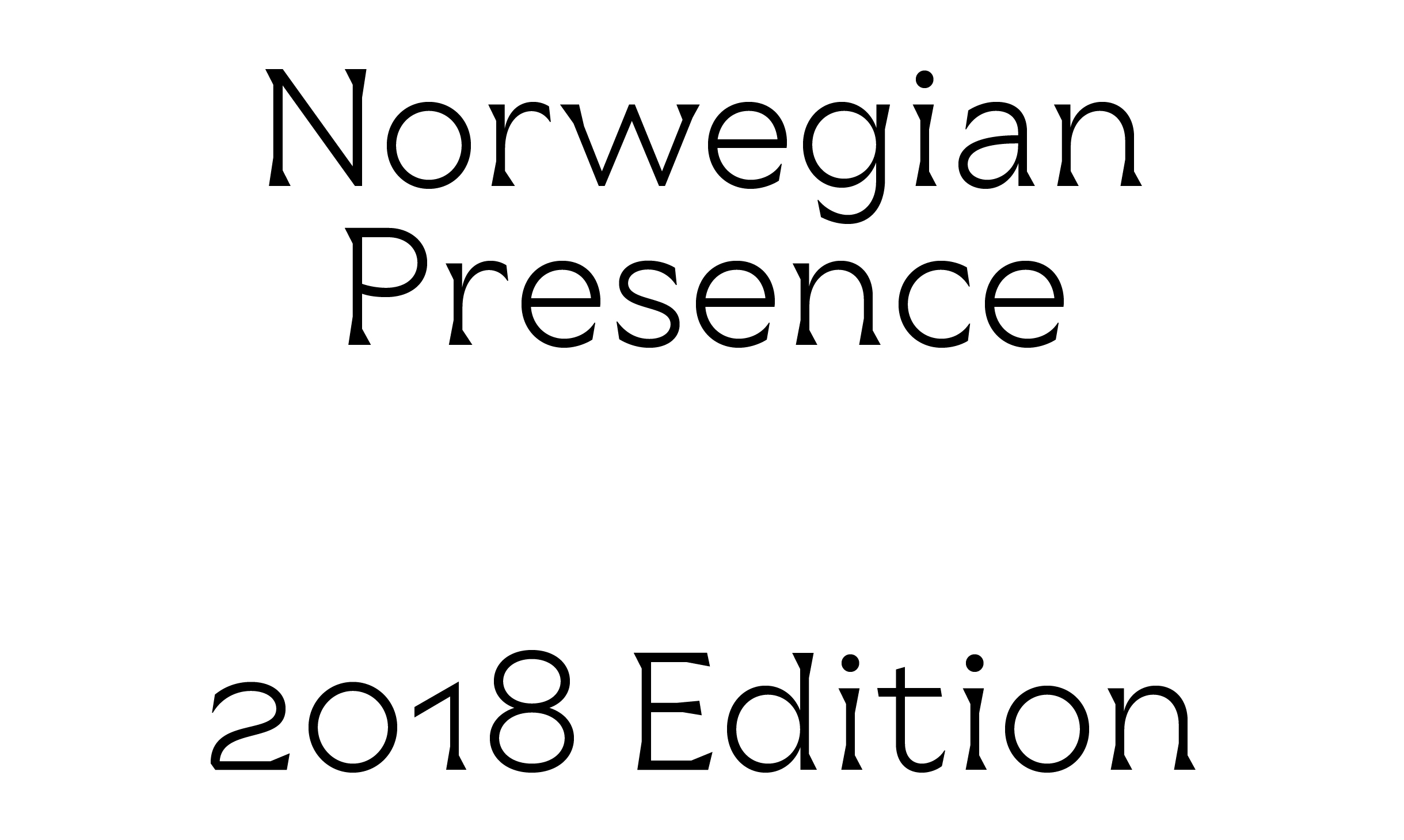
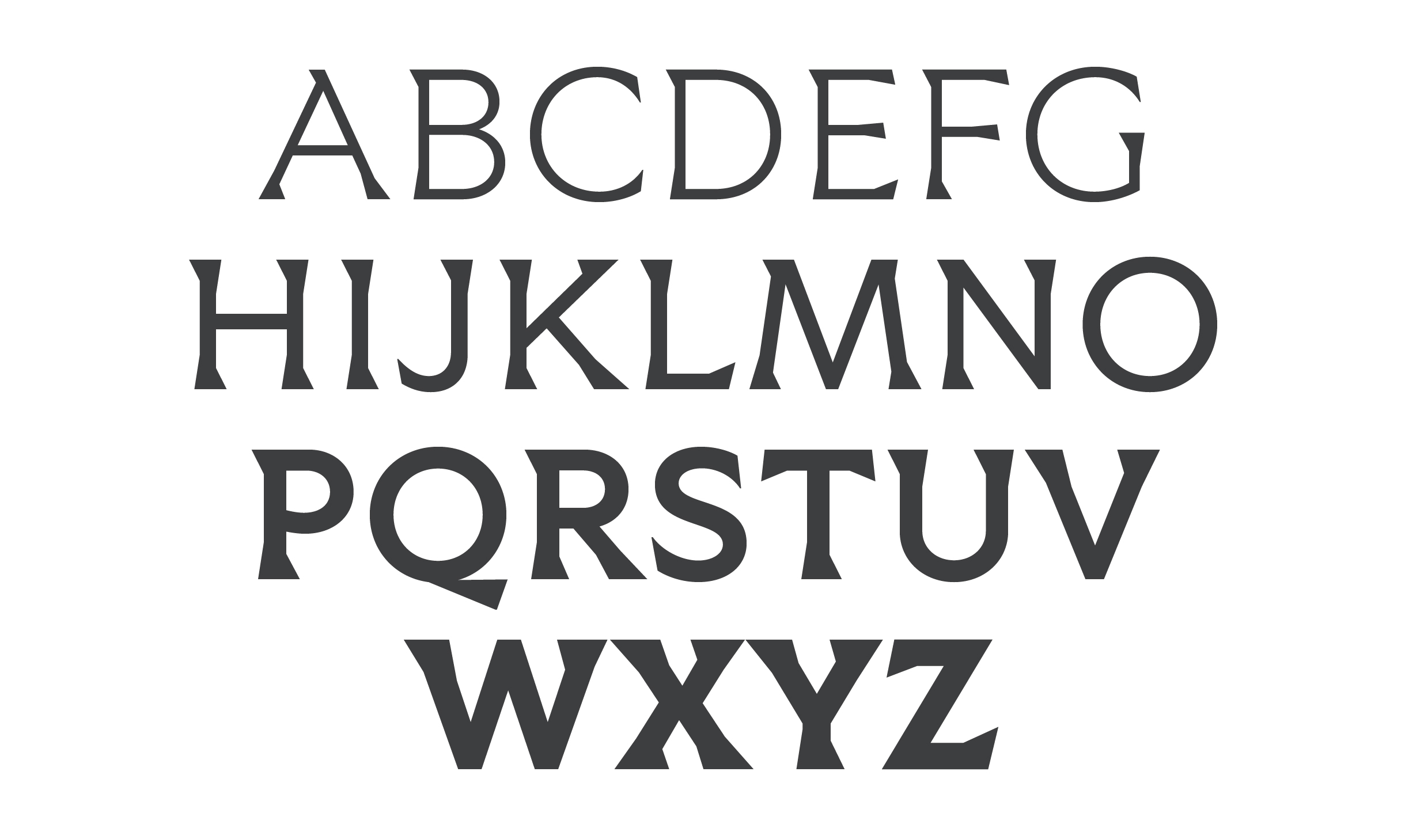
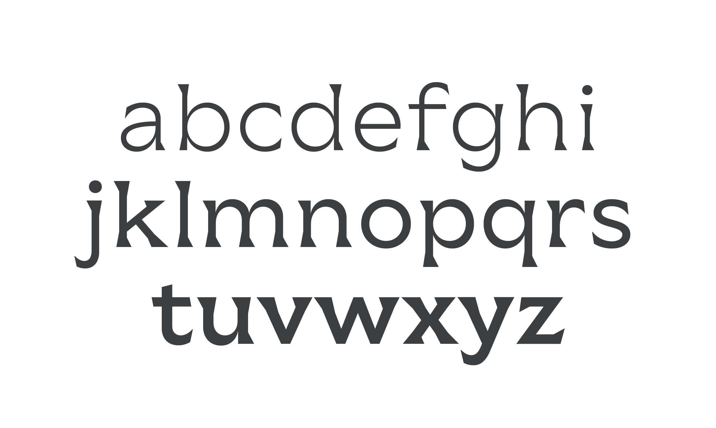
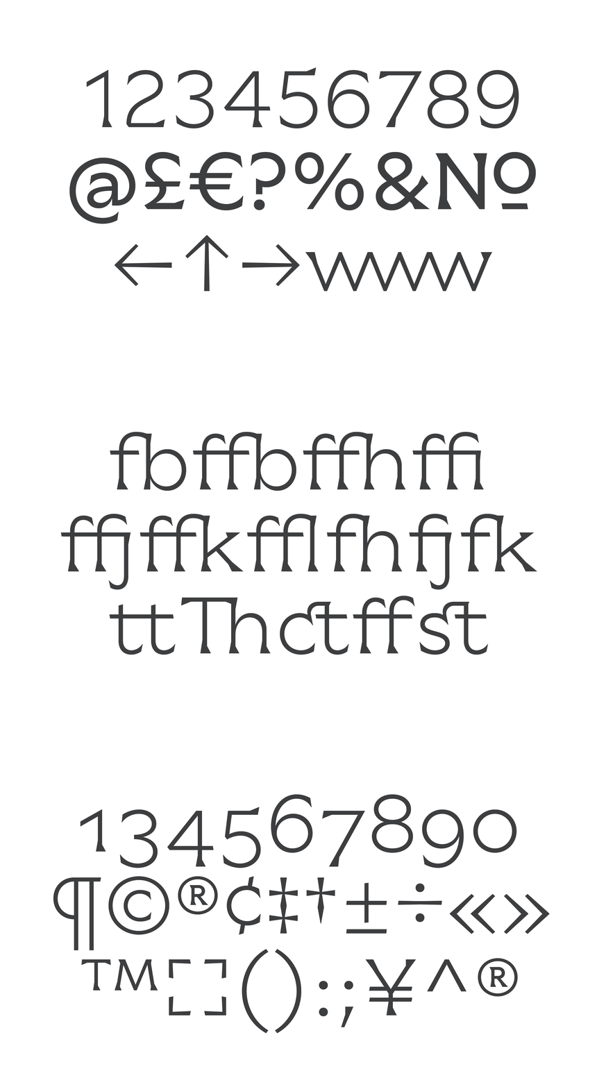
Norwegian Presence 2018 Typeface
2013
Designed by Evan McGuinness and Bobby Tannam at Bielke+Yang
Type Design: Bobby Tannam
Art Direction: Christian Bielke
Art Direction: Martin Yang Stousland
Categories: Typeface
Industry: Cultural
Website: norwegianpresence.no/2018
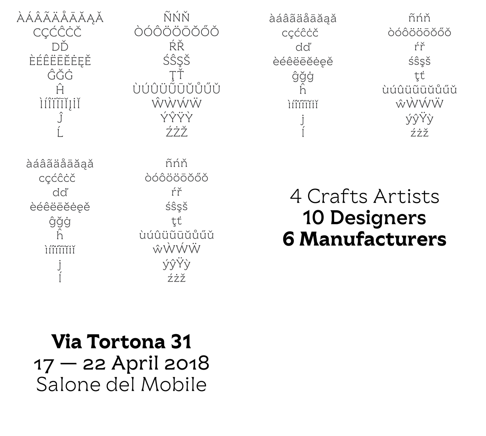
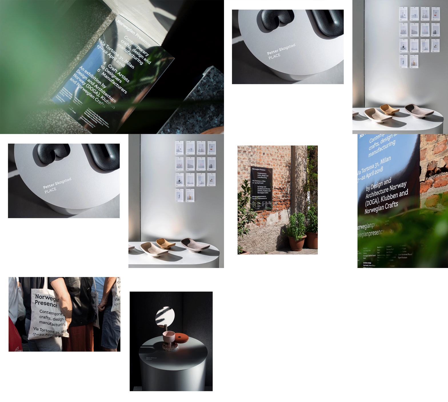
The Norwegian Presence 2018 exhibition was Norway’s 5th contribution at Salone del Mobile. The NP typeface was commissioned to embody the exhibitions values of; community, sustainability, and dedication to both contemporary and traditional Norwegian craft and design. By unifying the exhibitions participants, communications and identity—and through continued use in future exhibitions—it aims to build identity, recognition and over time a sense of belonging to the exhibition. The 4-weight typeface was completed in close collaboration with Bobby Tannam and will be used as an identity-bearing element for future exhibitions.
Norwegian Presence showcases new Norwegian talent in Milan, and is based on the idea of growth and newness. Its meaning and value on a cultural level was something that could be explored and expanded upon in future versions of the typeface: Building a special identity that tells a story and evolves over time with a sense of belonging to each exhibition.
The skeleton was originally drawn based on a very open Eusebius by N.Jenson (1470) and used as a divine proportional model. It will never change, while always visually changing. The skeleton, metrics and kerning, all that which is part of a framework which is finite. Its strokes, terminals, contrast and modulation, serif styles all that which is external, could be in constant change. The type could grow each year, but also exist in isolation, never being built upon.
