'Noji Architecture' Branding
Designed by Robert Boyle
3D Graphics for Animation: Element (Stephen Bowen)
Wood model build: Oikos Furniture
Sound design for 3D animation: Mutiny (Will Farrell)
Categories: Identity
Industry: Commercial
Tags: Architecture
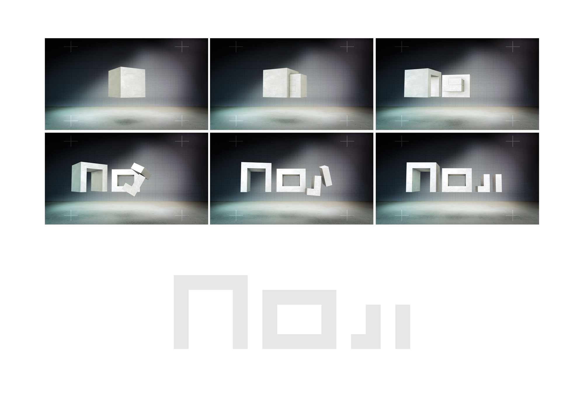
It started with four letters and a perfect cube.
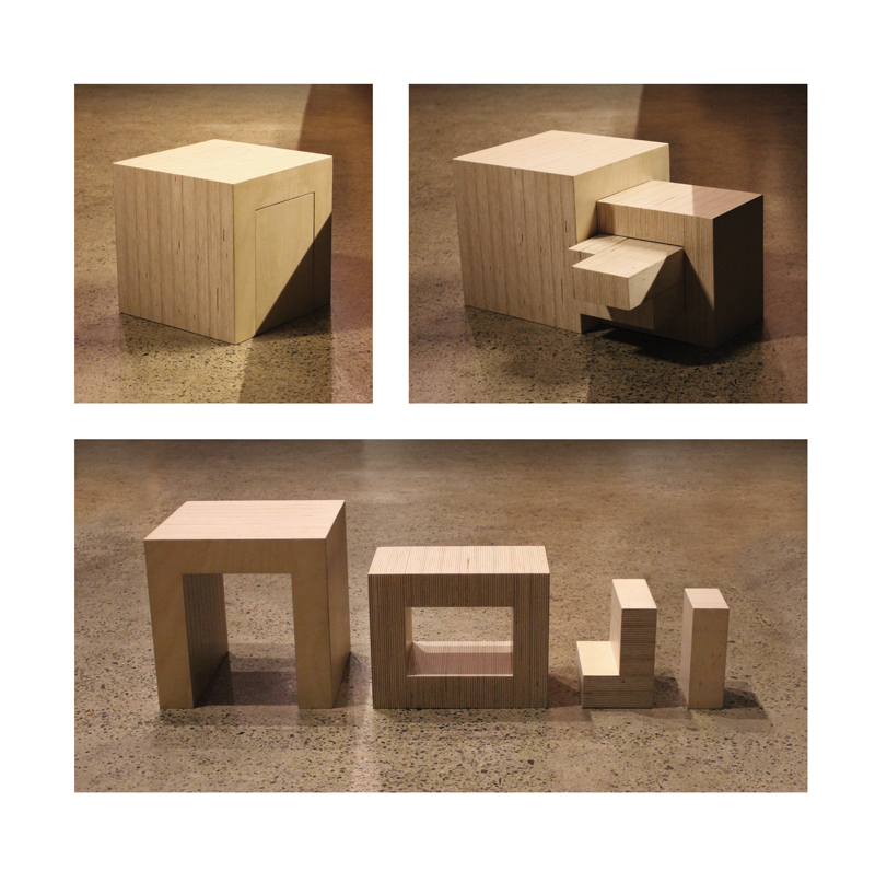
Once I noted that the letters of the brandname 'Noji' could contain eachother sequentially, I set myself the appropriately architectural challenge to extract them from a cube. This was to embody the ethos of considered and sustainable simplicity that Noji's buildings exemplify. No wasted space. No wasted material.
A cross section of the final solution then provided the two dimensional letterforms of the brand. What this produced is a bespoke typeface to the Noji brand in which the letterforms have a unique architectural relationship with eachother.
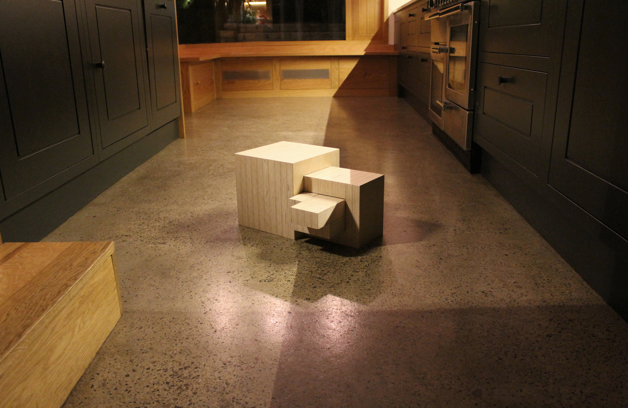
The 2D vector format is being used in stationery, signage, print collateral and blueprints. Its 3D derivation has been made in wood and each year another will be carved, moulded and sculpted from a different architectural material; 3D print, glass, concrete and plastic versions. Precision crafted to exact dimensions we can slot the different versions together in mixed material configurations for interactive sculptures.
Please visit the animation at the given url showing how it all fits together. It was produced for the Noji office screens and presentations and was animated by The Element.


