Ness
Designed by Kathryn Wilson at Slater Design
Tone of Voice: Jim & Daniel
Web Development: Will Rice
Categories: Identity / Print / Packaging / Signage
Industry: Commercial
Website: nessdrinks.ie
We were delighted to be approached by Jim, an architect, and Daniel, a musician, to design a brand for their new slow pressed fruit and veg juice company. We loved the juices and were excited by their plan to make the juices fresh every morning in Dublin 8 before delivering them to local businesses and retailers. Due to the DIY nature of Ness we wanted to create a brand which had the hand-crafted, organic feel of the company and their juices. Therefore we designed a logo which was based on creating the name out of segments of fruit.
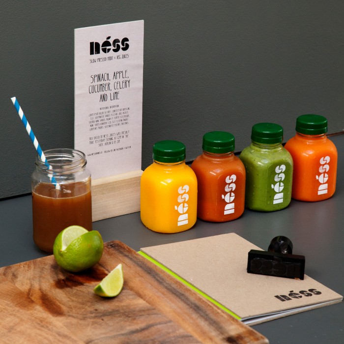
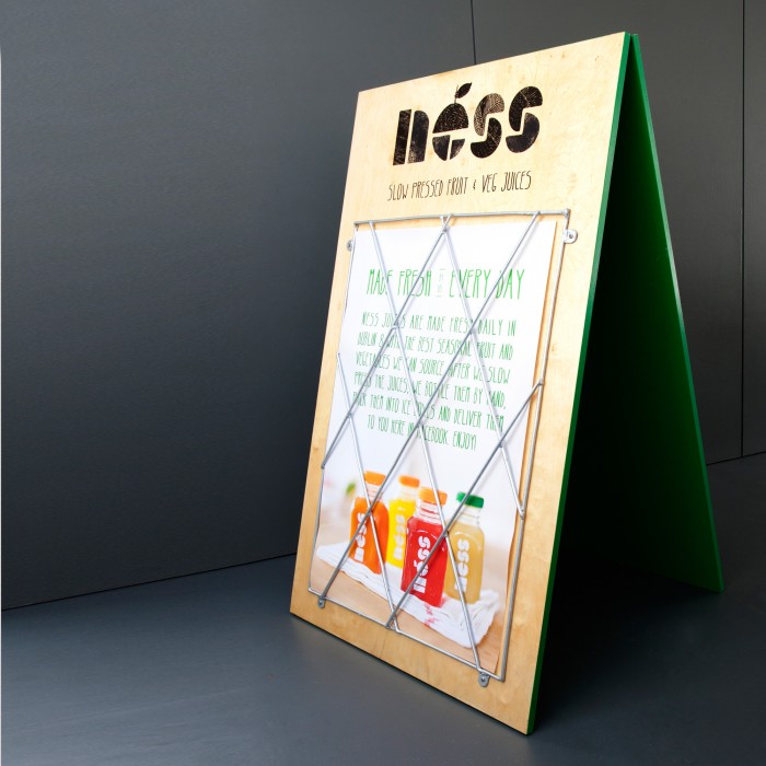
We have rolled out the identity and tone of voice to packaging, print collateral and signage for a pop-up Juicery. An important communication tool would be their website as they would use it (alongside social media) to build a following for their drinks and communicate daily flavours. In order to achieve this we came up with an online strategy and designed and built a website and Tumblr blog.
