NCH Rebrand
2011
Designed by Rupert Shafe at True Story
Creative Director, True Story: Sarah Maguire
Design Roll Out, NCH Design Team: Craig Potterton
Logo animation: Emberlight
Categories: Identity
Industry: Cultural
The National Concert Hall’s original identity reflected its musical heritage and the building itself, but was increasingly at odds with the contemporary side of the brand, its range of musical offerings and innovations. The heart of the new brand promise was ‘to enrich people’s lives through music and the magic of live performance’.
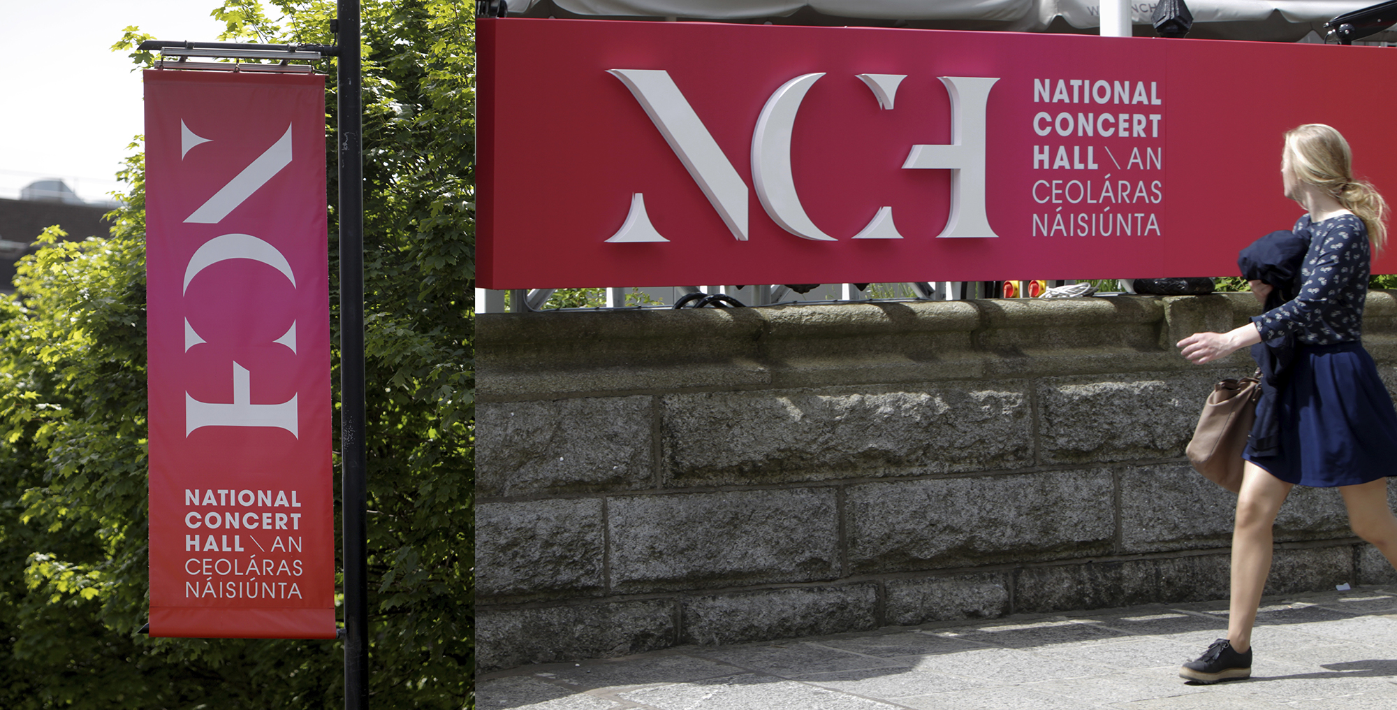
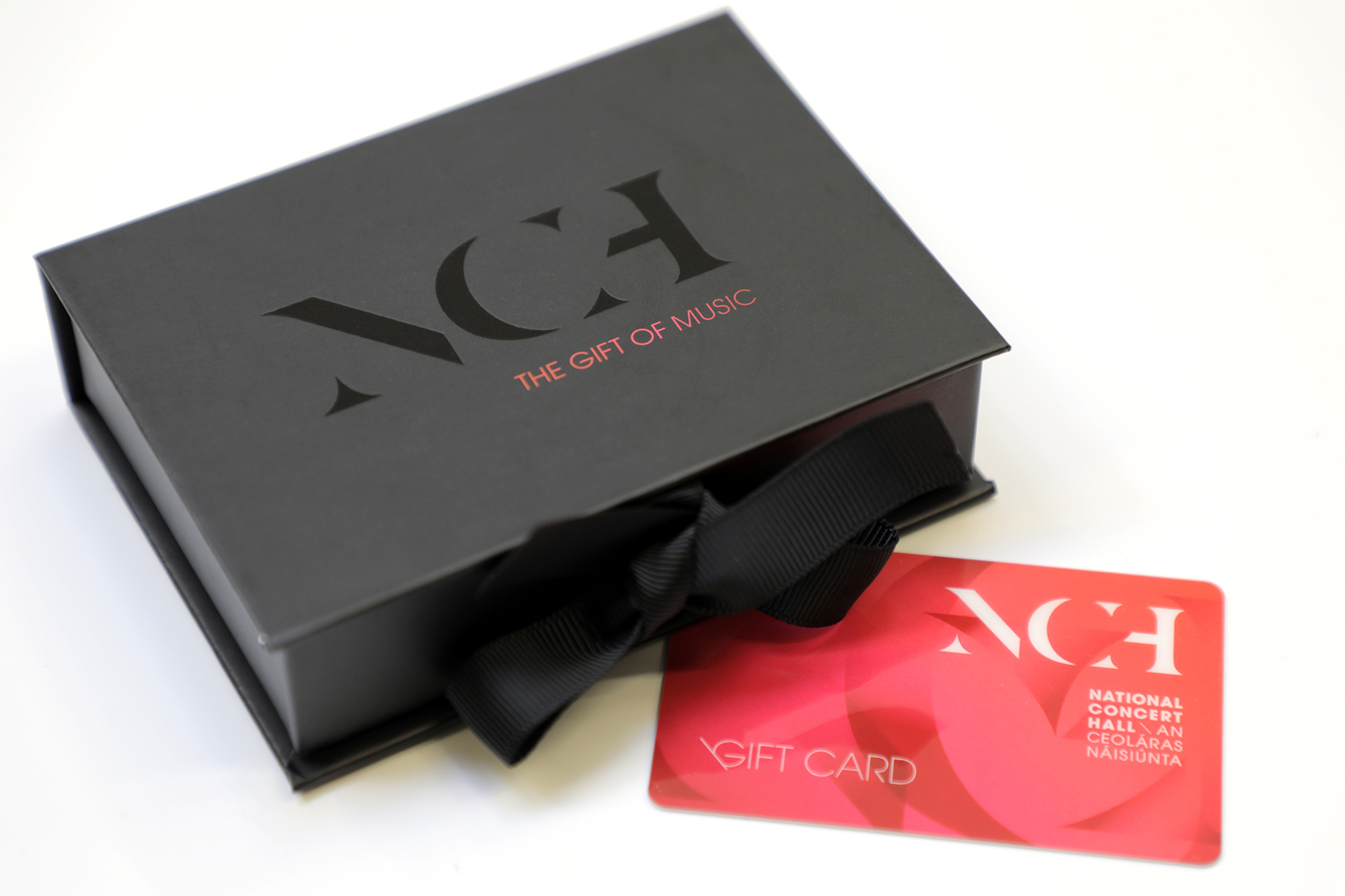
The main creative development for the brand identity was to make an icon out of NCH. This decision to focus on a visual NCH acronym would help create a balance between the classical heritage and the contemporary world of music today. The identity is intended to work in harmony with the beautiful architecture of the building, but with a contemporary approach and a customised typographic shape. Rather than rely on a separate visual symbol, the acronym would become the icon.
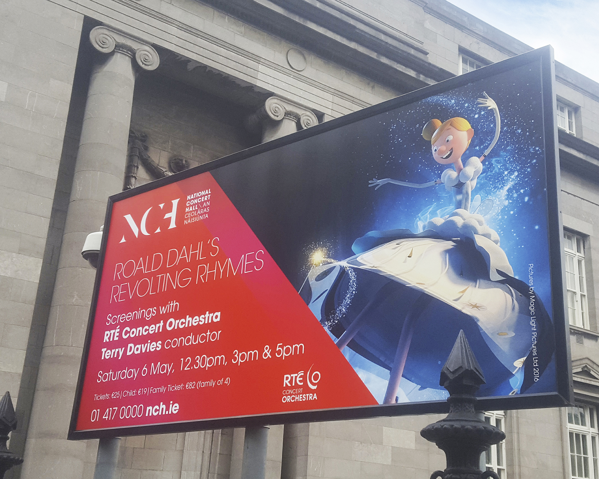
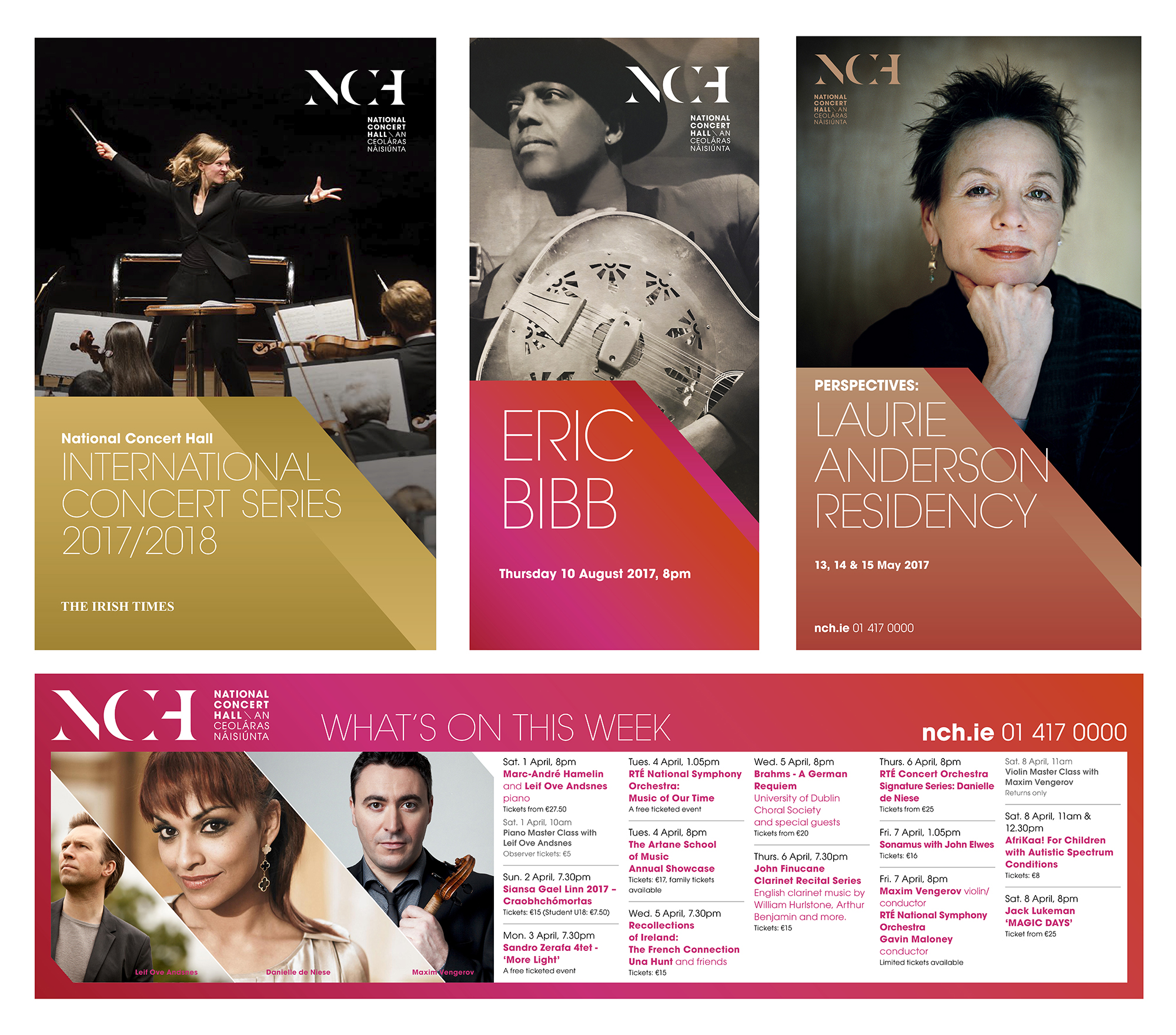
The diagonal cut in the ‘N’ formed the basis of the flexible design system and created a distinctive visual footprint for all communications. A bright and vibrant gradient brought a fresh energy to the brand, reflecting the magic and passion of live performance and the range of musical genres presented there.


