Move!
Designed by Sarah Fox at Zoopla
Lead UX: Tara Robinson
Categories: Website
Industry: Corporate
Website: behance.net/gallery/58444981/Move
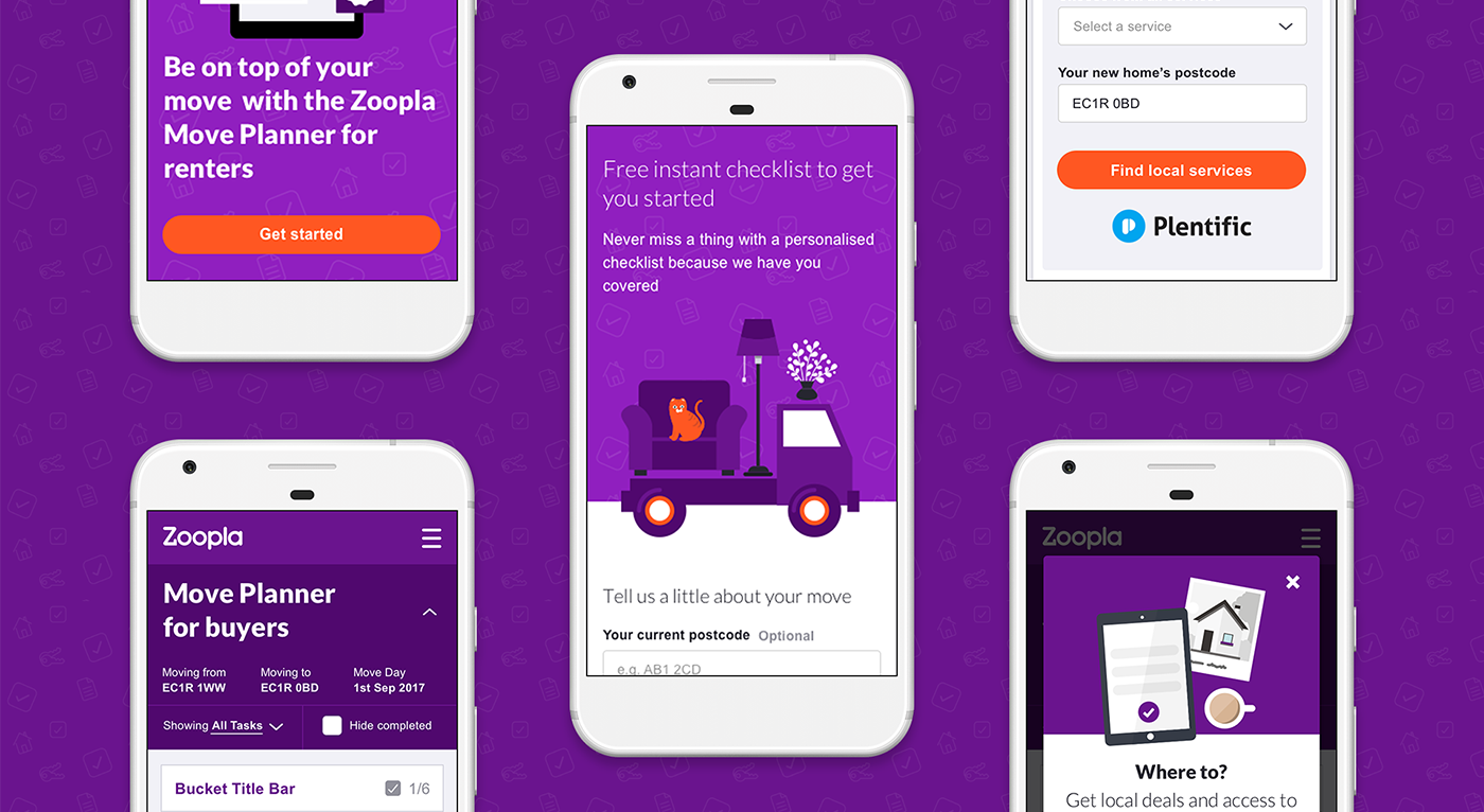
The Zoopla Move Channel is a new channel in the Zoopla property portal as part of the Find/Move/Manage user journey. Zoopla has traditionally been associated with the finding in a users property journey but, following strategic acquisitions, now also have the capability to fulfil the needs of people in the hoe move process as well as their household management.
The MVP of the Move channel comprised a buyers and renters checklist section. The launch was lean; we dropped users straight onto separate checklists and as a result encountered a few issues straight away which we were able to address in subsequent releases.
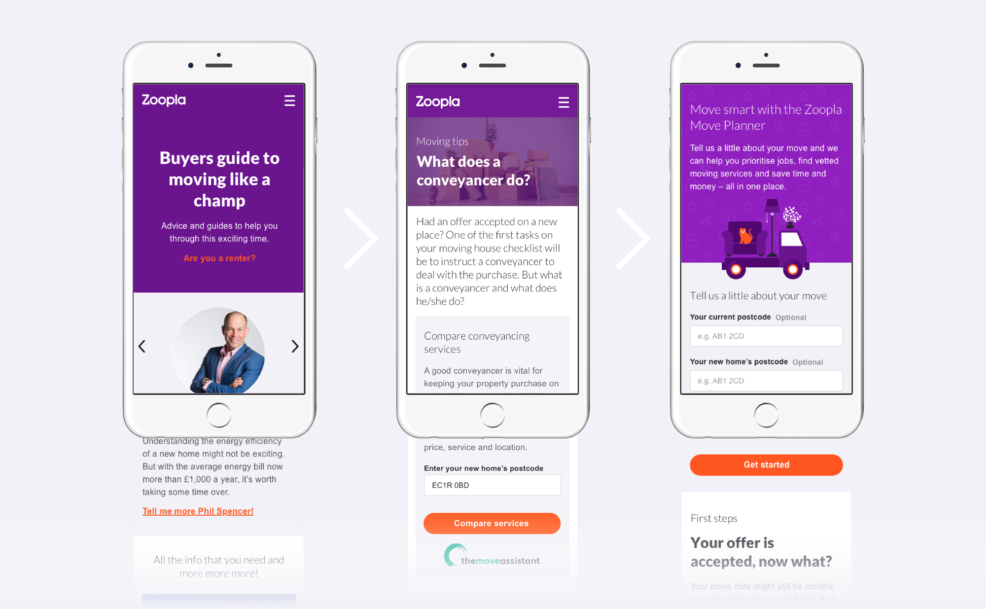
The second major launch for the Move Channel was the introduction of content in a guides section intended to supplement the planner. Bespoke written articles provide the user with expert advice, tricks and tips, plus access to exclusive offers from our third party partners. The guides are intended to provide knowledge to ease the pain of the move process and help people move smarter.
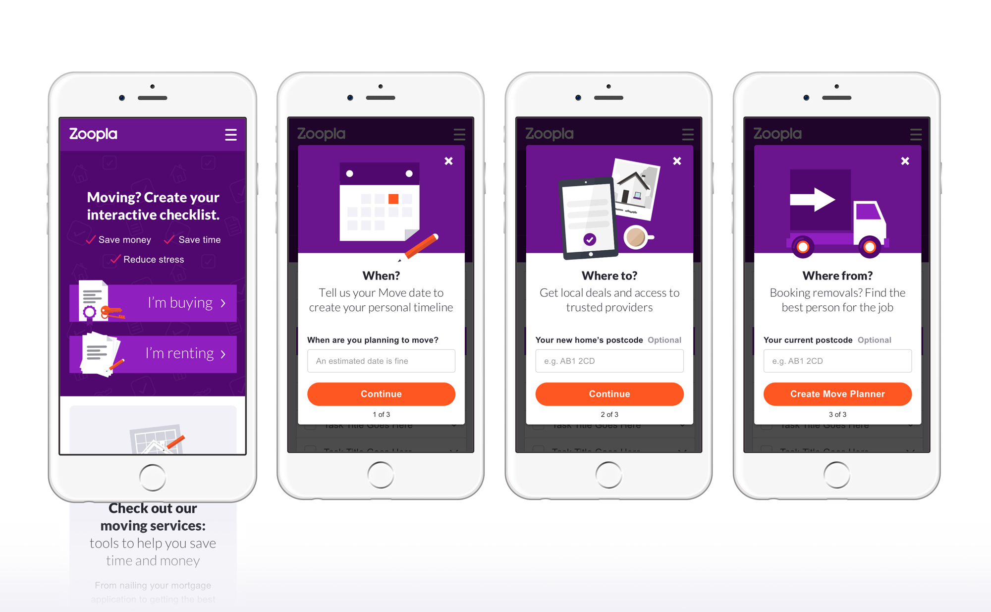
The minimum marketable product launch saw the introduction of an on-boarding journey which tackled many of our usability issues and had a significant positive influence on user engagement.


