Marsh Sisters
2014
Designed by Bridget Butler
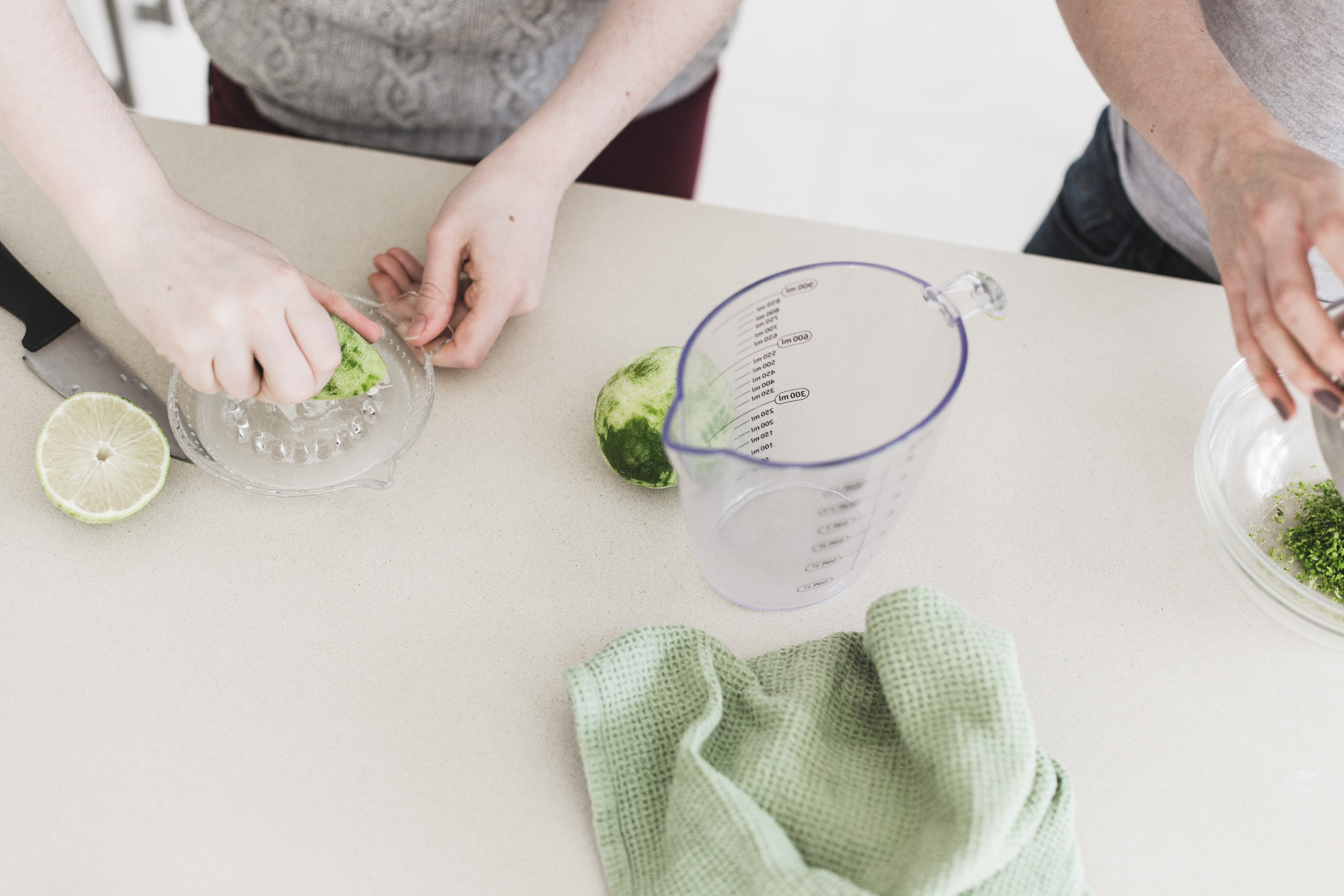
Photography: Bríd O'Donovan
Categories: Identity / Packaging
Industry: Commercial
Tags: Food and drink
Website: marshsisters.com
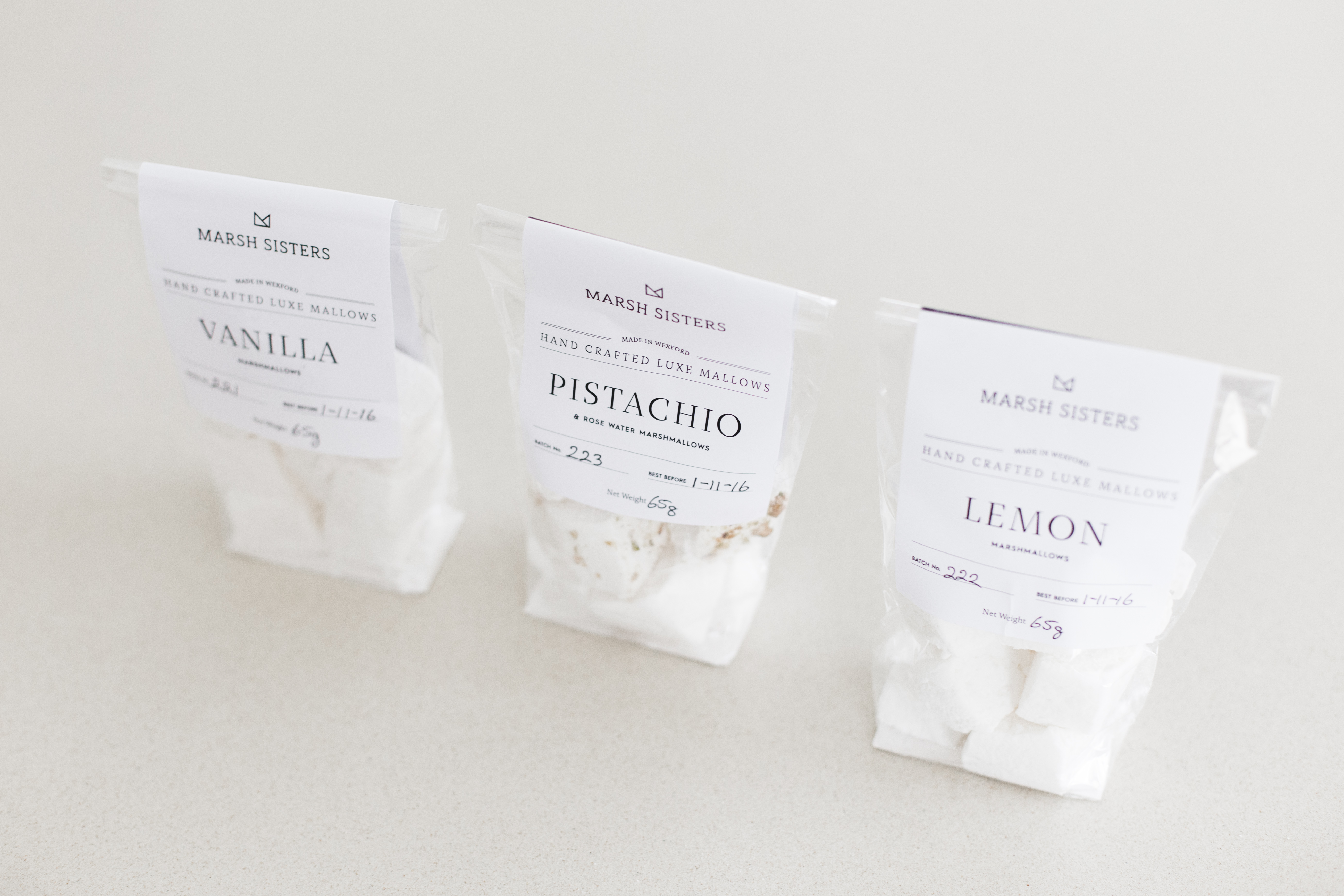
Marsh Sisters was born out of a love of all things sweet between two sisters who enjoy making and eating marshmallows together. The logo mark is based on the triangular mallows made for custom orders. Two triangular mallows come together to make an M, simultaneously representing both partners and sits atop the name as a crown. The packaging was pared back to reflect the simple and natural ingredients of the mallows themselves. The crown also reinforces the luxury and quality of this handmade product. We worked Bríd O’Donovan on our photography to add to our overall look and feel on our site and social media.


