lululemon practice
2012
Designed by Ken Deegan and Jack Collins at Pentagram
Partner in Charge: Eddie Opara
Designer: Paul Yoon
Project Manager: Dana Reginiano
Typeface Customization: Chester Jenkins
Typeface Animations: Pierce Cunnane
Photography: Lauren Coleman
Categories: Identity / Typeface / Packaging
Industry: Commercial
lululemon practice is the new loyalty membership program from the athletic apparel retailer. Developed as the companies first membership program, practice members are invited to improve their fitness regiment and personal development as part of a year long program with access to member-specific classes and events, exclusive practice workout gear and perks like early access to new products and express shipping.
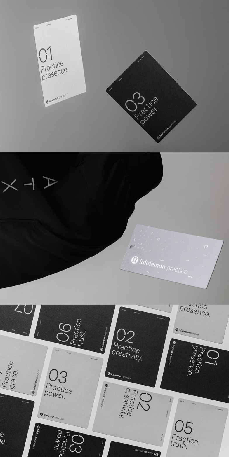
The brand identity design stems from a custom-built version of the lululemon brand typeface – Calibre, originally created by Klim Type Foundry. Through introducing custom stencil cuts to the characters, the typeface’s curved nature is greatly accentuated, resulting in a typographic form reflective of the premium, elevated nature of the brand and a visual reference to the circular forms of the recognizable lululemon “yogo”. The designers customized the practice mark in-house and then worked with type designer Chester Jenkins on expanding out a full display typeface, which underpins all brand messaging across practice applications. The typeface also forms the basis of an orbital circular pattern, unique to the practice brand.
As part of the branding process, the team also designed the packaging for the membership kit that new practice members receive. The box employs silver foil stamping across the white exterior while inside light gray card insets encase the practice workout gear and a set of branded practice development cards.


