Insular Typeface
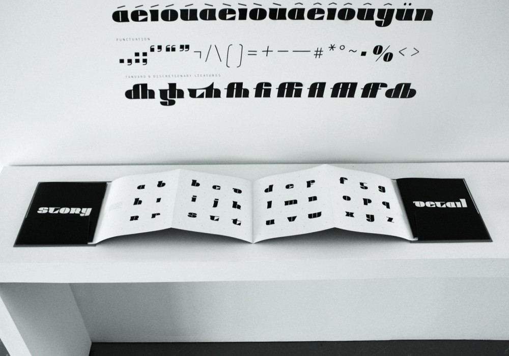
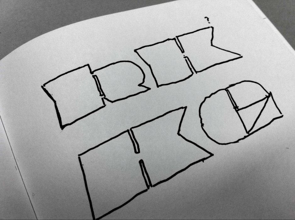
Until the '60s the Irish Language was set and written in it's own unique alphabet, Gaelic. Gaelic overtly distinguished texts as being Irish, but with this alphabet no longer in use can a typeface still be Irish? Is there a way of designing in an Irish style that does not rely on traditional clichés? Insular is a contemporary display typeface designed to explore this question.
The typeface is influenced by the work and methods of renowned stone letter cutter Michael Biggs but mainly takes reference from contemporary sources.
A significant feature of the typeface is its range of standard and stylistic ligatures. The consonant plus ‘h’ ligatures are a way of making reference to the now obsolete practice of putting a dot on consonants in order to represent a following ‘h’, known as the ‘cló buailte’.


