Gift of a Lifetime
Designed by Brian Nolan, Paul McBride, Naoise Ó Conchubhair, Keith Byrne and Pierce Cunnane at Detail. Design Studio
Project Manager: Leonie Henson
Categories: Identity
Industry: Cultural
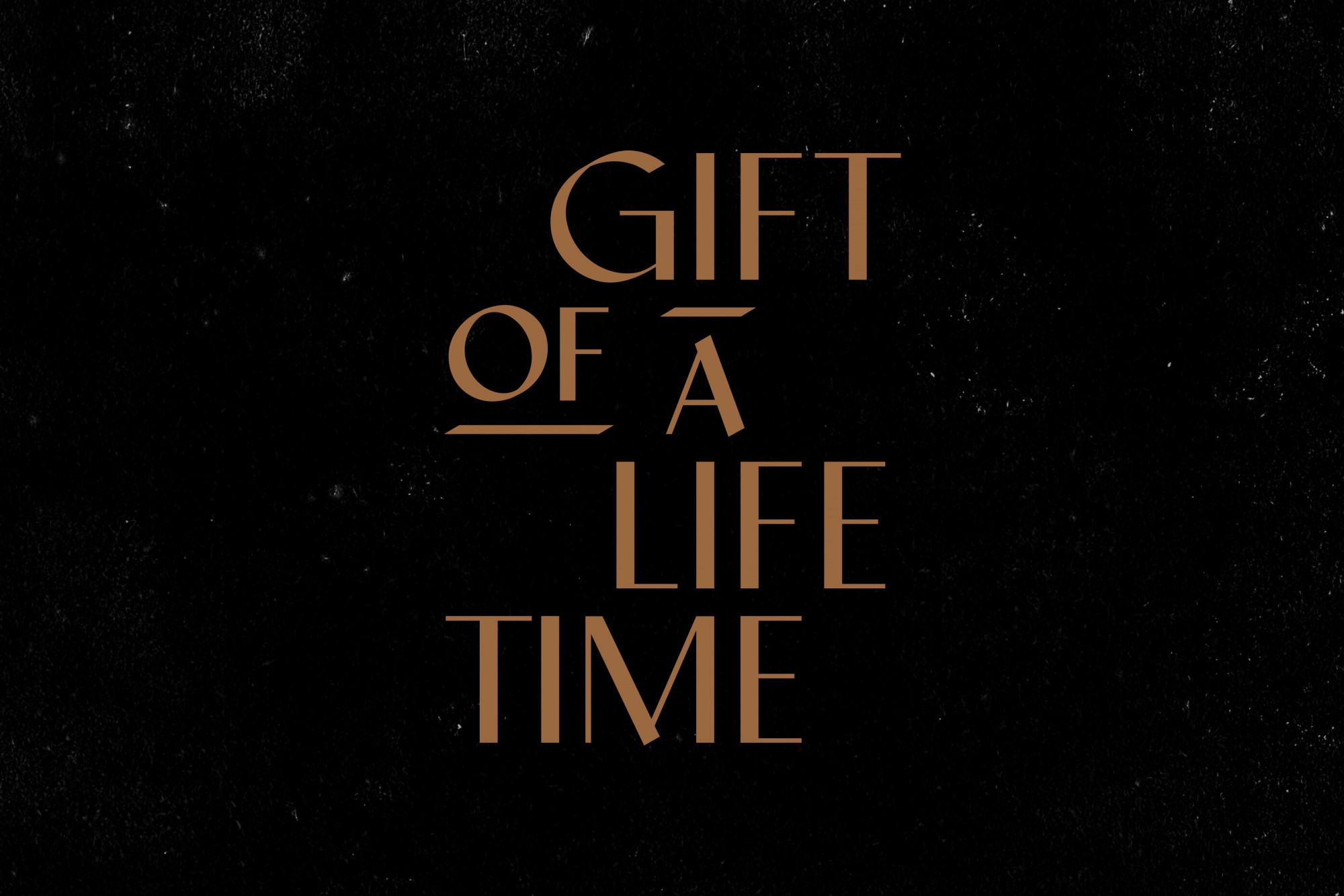
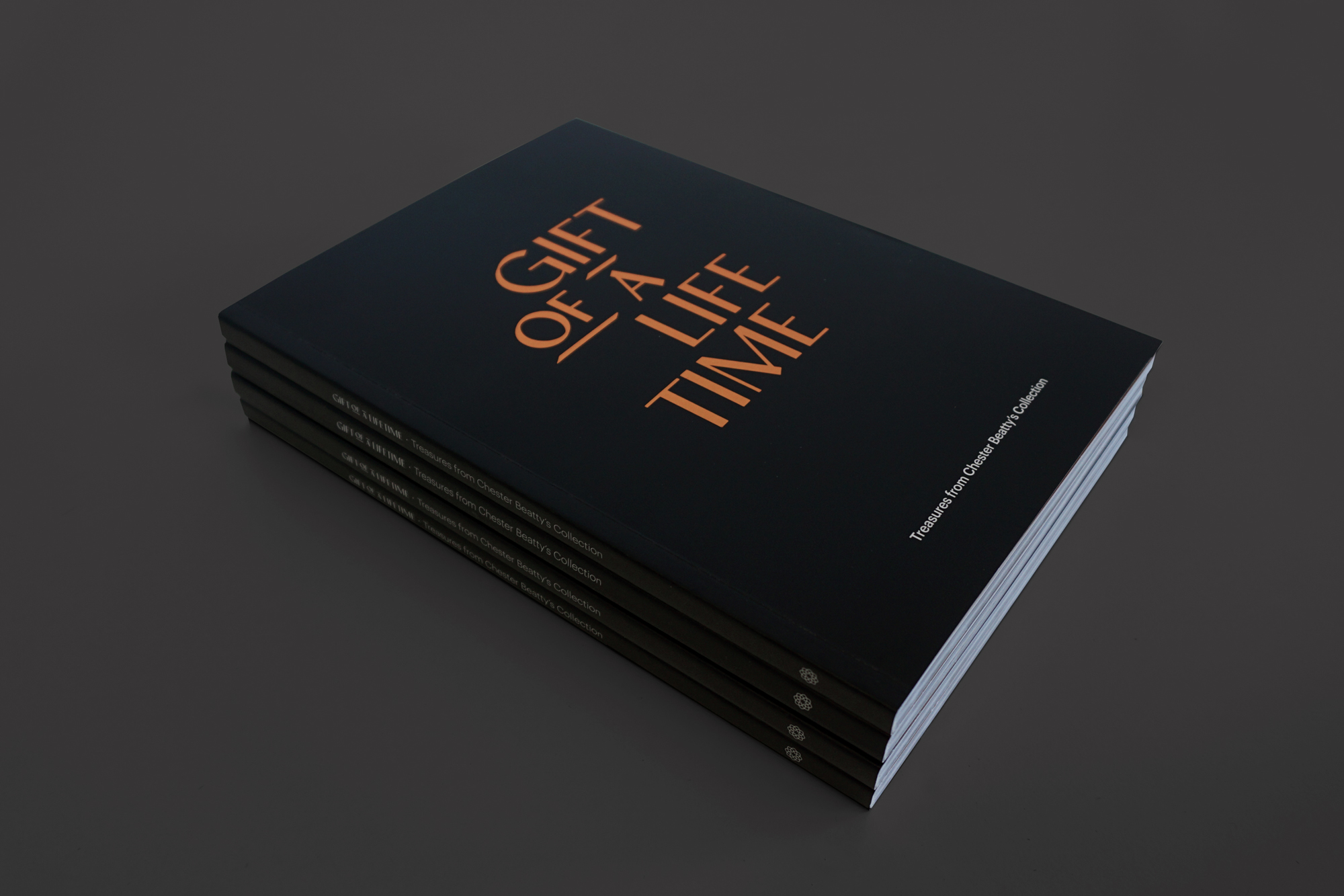
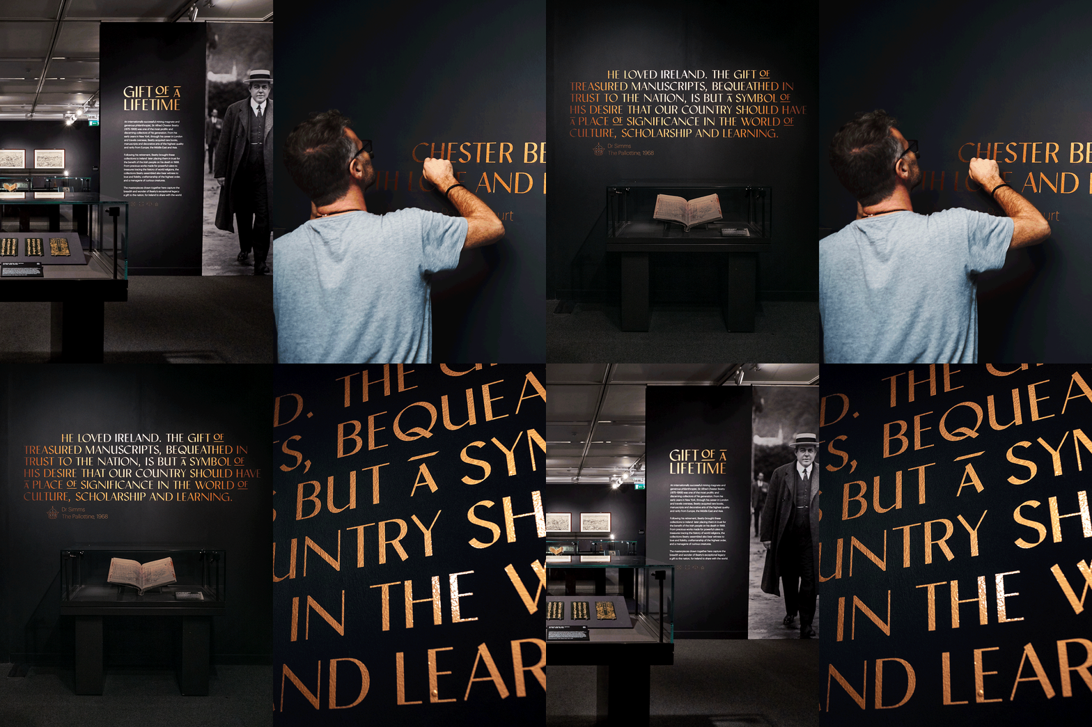
The basis of this identity lies in the typeface. Our custom typeface: Archivist, blended the 3 main subject areas of the exhibition — the Middle East, Asia and Europe. The metallic colour palette makes reference to the precious collection and Chester Beatty’s epithet of the "King of Copper”. Supporting illustrative icons were created to represent, the various genres/locations of the artworks. The identity covered a vast number of outcomes, from the exhibition graphics and catalogue, to advertising & signage.


