Gallagher
2013
Designed by Paul McCann and Kieran Duffy at CDG Brand
Categories: Identity / Website
Industry: Commercial
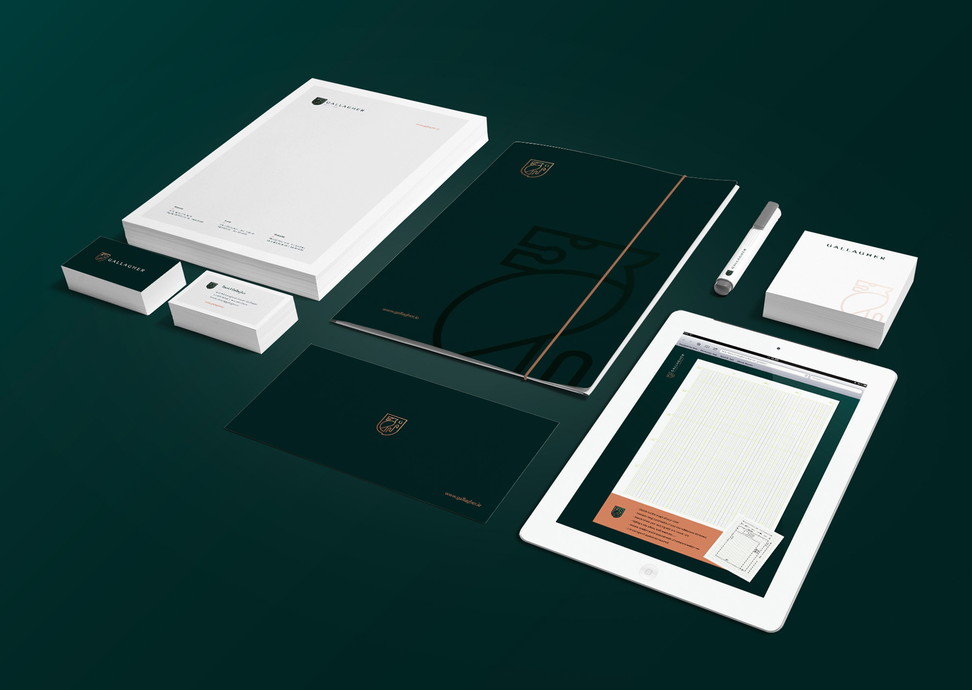
Tags: Stationery
Website: gallagherkitchens.ie/
For more than 25 years, Gallagher Kitchens has provided a quality service to its customers through its high values of commitment, honesty and purpose in their work. Gallagher’s creates kitchens and wardrobes to answer their customers’ needs in perfection. The family-run business has helped customers achieve their dream kitchens by listening to their needs every step of the way from planning the project to providing them the end product. Established in 1991 in the Lucan area and recently opened a new showroom in the Clondalkin area, Gallagher Kitchens have a strong dedicated team of loyal staff of sales, designers, cabinet makers and craftsmen.
We where given the task to design a new corporate brand identity and digital marketing platform. Our goal while working with Gallagher’s was to translate their values of hard work and traditions while showing an image that will attract their main audience. Our main challenge was to create a contemporary image that would empathise with their core target audiences (females predominantly) while accommodating the company’s stakeholders which consisted of two generations, the mother and father who are the funders and the sons. For the website, our goal was to make it very visually pleasing as well as interactive and more engaging for users.
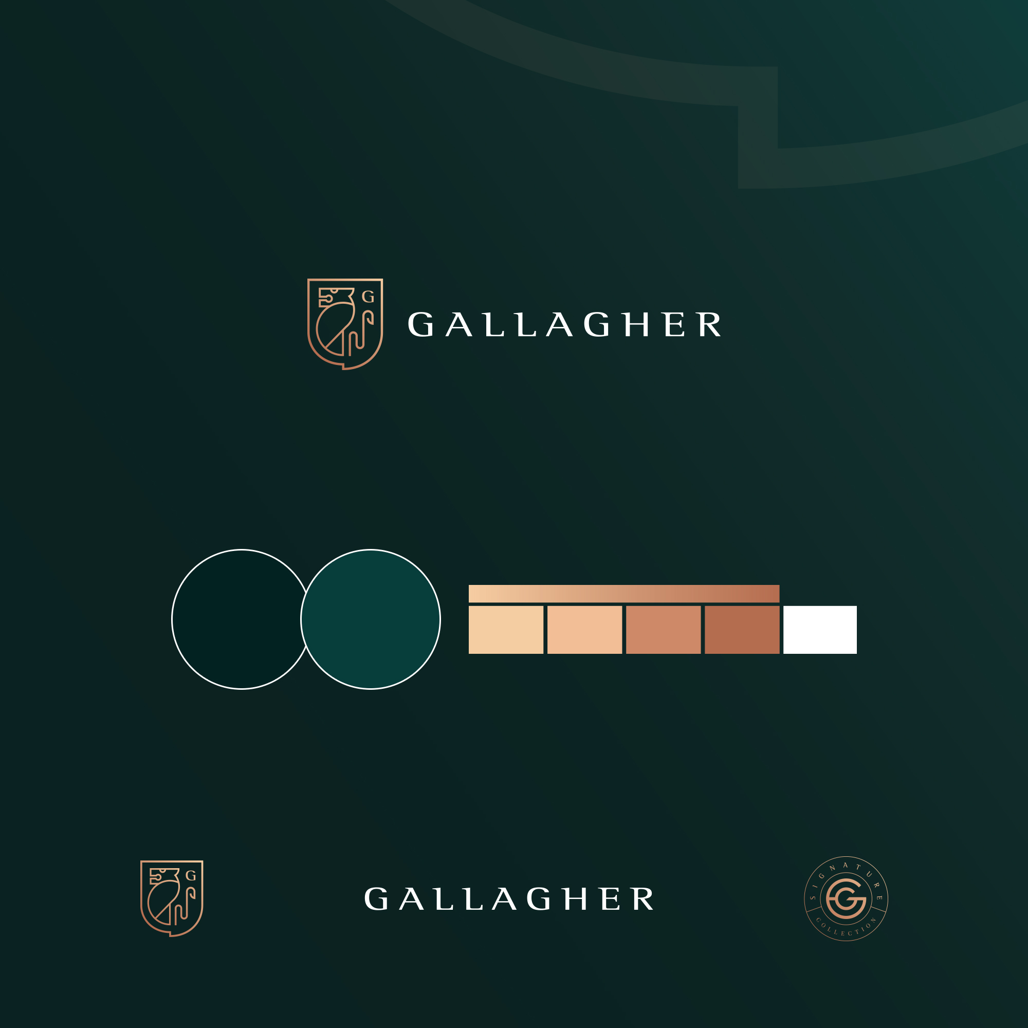
To give Gallagher Kitchens the best solution possible, we started with studying who their customers really are and why they would choose one kitchen company over another. From this research, our solution was to rethink the company’s image by trying to satisfy both the company and the audience. For Us, the idea was to give the company an end product that shows quality and modernity at the same time. With that idea in mind, we started with the Brand design . We drew inspiration from the former Gallagher Kitchens’ logomark to keep the Heraldic Coat of Arms influence but trying to contemporise it. We chose a more modern color combination and logo motif and drew upon rich colours to complement the new image. We also created a new RWD website using a custom theme and unique design. The site colors are used to differentiate core content and call to actions, making it easier for customers to read and to interact with it. Smartphone and tablet friendly


