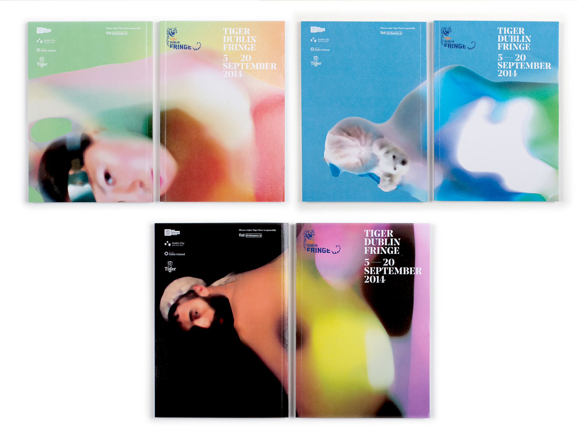
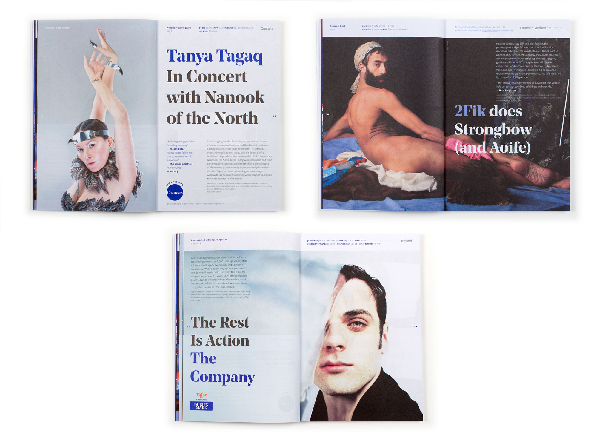
Fringe Programme 2014
Our ongoing approach with the Fringe is to try and capture the themes and thinking from any given year so that we show the creative energy of the festival which is always changing, and so that each campaign feels like an integral part of the overall festival.
This year, the Fringe's new director had developed a programme about blurring the edges, championing the senses and embracing the psychedelic. We worked with images from 3 of the main shows, turning each one into a colourful, psychedelic composition. On the programme covers we used abstract colours, with faces on the back to provide a narrative. This approach was continued across posters, with the faces pushed to the edges and cropped.


