FREESPACE – 16th International Architecture Exhibition — Supergraphics and Exhibition
Designed by David Smith, Oran Day, Isabelle McCarthy and Johnny Brennan at Atelier David Smith
Grafton Architects Editorial Team: Emmett Scanlon, Nathalie Weadick & Alice Clancy
Exhibition Spatial and Structural Design: Grafton Architects
Categories: Environmental
Industry: Cultural
The overarching graphic identity for Biennale Architettura 2018 seeks to visualise and communicate the ‘generosity of spirit’ and universal ideals at the core of the curator’s FREESPACE manifesto.
The multilingual design concept for the FREESPACE identity visually references a number of historic, cultural, geographic and environmental antecedents – the typographic vernacular of the Futurist manifestos; the protomodernist structural innovations of Venetian opera and the distinctive columns and surface textures of the Corderie & Arsenale Venues.
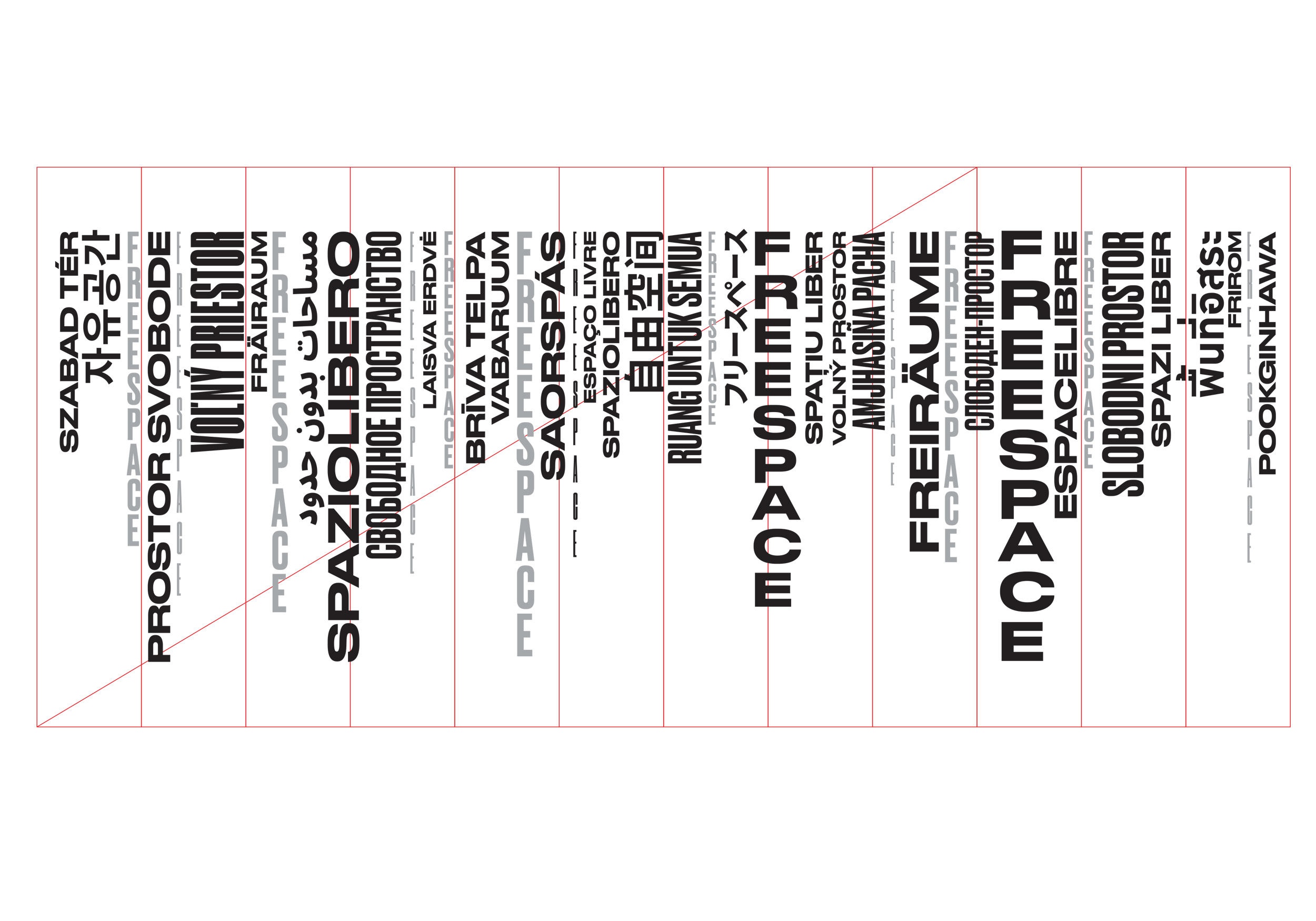
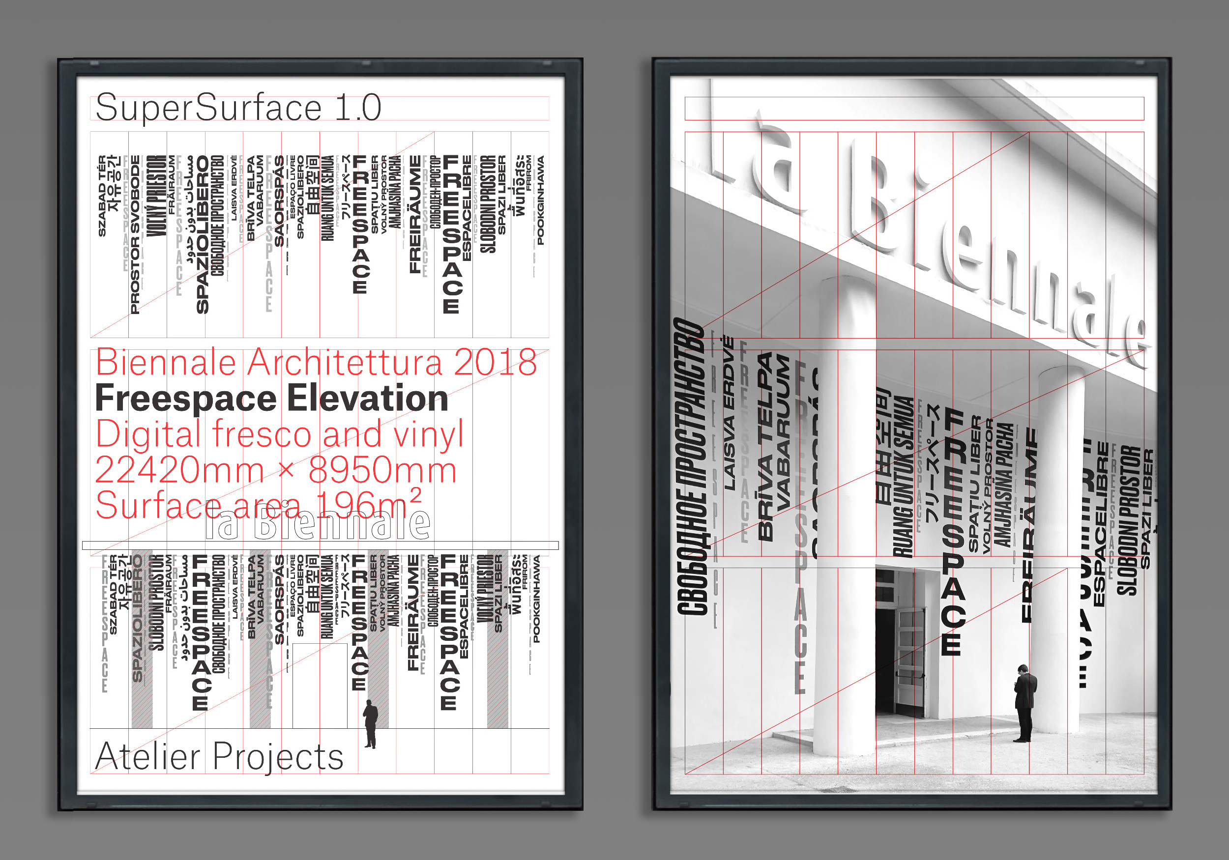
The FREESPACE identity offers a suite of modular ’typographic stacks’ (that visually reference the environmental staining and textural contrast on the columns of the Corderie and buildings across Venice), to be used in conjunction with the FREESPACE grid (based on the format of classical Venetian opera). These elements provided the visual toolkit for the design team working on Biennale.
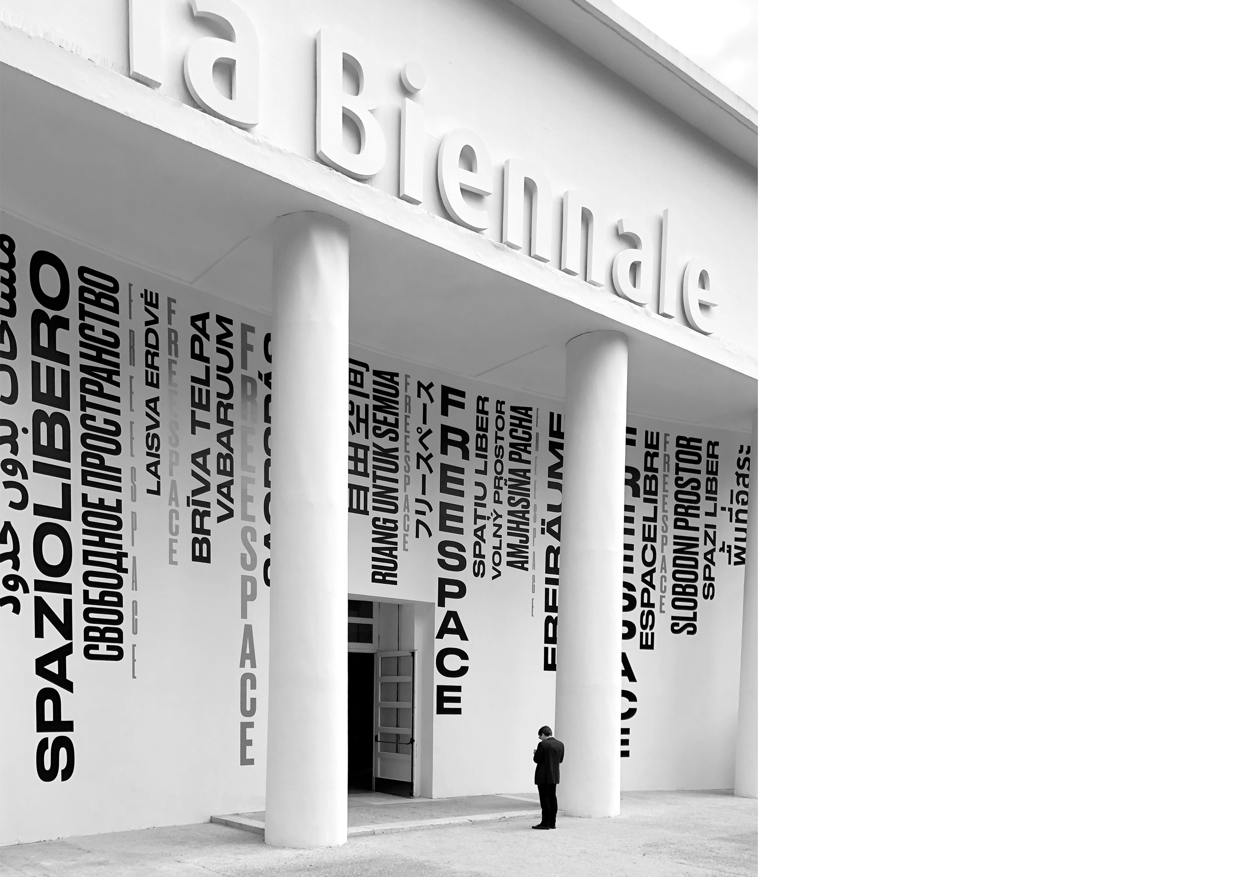
The Giardini venue (which hosted the main international pavilions) presented us with significant ’blank canvas’ to interpret the typographic identity at scale for the main Exhibition spaces.
The environmental graphics extend and interpret the typographic stacks evident on all print collateral. As noted the supergraphic takes its cues from the contrast between the black environmental stains and sun bleaching evident on all historic buildings across Venice. The facade is essentially mirroring the Venetian landscape, the typographic marks cascading down the facade to create a multi-lingual curtain – inviting and welcoming visitors in their native language.
Beyond the Giardini facade, typography at scale was used within the main exhibition hall of the Arsenal – this long internal boulevard was stripped back to its bare walls to reveal the original structure of the building. A consequence of doing so (and to ensure the fabric of the historic building was protected) was that there were no floating or partition walls to apply ’graphics or information’ all information had to be freestanding or projected. Working closely with the Grafton Architects team the typographic animations were successfully applied and projected overhead on the ceiling beams of the 300 metre Corderie.


_BW_2500.jpg)
