Faction Barbershop
2012
Designed by Eric Lynch at Eric Lynch Design
Decals / Signage: Extrabrite Signs
Interior Design: Rob Flynn
Interior Design: Aaron Kiely
Interior Design / Photography / Retouching: Eric Lynch
Additional Photography: James Fagan
Embroidered Barber Capes / Apparel: Cape Kings
Categories: Identity / Print / CD / Vinyl / Cassette / Signage / Environmental
Industry: Commercial / Cultural
Tags: Typography / Retail
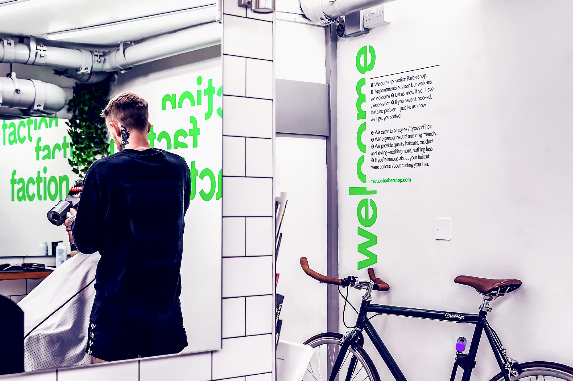
Faction Barbershop provides a premium offering and engages a diverse audience with contemporary haircuts and styling. As a new model for Dublin barbering, Faction offers a unique and inclusive environment, where the combination of collaborative creativity and barbering affords clients complete control over their experience.
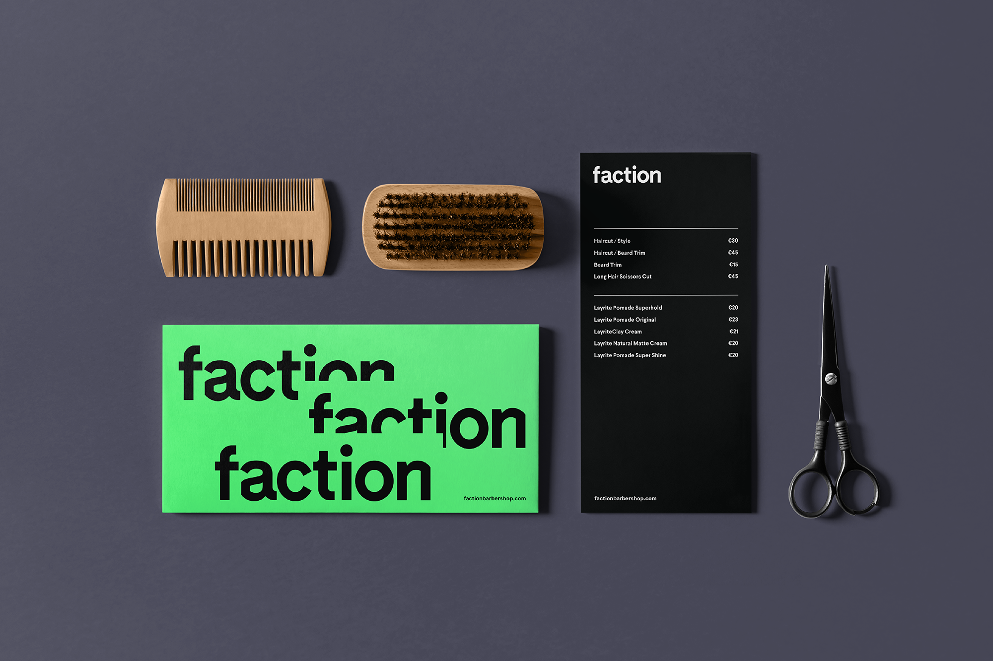
The outlined design brief was to give Faction complete visual distinction within the national barbering marketplace while communicating their core values and methodologies. This was achieved by working with the founders to build the brand ethos of ‘Clean but Cut’, which reflects the barber’s surgical attention to detail and experimental approach to cutting hair.
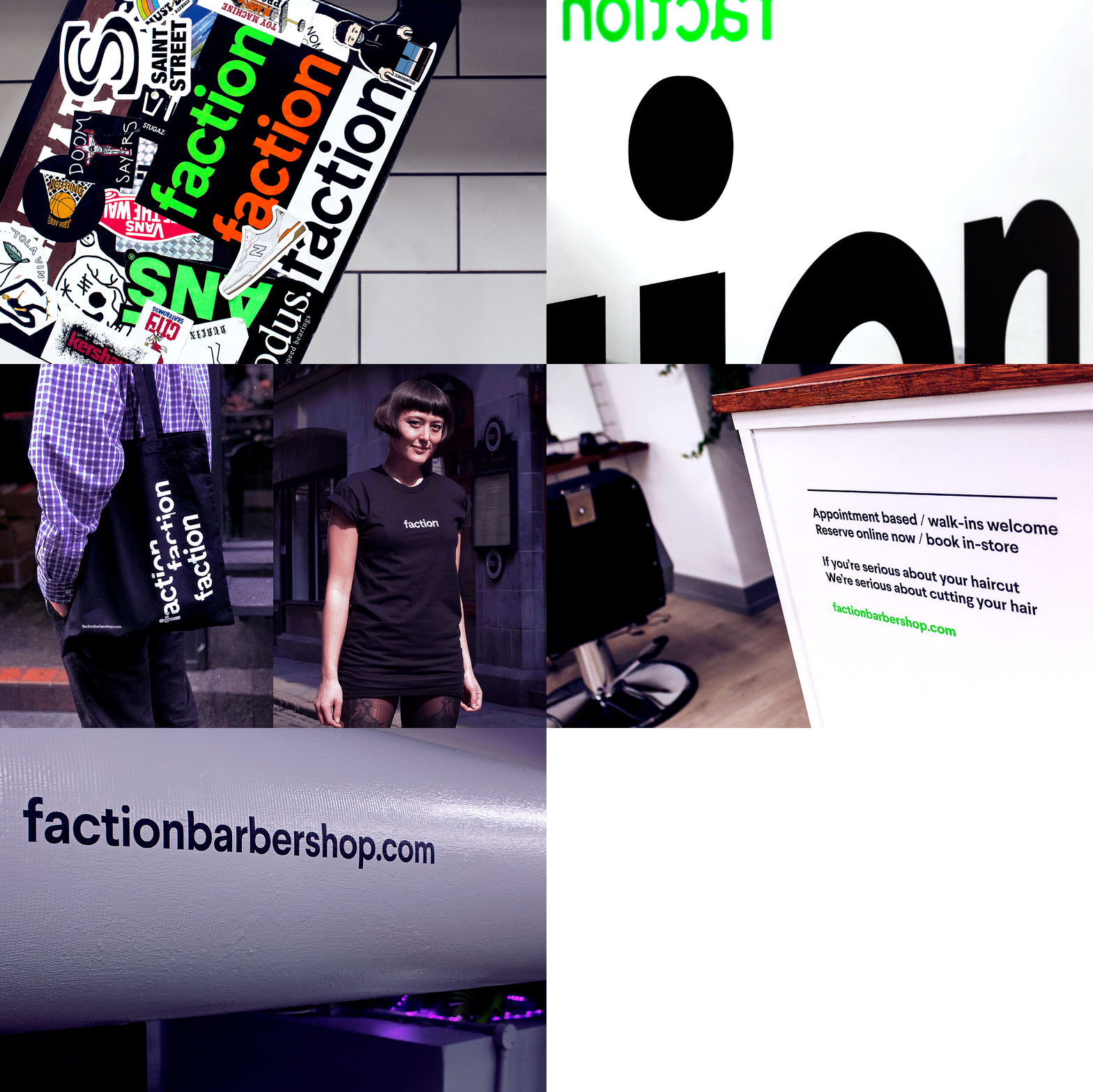
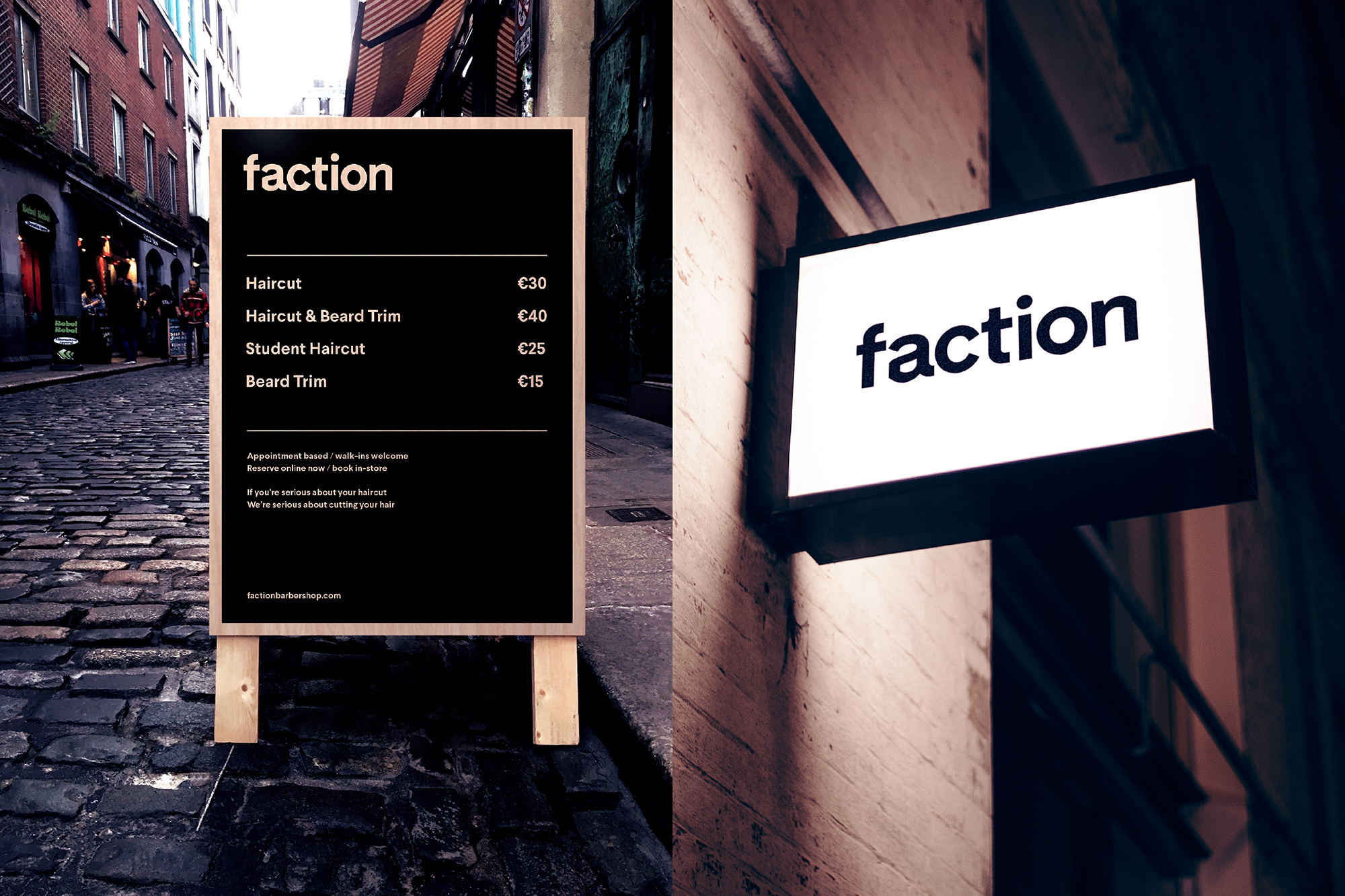
The brand ethos informed the look-and-feel at all touchpoints, represented by truncated typographic form. The visual language was extended into the shop’s physical space by using the edges of material objects to cut the letterforms.


