Face Forward International Typography Conference 2015; Identity + Book of Abstracts
Designed by Brenda Dermody and Clare Bell at Technological University Dublin
Categories: Identity
Industry: Cultural
Website: faceforward.typography.ie/
Face Forward was conceived as an international, peer-reviewed conference focused on typography that provided a forum for critical research into typography. Currently, established platforms for critical discussion in the field, although highly valued, are few and far between. As a consequence, concrete theoretical or methodological positions around which the discipline could cohere have yet to emerge—a situation this conference sought to address.
One the central aims of this inaugural conference was to make explicit the existing connections between craft, research, theory, history, criticism and pedagogy. Included in the programme were submissions that considered typography in as broad a sense as possible and those which sought to expand definitions of both typographic object and practice.
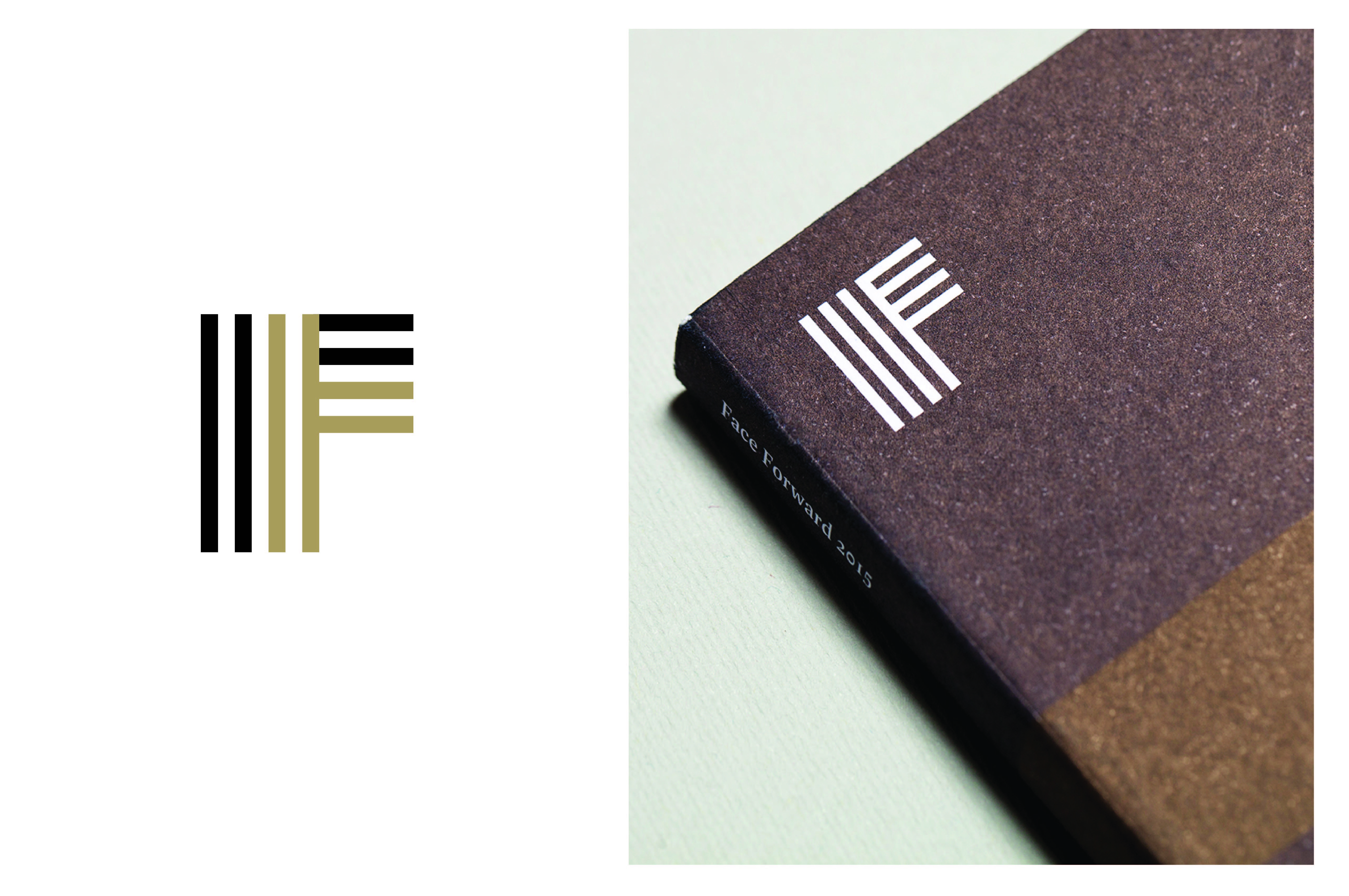
The reference points for the visual identity are rooted in Ireland’s visual and typographic heritage, obliquely drawing upon pre-Celtic and contemporary Irish motifs. In this way it was hoped to make direct reference to Ireland’s early typographic and visual history without ascription to the customary elements, or typographic tropes, associated with it, and to internationalise its relevance. It was intended that the new and fresh perspectives on the histories and discourses of typography achieved by the conference would be reflected in the mark itself.
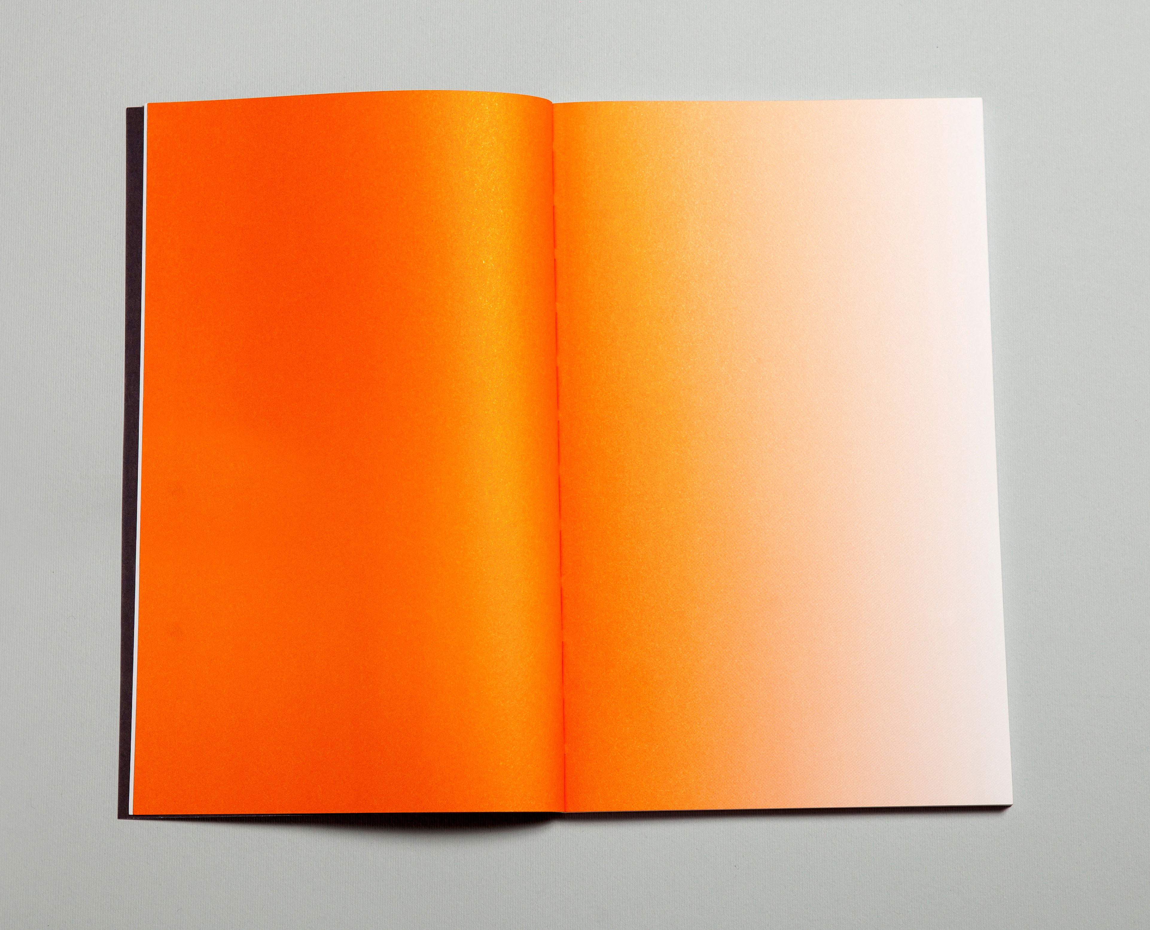
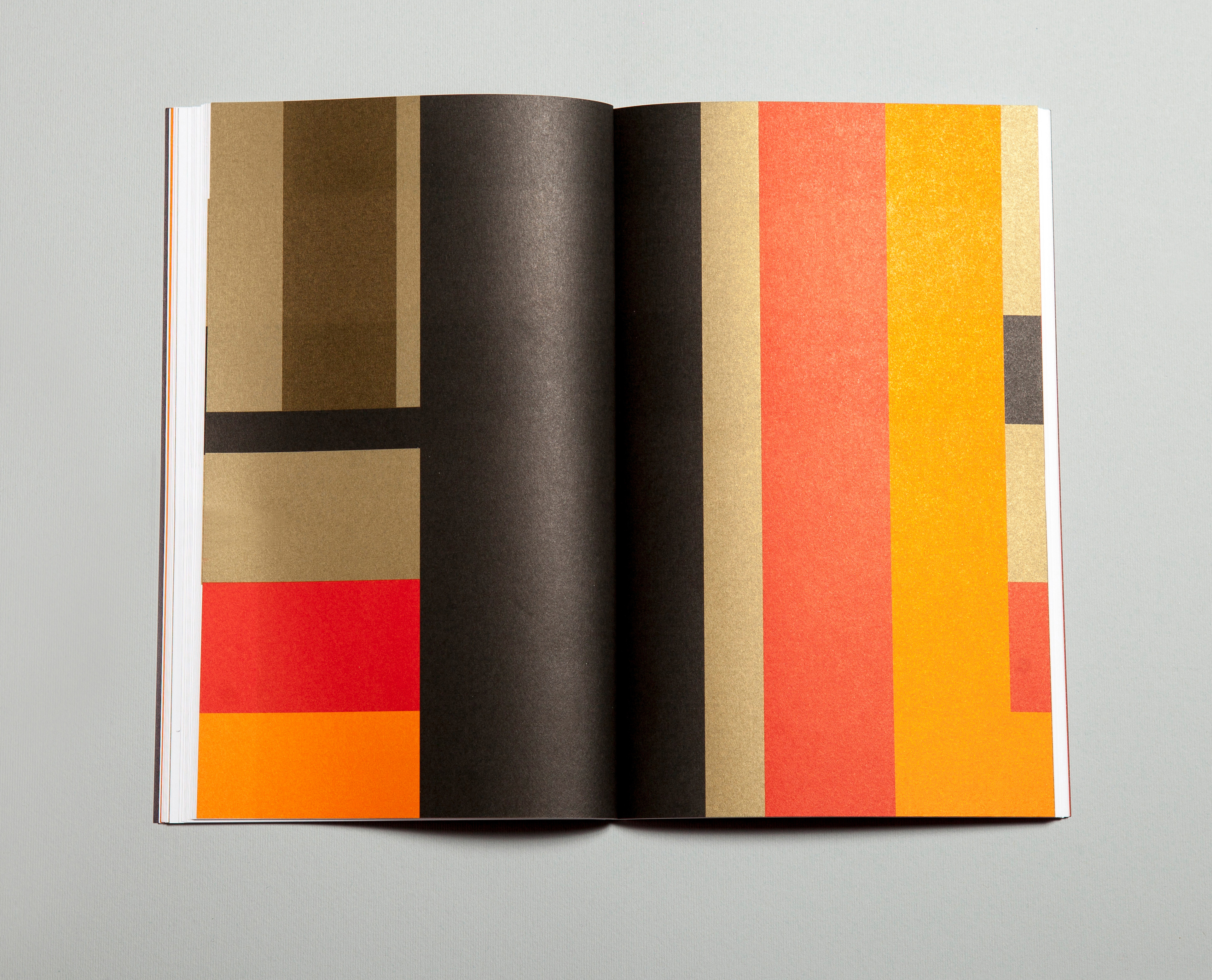
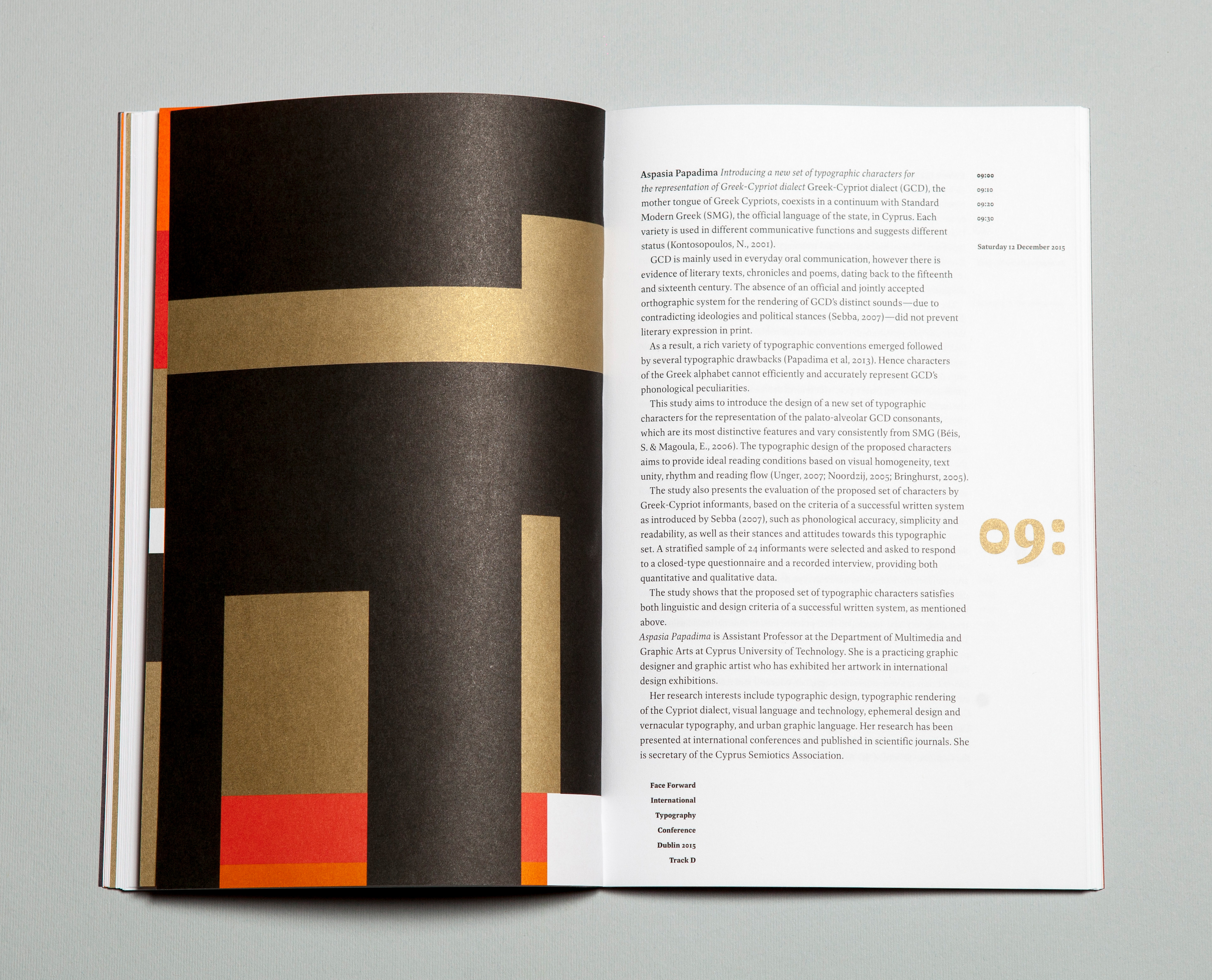
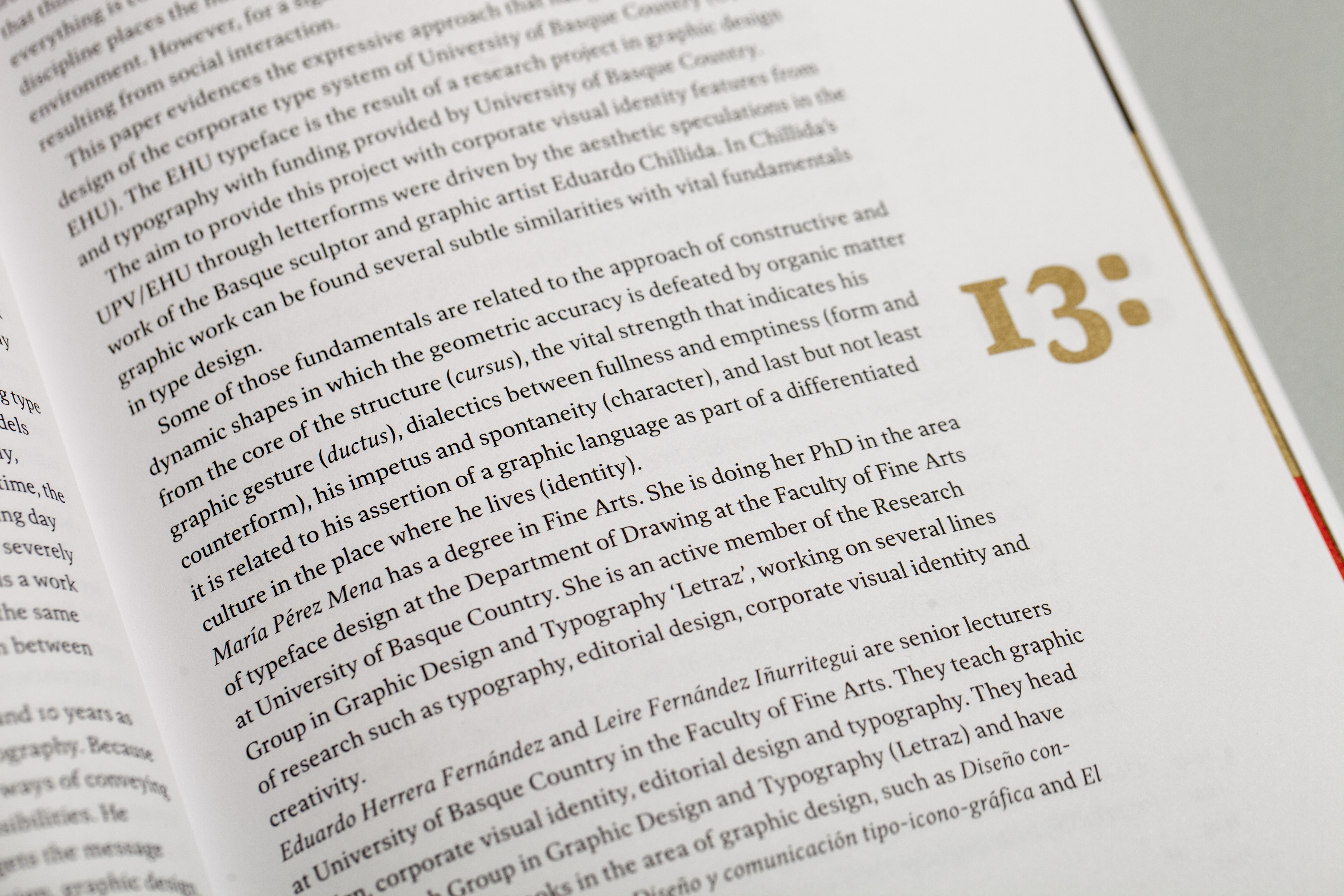
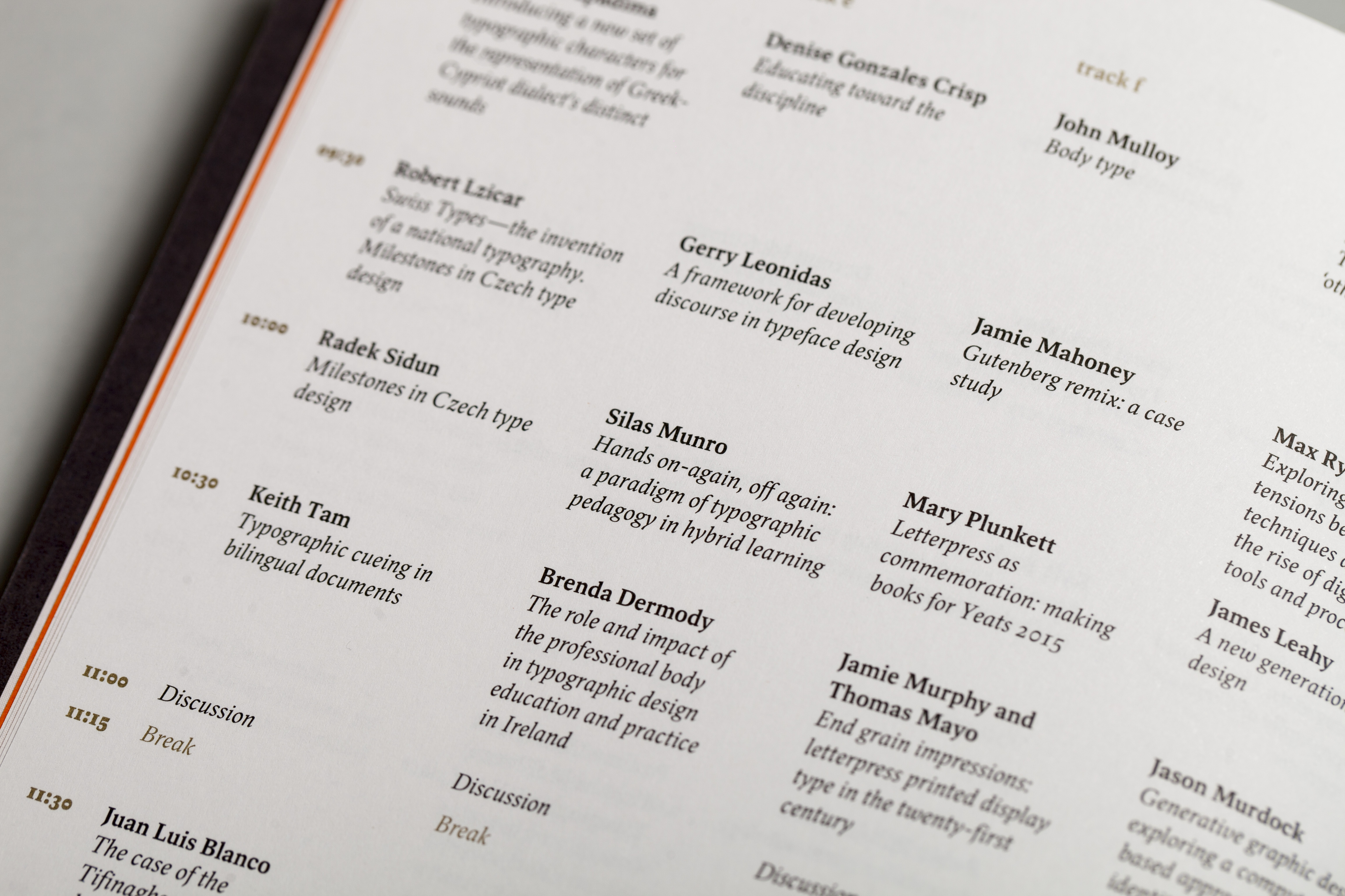
For the Book of Abstracts the themes approached in the conference identity were developed and expanded upon, moving from the structured typographic elements of the mark to the unstructured use of colour alone across numerous pages as a reflection of the dissolution and shifting of perspectives we hoped to achieve during and post the event.
We would like to thank ID2015: the Year of Irish Design, the Graduate School of Creative Arts and Media (GradCAM) and the Dublin School of Creative Arts at DIT for their support of this year’s conference.
Visual identity: Clare Bell, Brenda Dermody
Book of abstracts, design: Clare Bell, Brenda Dermody
Colophon: The text is set in Spinoza, designed by Max Phillips of Signal Type. The paper specified is Munken Lynx at 120gsm and 300gsm. The book was printed and bound by Nicholson Bass, Belfast.
