Devils Bit Mountain Cider
2010
Designed by David Walsh at Greenhouse
Creative Director: Richie Ryan
Categories: Packaging
Industry: Commercial
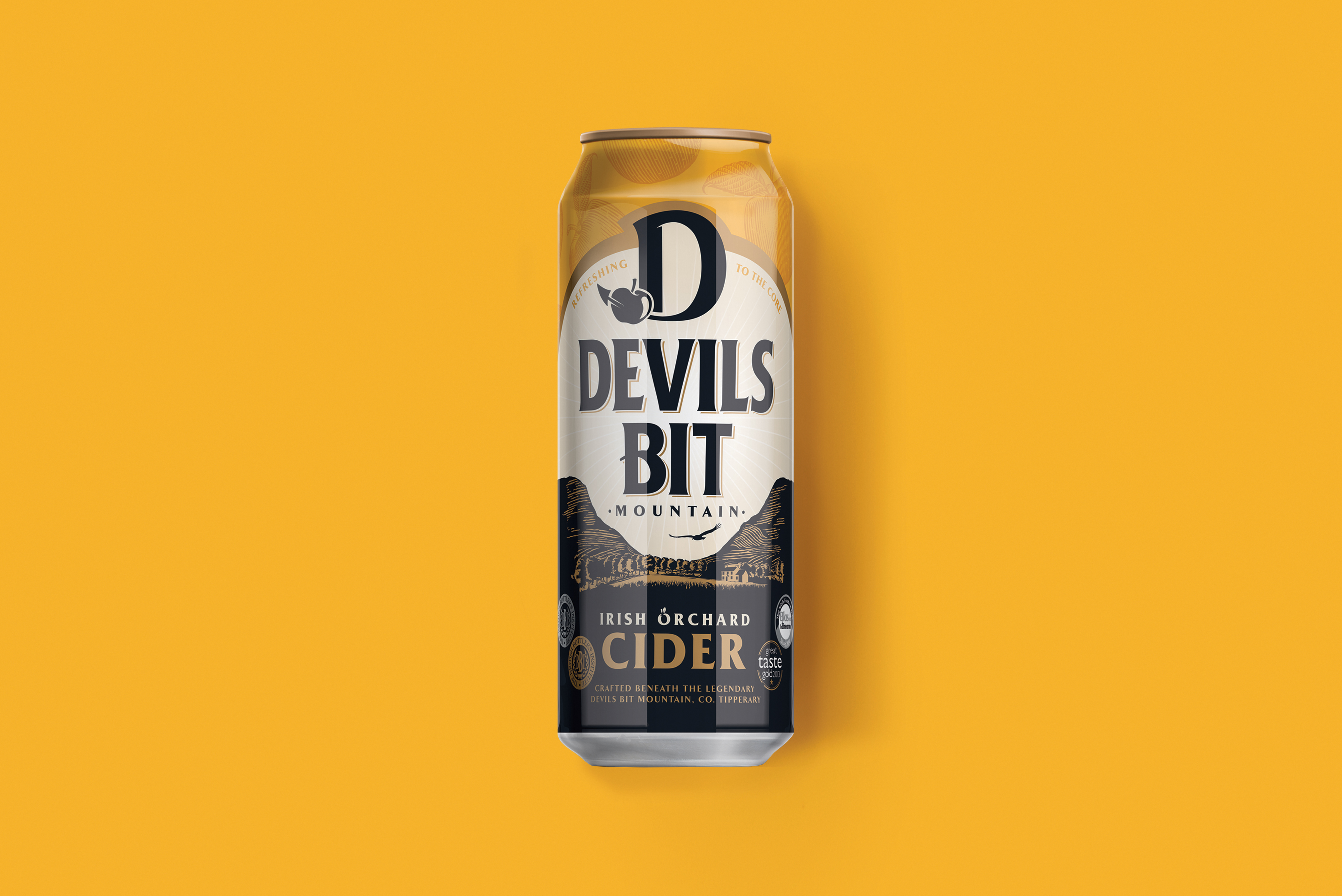
Devils Bit is a brand that had a tarnished image. When they came to us requesting a rebrand, the biggest task was to remove the link of Devils Bit being associated with strength of alcohol. When looking into the brand we found that it indeed had strong origins in craft and quality as well as roots in Irish history folklore. Taking these along with the the fact that their orchard is located beneath the legendary Devils Bit Mountain in Co. Tipperary - from which it got its name - a new brand story took shape.
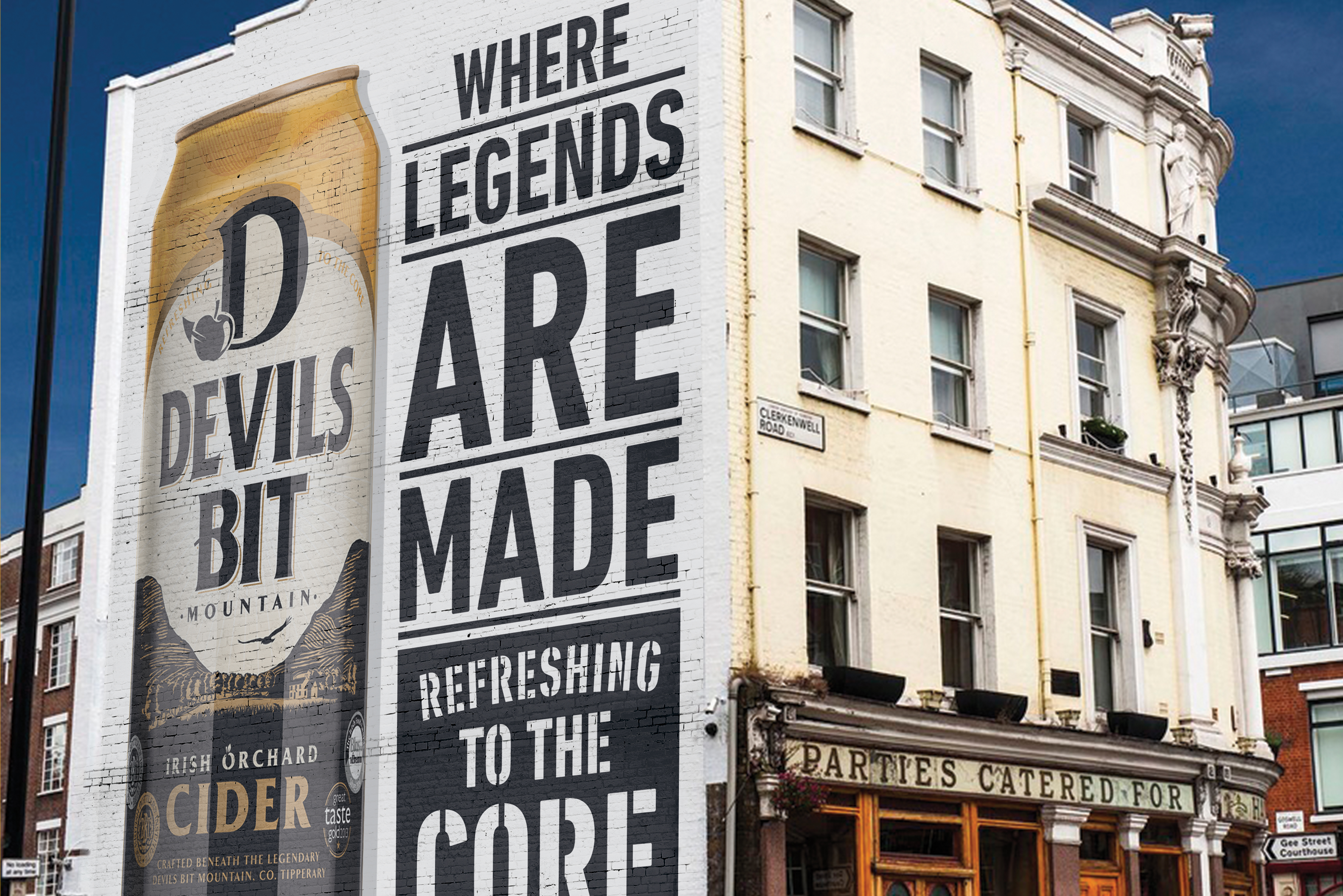
Having a sizeable market share as well as being in a competitive space, we wanted the design and brand to tell this new story, move Devils Bit Cider forward and develop on its current position.
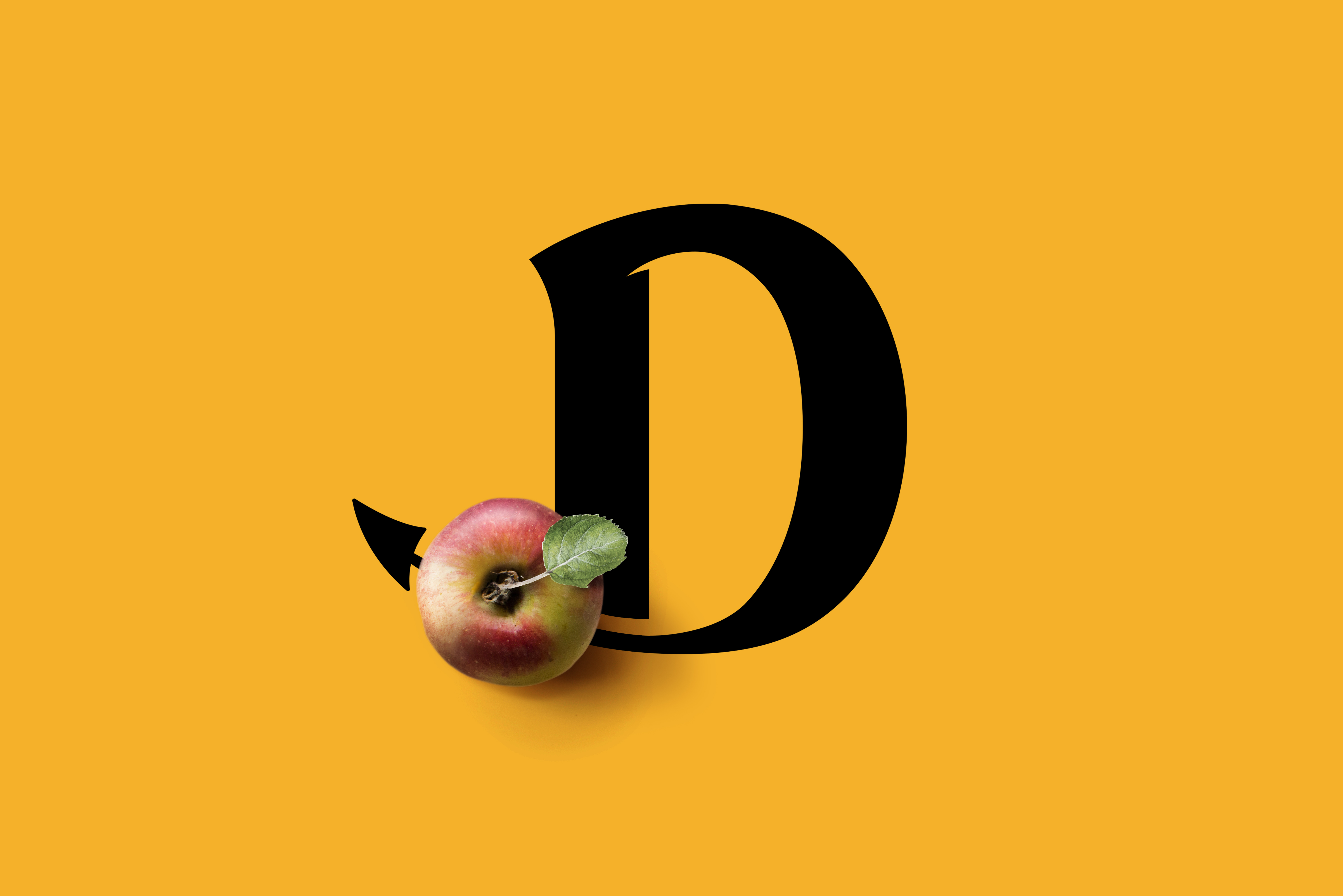
Beneath a powerful brand mark and memorable motif, we created a design portraying this newly realised Devils Bit story. Moving the brand form its current stigma to something that is much more credible, rooted in craft and having a sense of place, allowing Devils Bit Mountain Cider to get the credit it deserves.


