Corso Italia 23
Designed by Sinéad Foley at Something More Near
Design Director: Walter Hutton
Graphic Designer: Alasdair Hiscock
Content Manager: Cosimo Bizzarri
Project Manager: Becky Lyon
Photographer: Marina Rosso
Illustrator: Elena Xausa
Categories: Environmental / Exhibition / Identity
Tags: Architecture / Illustration
Allianz’s former HQ in the centre of Milan is being reinvented by architects Skidmore, Owings and Merrill (SOM) as a cutting edge campus workspace. Designed by Italian design hero Gio Ponti in the 1950's, Corso Italia 23 is only a ten minute walk away from the Duomo in a part of Milan that is about to see a huge amount of change. The welcome redevelopment of this site and others in the area, plus a new metro station ready for 2022, means this rather staid and quiet part of Milan will become much more familiar to both the Milanese and visitors to the city over the coming years.
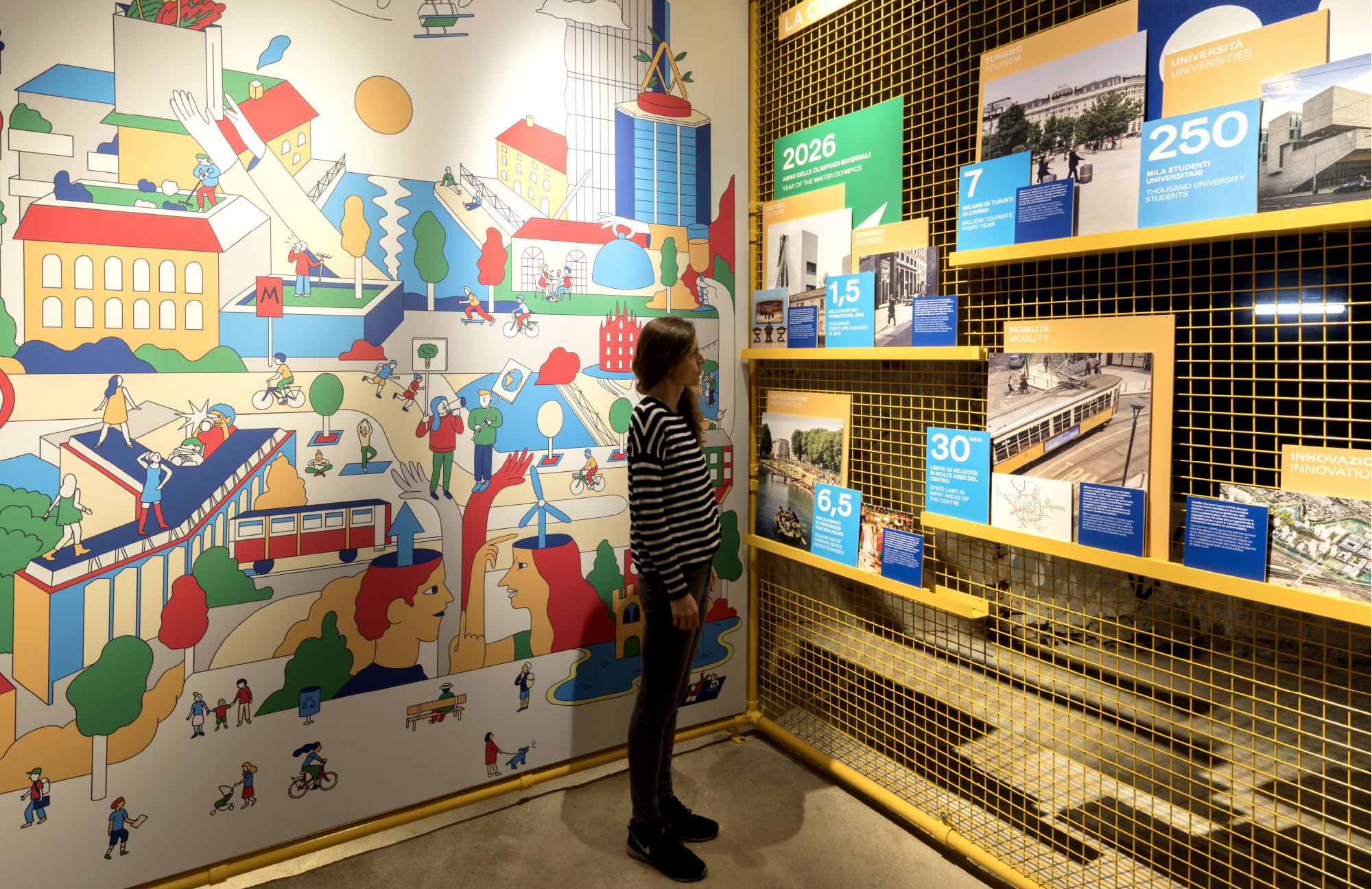
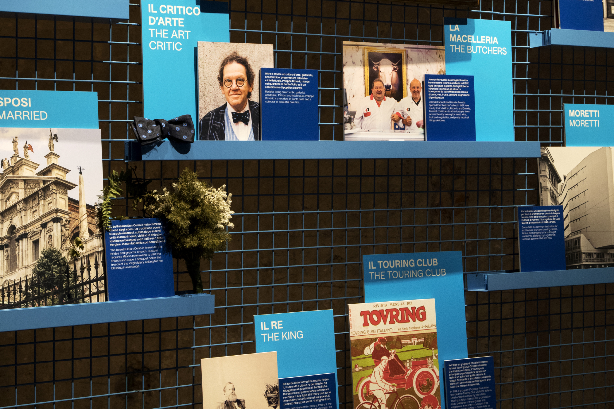
Something More Near were asked to engage with the neighbourhood, discover the hopes and fears for the area and ensure the re-introduction of the space was done in a sustainable, imaginative, sensitive and positive manner.
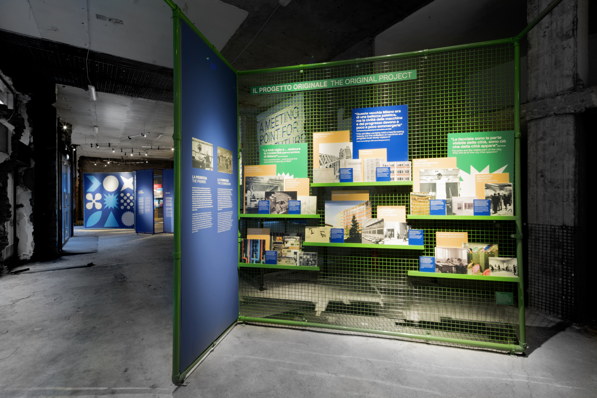
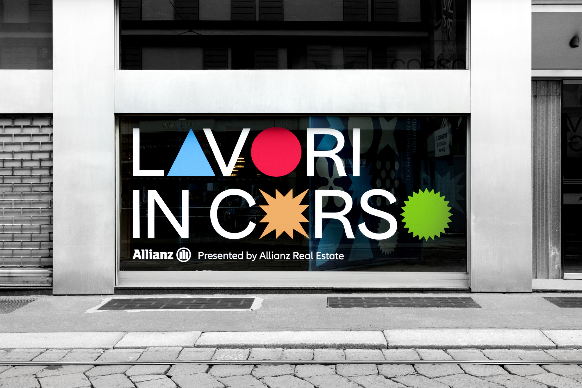
'Lavori in Corso', meaning 'work in progress' inspired the exhibition to adapt materials used during the developmental phase of an architectural project. Given the nature of the unfurnished surroundings the use of colourful graphics inspired by Gio Ponti's tile collection brings the exhibition content to life.
