Cork Midsummer Festival (2013)
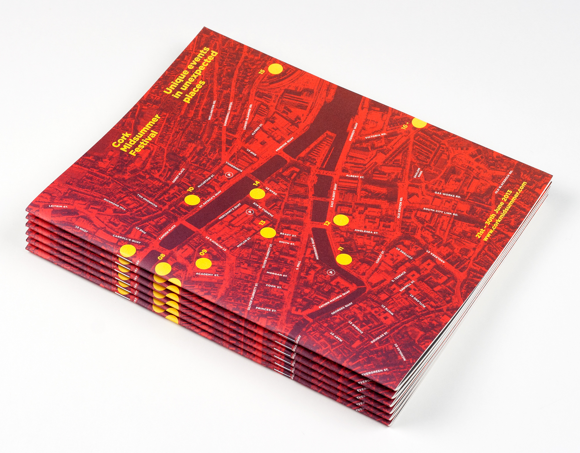
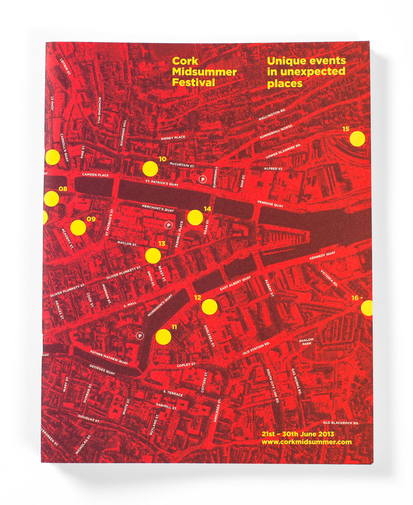
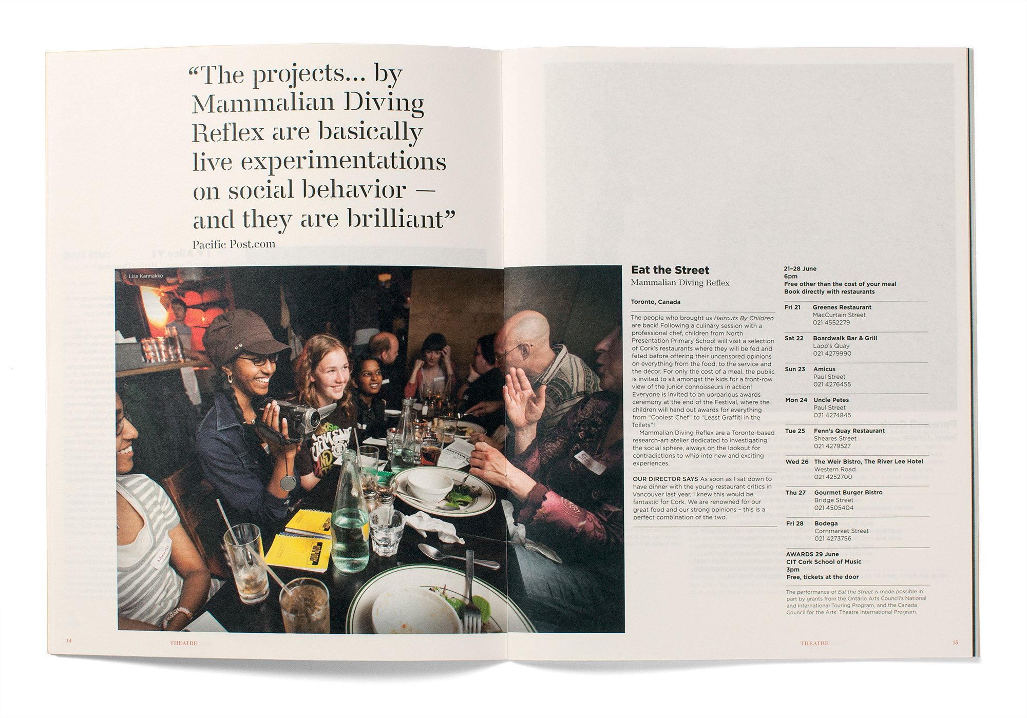
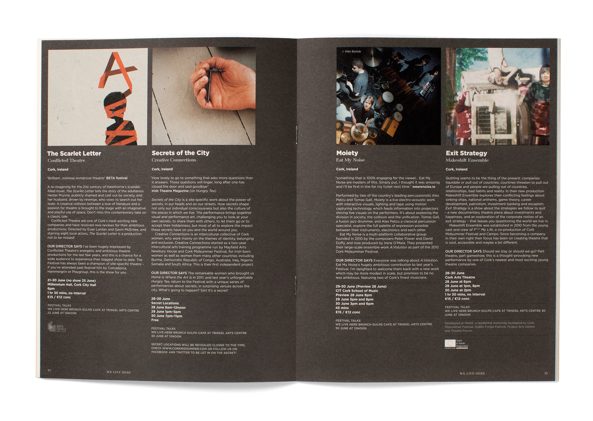
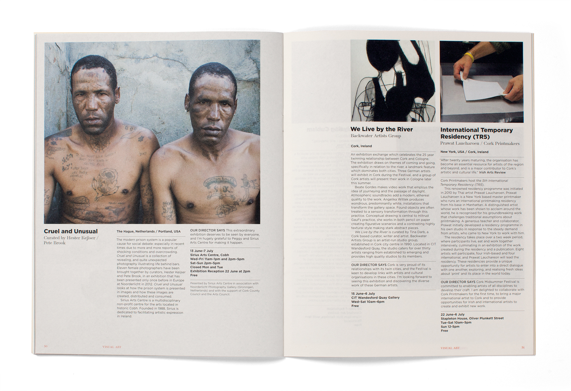
For the cork midsummer 2013 programme we put the focus on the city. Using an aerial photograph of Cork as the cover image communicated the idea of the city as a canvas while also working as the festival map. Being presented with a smaller print budget than the previous year forced us to rethink the production, leading to a larger programme on better paper that had less pages and was saddle stitched. This allowed us to create more impact with the object and also the layout.
