Chipmongers - Website
2014
Designed by Kathryn Wilson at Slater Design
Developer : Thought Collective
Categories: Website
Industry: Commercial
Tags: Food and drink
Mentioned in:
Website: chipmongers.com
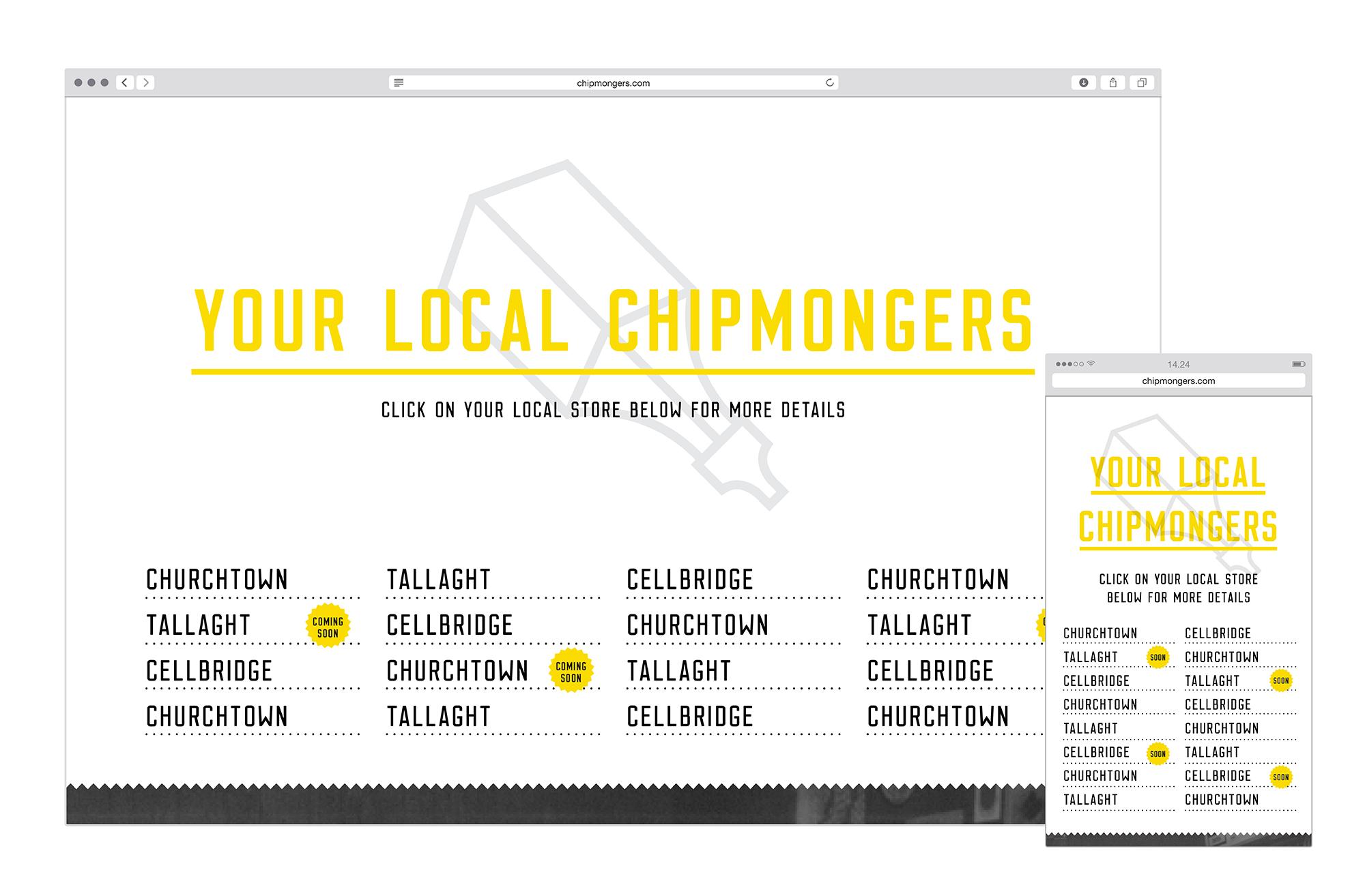
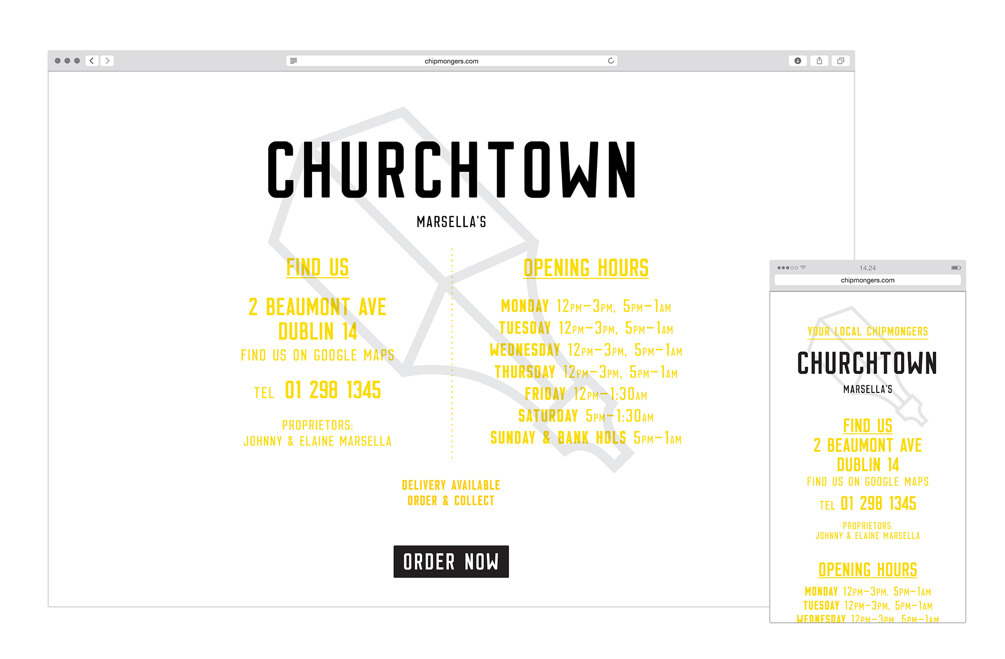
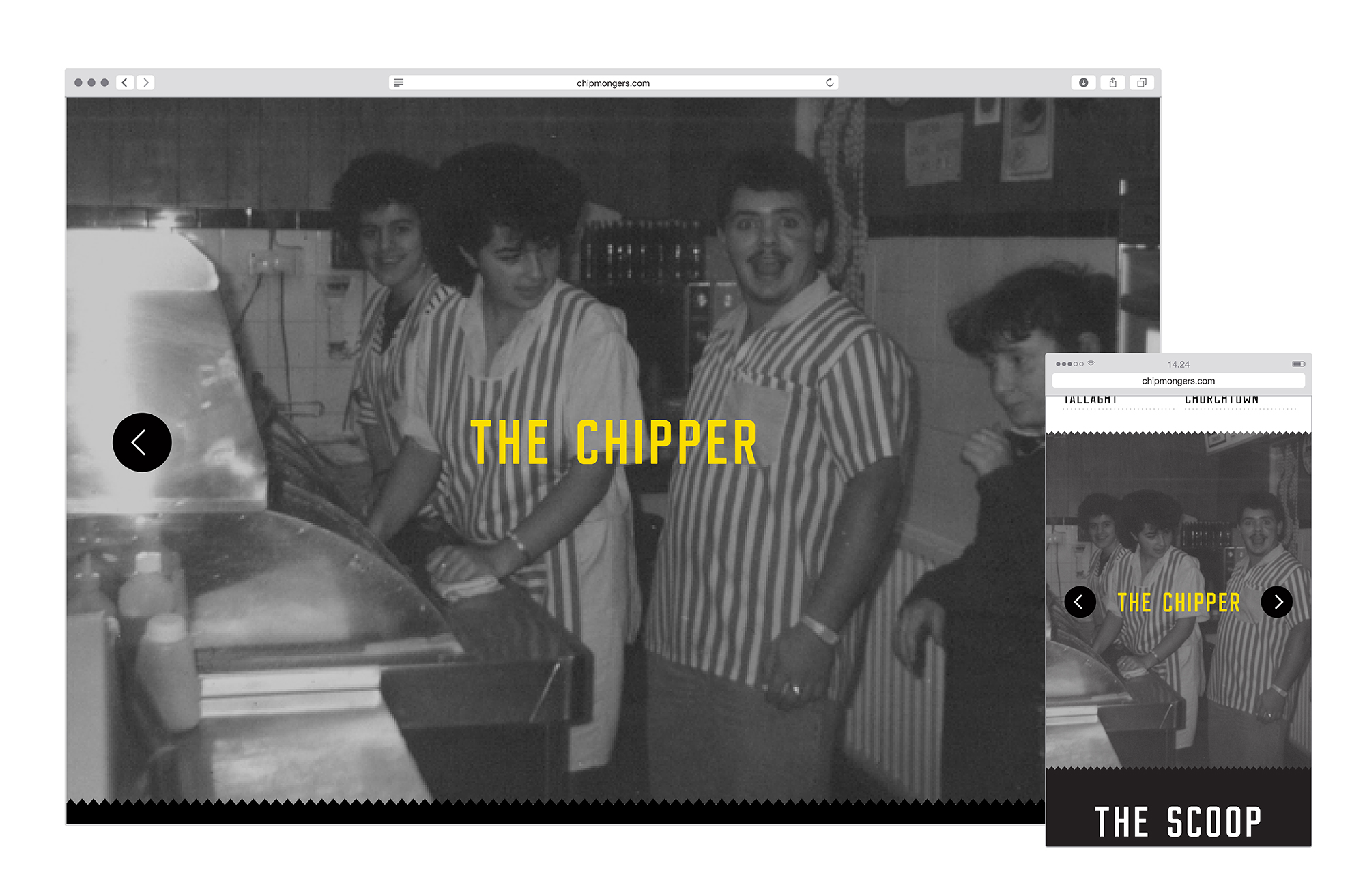
The Chipmongers website needed to fulfil two key functions - to tell the Chipmongers brand story and to allow the user to easily access online ordering or store details.
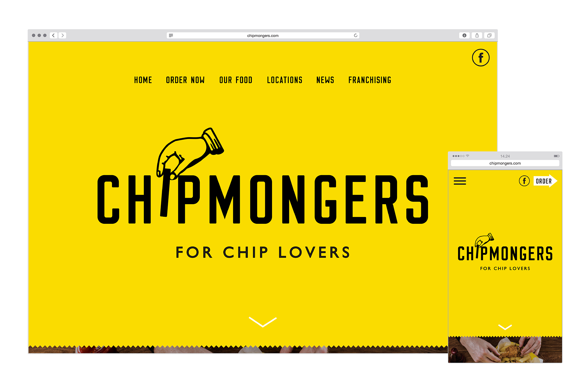
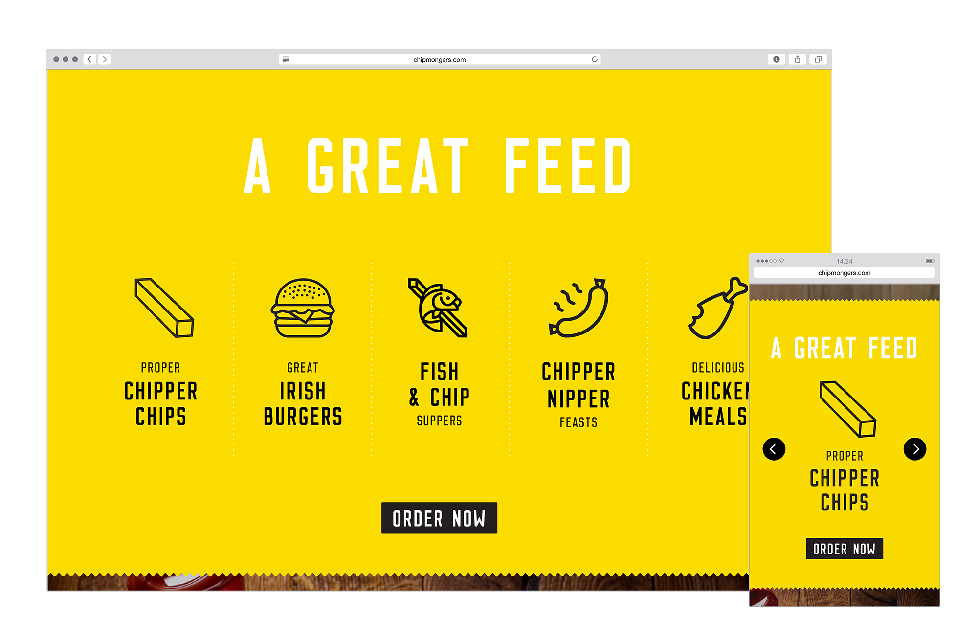
We tell the story of the brand through a long homepage employing parallax scrolling. The serrated edges (reflecting those on a bag of chips) divides up the page and allows us to tell the brand story by breaking it up to make it a little easier to digest. This also allows us to section off different pieces of information and for the user to easily navigate to the information you need through the top level menu.
We were able to use the functionality of the web to bring aspects of the brand to life. On designing the logo I had imagined the hand reaching down to lift a chip out of the name, we were able to animate this and have used this animated logo to greet you as you land on the site. The website also allowed us the opportunity to add a gallery of images of chippers old and new, cementing just what this brand is about and creating an archive of images that can be added to over time.
On the mobile version of the site we moved the 'order' button out of the menu, making it easier for repeat visitors to easily access this functionality. The online ordering system had already been developed by the time we were invited to work on the project and therefore the ordering functionality plugs into the site we have developed.
