Centus
2013
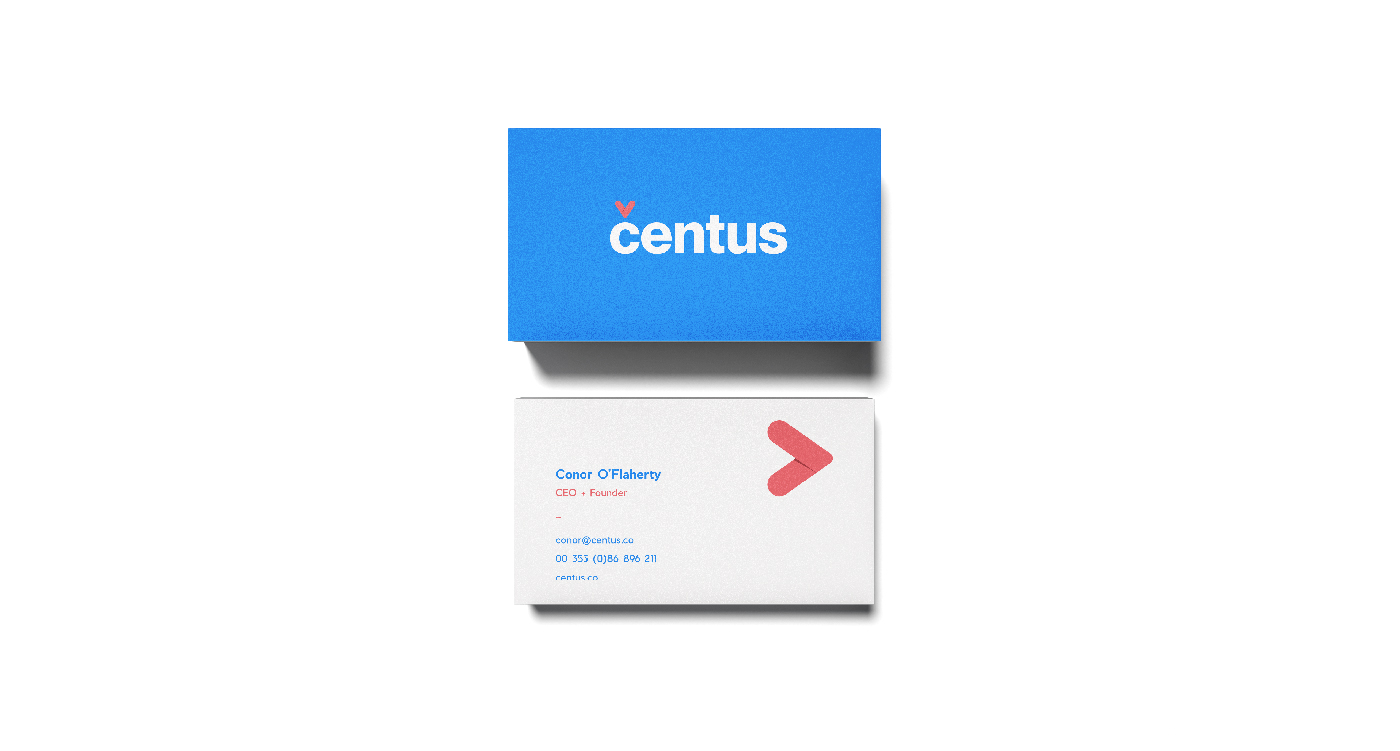
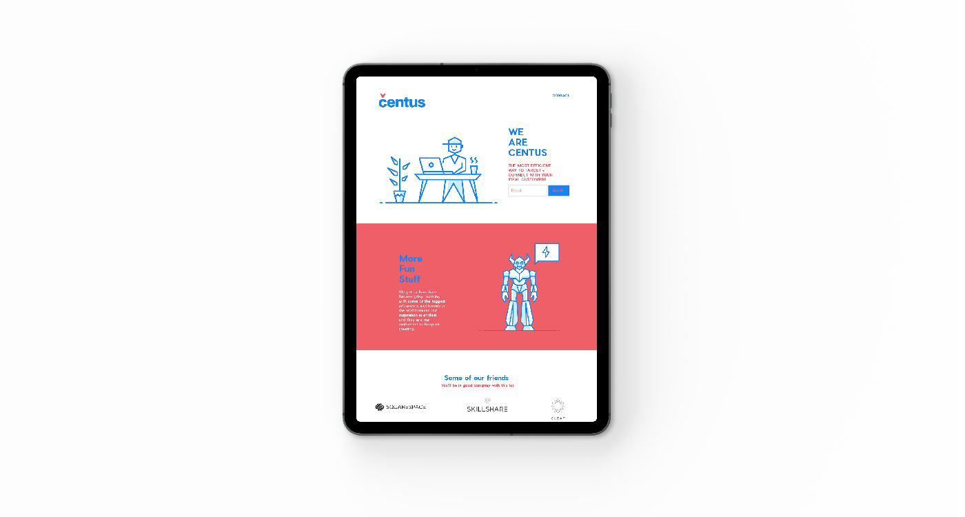
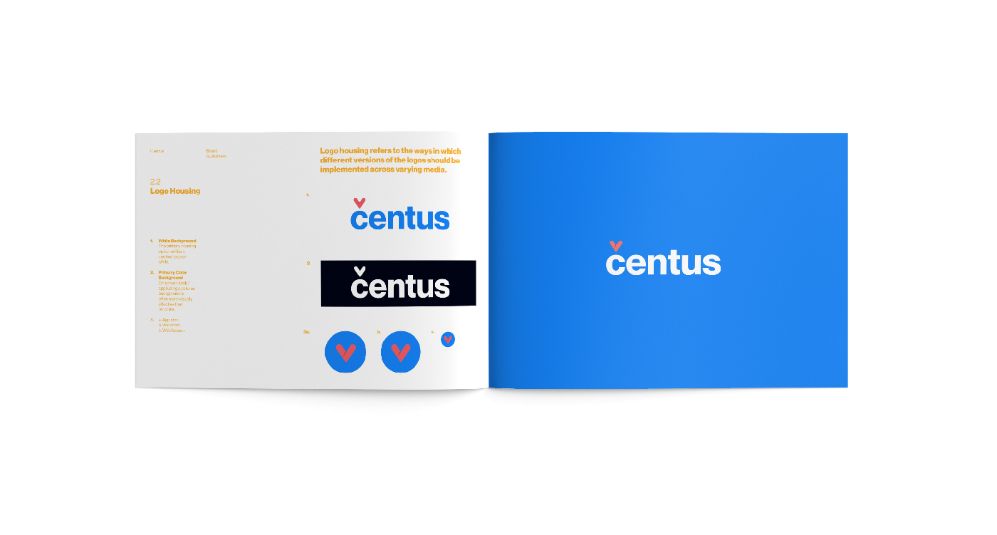
Centus are a young company representing brand influencers and working with a number of high profile clients such as Sqarespace, Skillshare and Quip. From the outset, the goal was to create something that looked quite timeless and would sit in the folio of businesses in their roster in order to present Centus as a kindred spirit. For the type, we used a small type foundry called Pangram and their geometric font Pier which is a modern and structured and recognisable. To this, we wanted to add a symbol, something that embodied the ambition of the brand and could be used in different ways throughout the brand materials. This led Caron heart over the c which is known as a check or a haček – When placed over vowels symbols, the caron can indicate a contour tone. It has been moulded to encompass elements of peace sign/heart/forward arrow which we felt are all really part of the ambition of the brand. The mix of the formal type and the playful the caron heart is something we can have fun with and bring into your presentations, pitches and animation.
