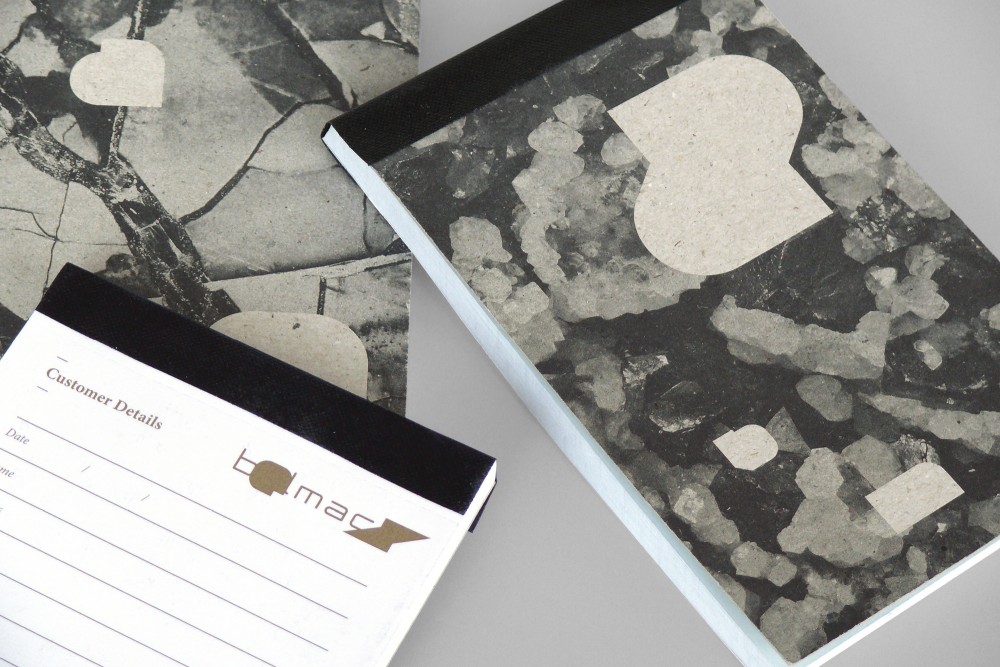
Belmacz identity (2011)
Designed by Craig Sinnamon at Mind Design
Creative Director: Holger Jacobs
Categories: Identity
Industry: Cultural
Website: belmacz.com
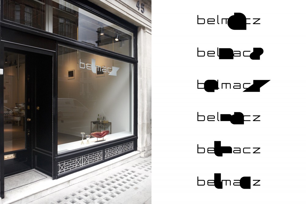
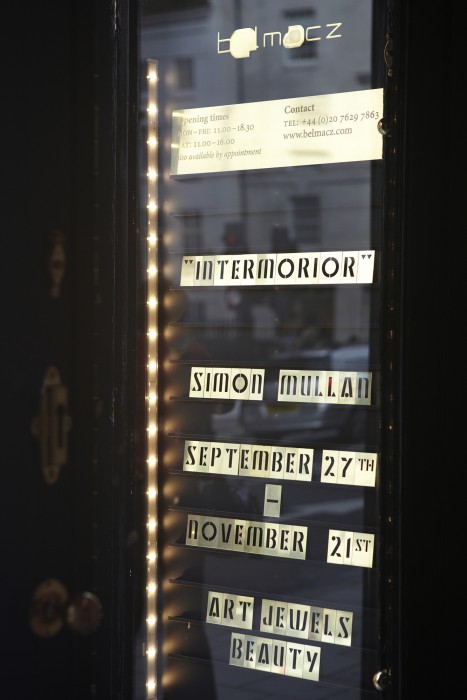
Redesign of the Belmacz identity to coincide with the opening of their gallery and shop in Mayfair, London.
The identity is based on the ideas of dislocation and refinement, relating to the excavation, journey and crafting of the jewellery pieces. The logo was redrawn and each of the letters was expanded to find their 'raw' form.
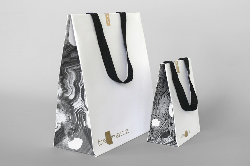
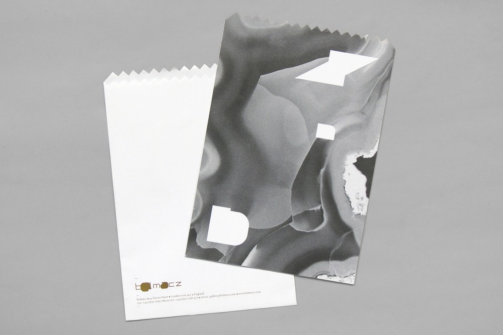
The materials used to create the jewellery were researched and these textures appear across the printed items. To visualise the idea of dislocation, shapes were then cut out from these textures and appear elsewhere on other printed items. For instance a shape cut out from a paper bag could appear later on a letterhead.
