Bannon Jewellers
2012
Designed by Paul McBride, Naoise Ó Conchubhair, Keith Byrne and Ross Phelan at Detail. Design Studio
Industry: Commercial
Bannon is a third-generation jeweller with stores in Bray and Blackrock, Co. Dublin. The brand had evolved organically over the last 20 years and with the redesign of their flagship store, the time was right to review and contemporise the brand with a view to attracting younger consumers.
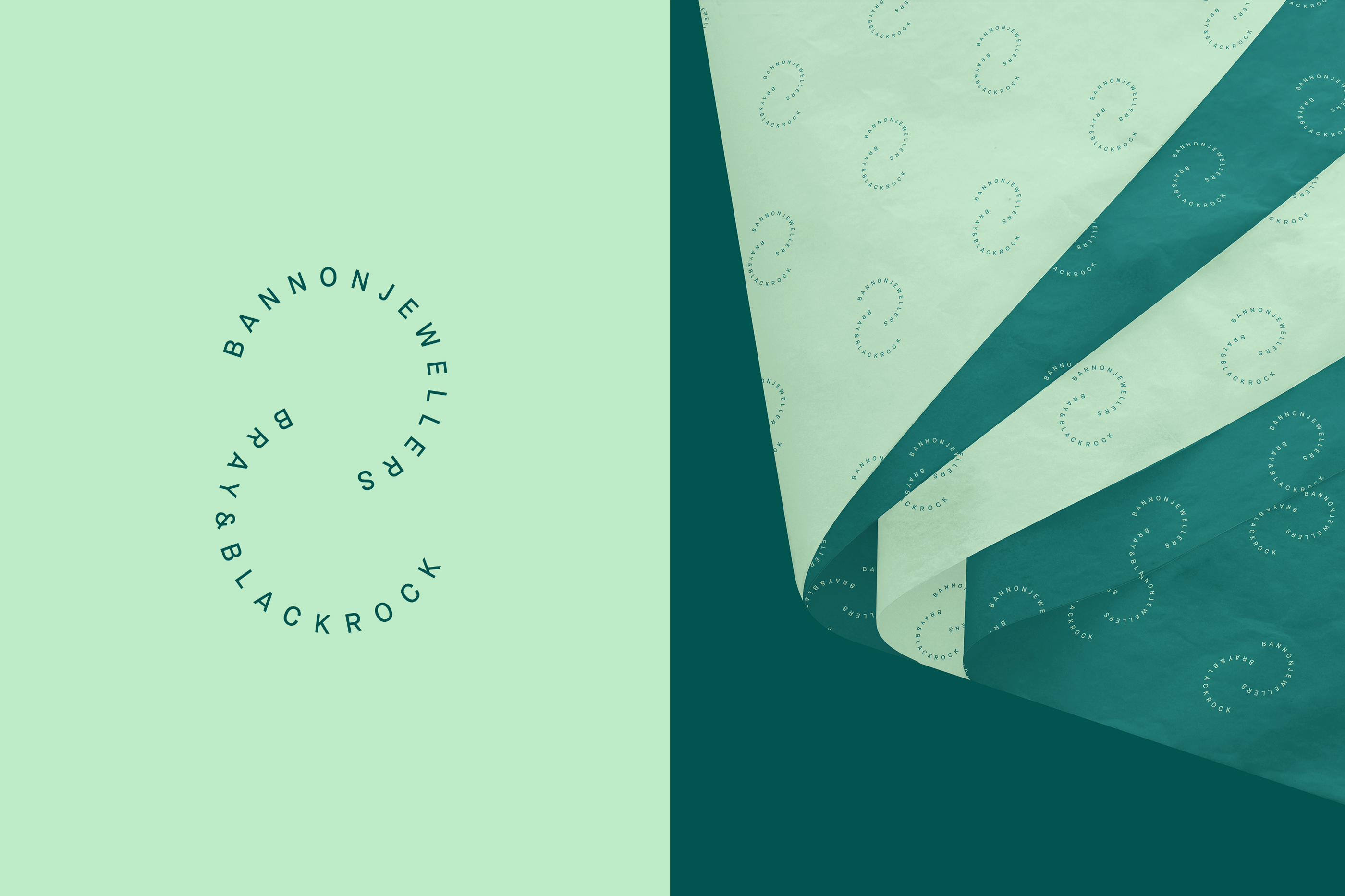
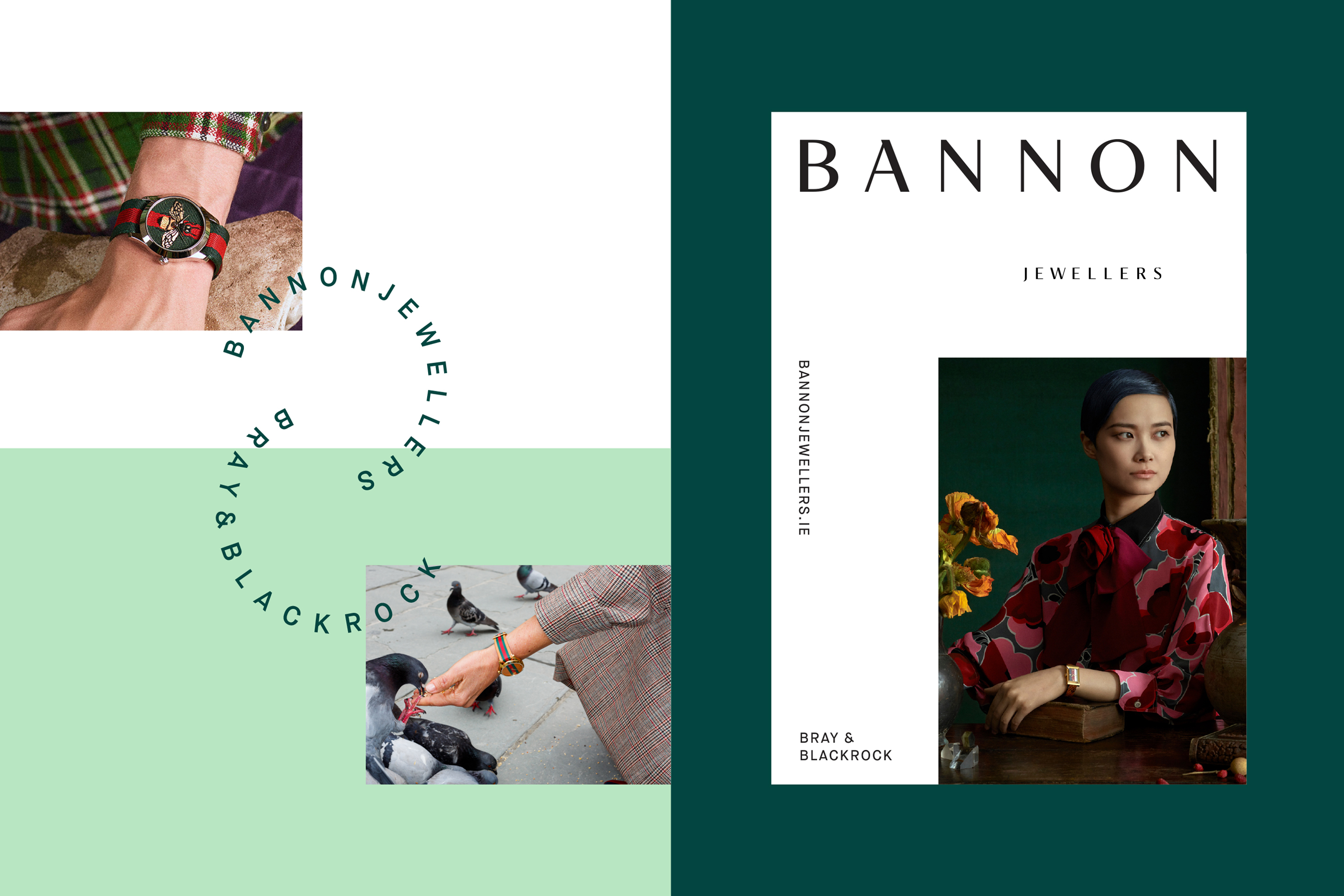
Our approach focused on a developing a custom logotype inspired by serif typography typically found in jewellery engraving — a reflection of the Bannon heritage, and in line with the vernacular of the high-end brands on sale. The wordmark is supported by a secondary type treatment that echoes a monogram B and suggestive of finely linked bracelet. These assets were key in adding personality and taking ownership of product & lifestyle imagery on both screen animations and print applications.
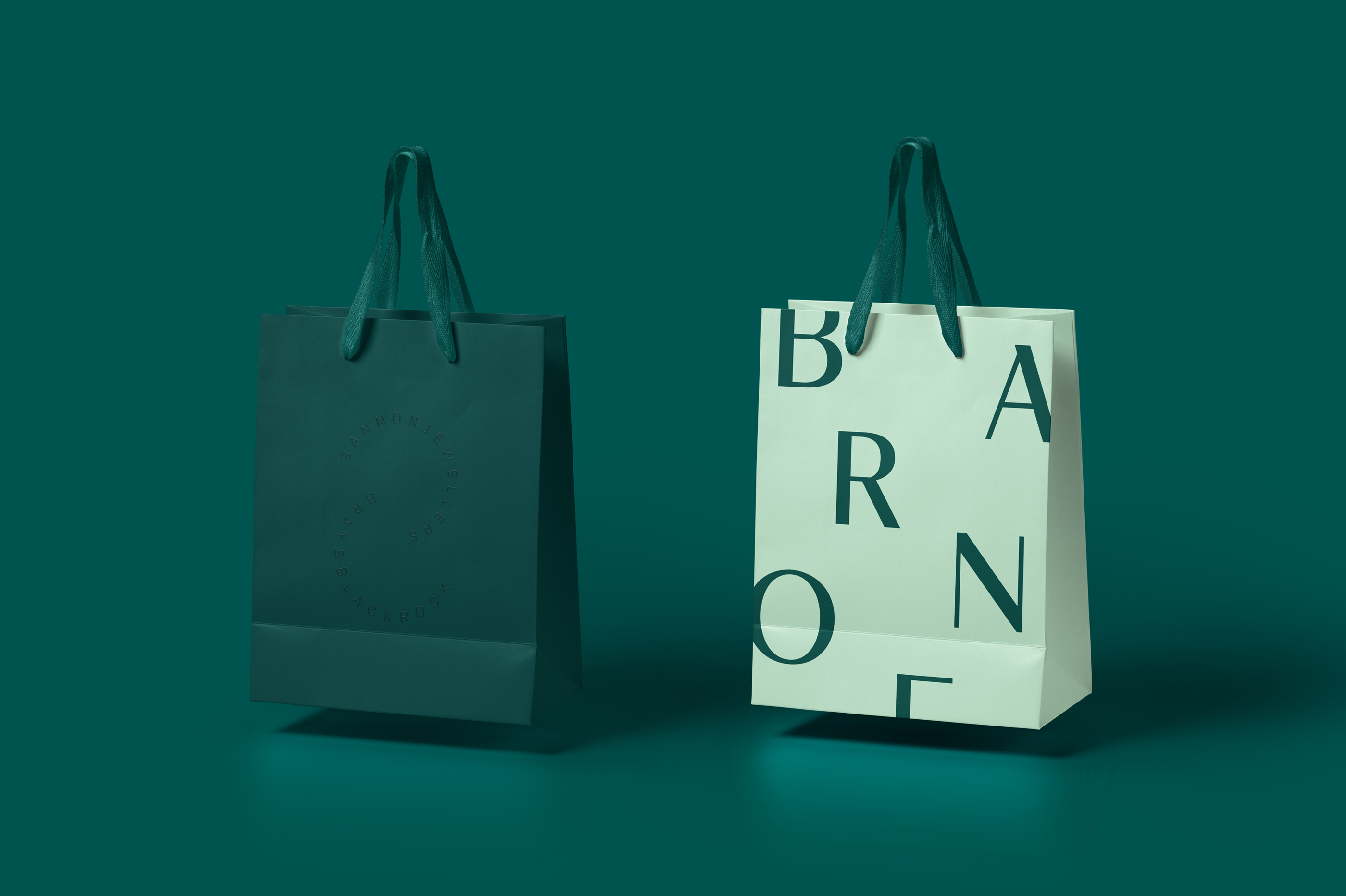
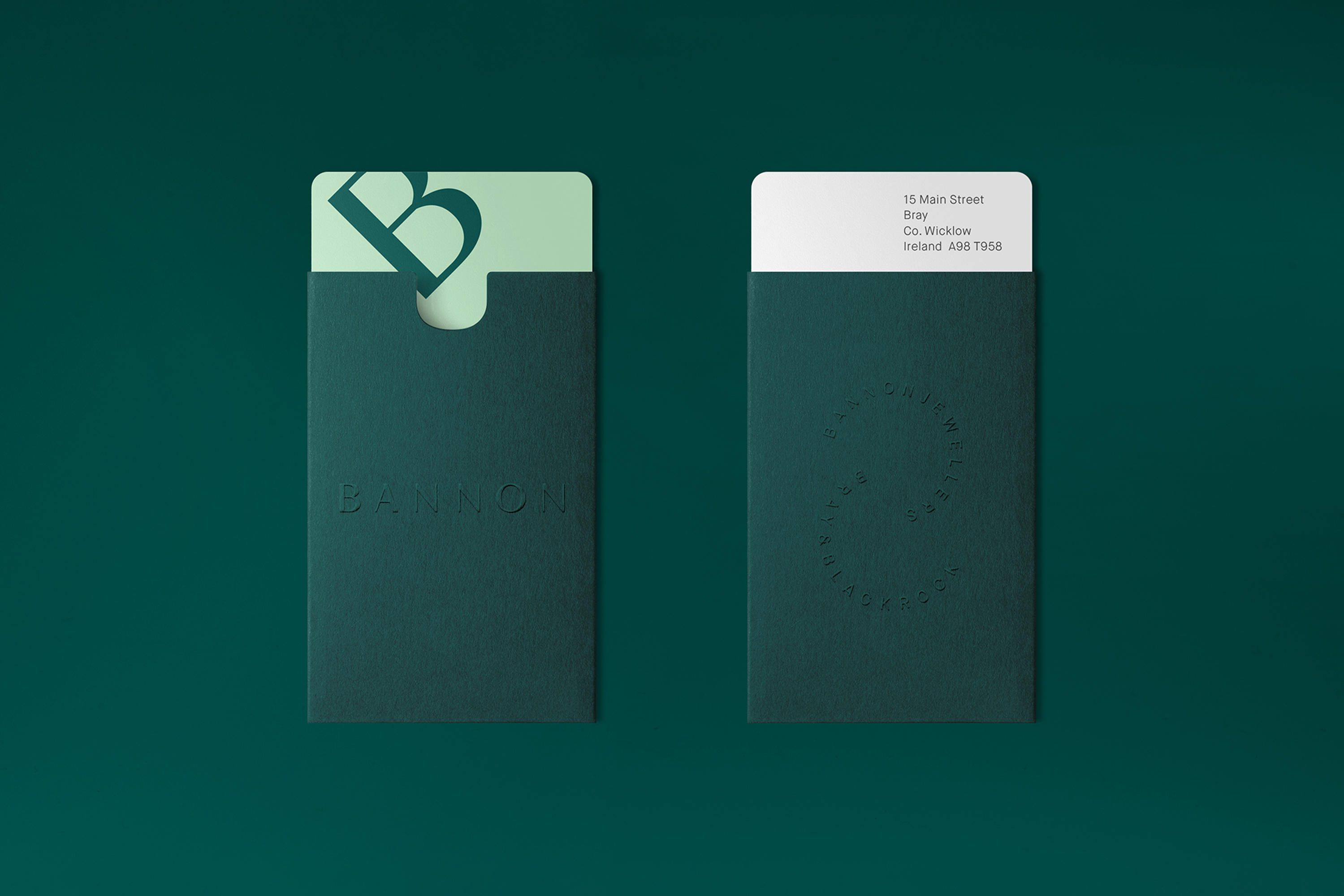
The colour choice and bold typographic approach is informed by the desire for strong brand recognition, with particular focus to the suite of gift cards, bags and boxes as the ultimate luxury shopping signifier that customers take home. Patterning and embossing, based on the two marks, also feature across the printed items echoing the highly tactile and decorative experience of jewellery and timepieces.
