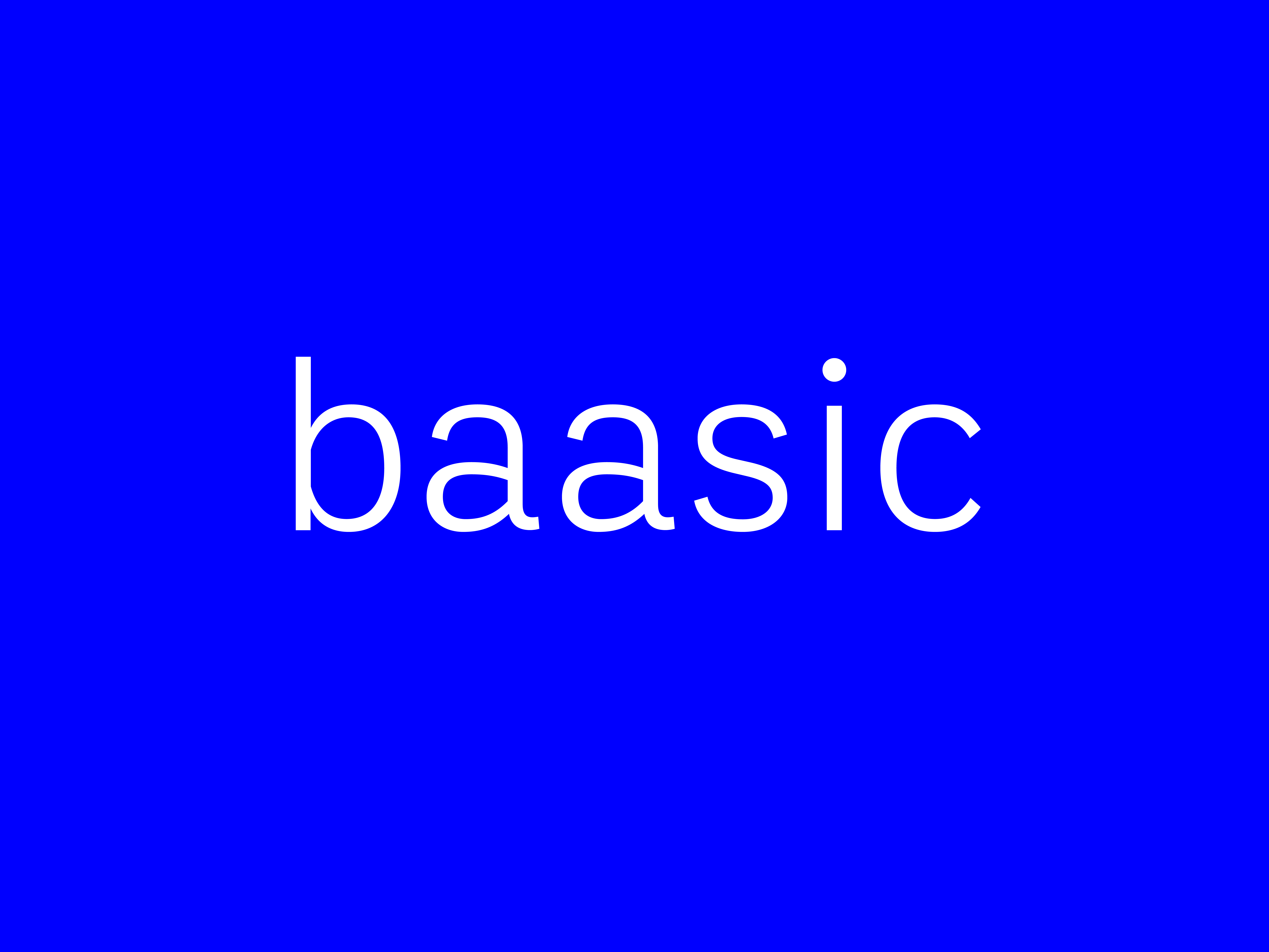
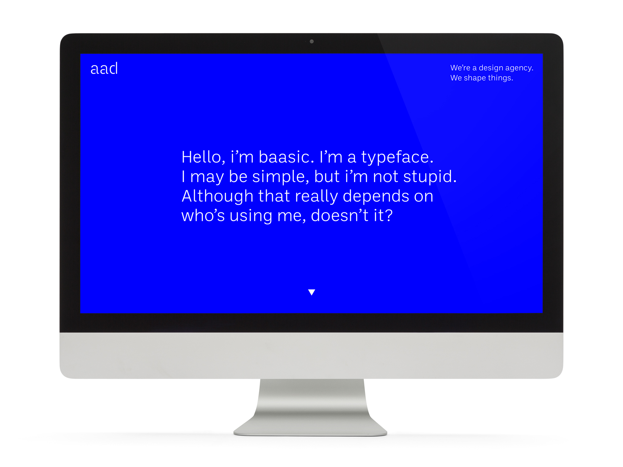
baasic typeface for aad
Designed by Scott Burnett and Max Phillips at Aad and Signal Type Foundry
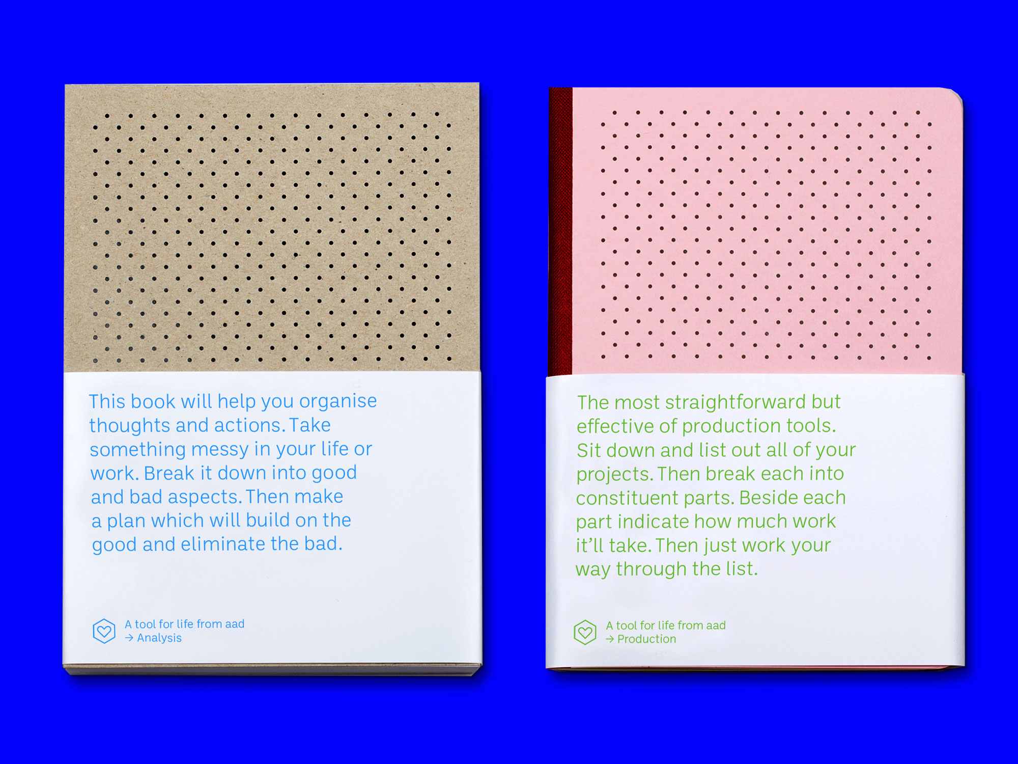
Notebook design: aad
Categories: Typeface
Industry: Cultural
Website: studioaad.com/about/
A single-weight proprietary typeface for aad, baasic was intended as a plain, hardworking grotesque: an unornamented tool for clear communication. Sources include early 20th century jobbing sanses like Morris Benton’s News Gothic and an unrealized typewriter face Josef Müller-Brockmann designed for Olivetti, which had unusually deep junctures that added energy to letters like m and n. Lightweight and monoline, baasic has large counters, a generous x-height, and an open aperture. Semi-oldstyle figures support readability in small sizes. Stencil cuts were added to produce a new studio logotype.
(Notebook design by aad.)
