Aftering (2014)
Branding and Identity for Dublin based company Aftering; an online platform to help you prepare and plan for the loss of a loved one.
Naturally, the solution required a sensitive approach due to the subject matter. A conscious effort was made to visualise a new aesthetic for a well-worn occupation.
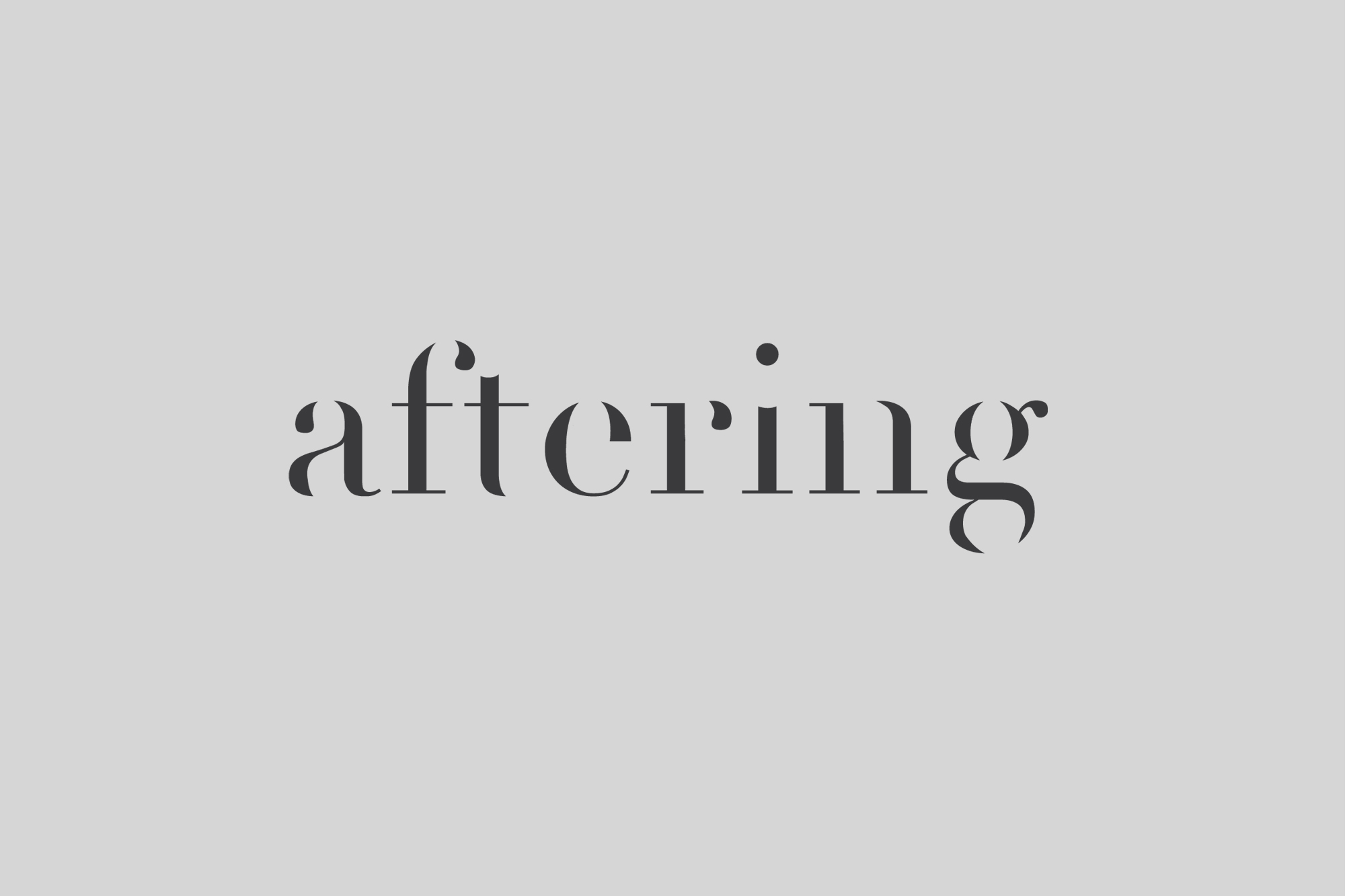
To introduce this new narrative, the logo was set in lowercase to represent how death isn’t necessarily the end. The elimination of some of the anatomy of each character expresses the intangible, yet ever present, nature of the memory of the person.
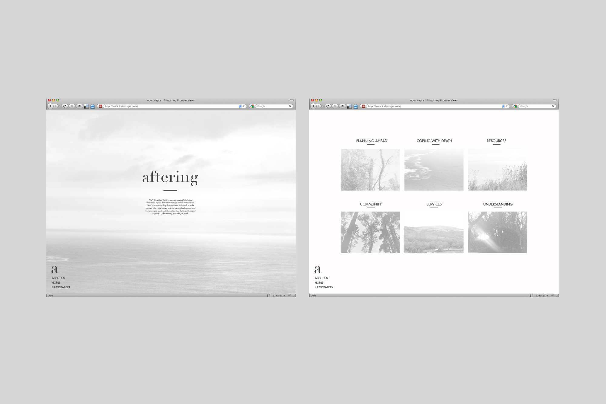
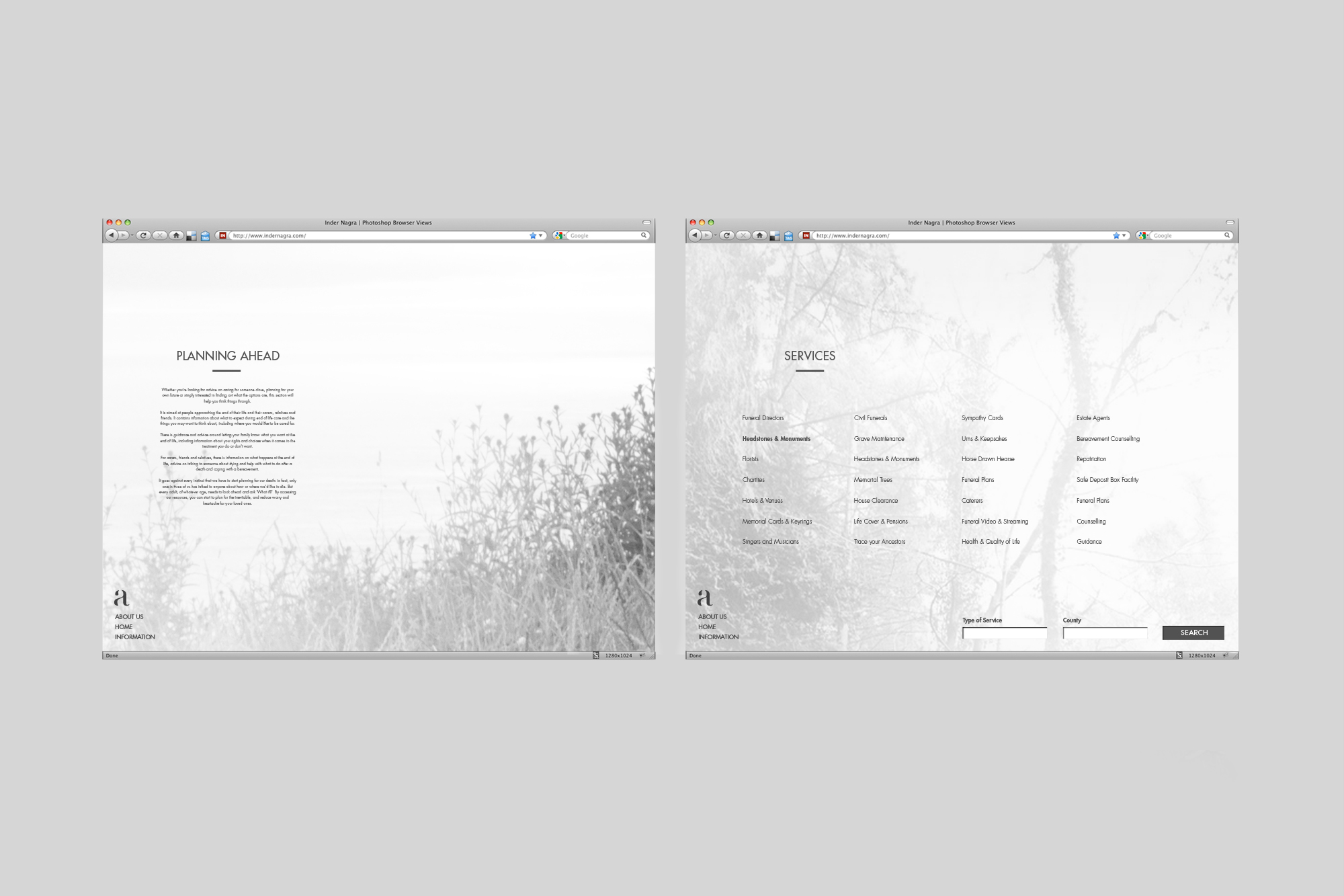
The use of photography within the identity reinforces the idea that death is part of nature and is integral to a new visual approach in this industry.


