32 Molesworth Street (2015)
Designed by Paula McEntee at Red Dog
Categories: Identity / Website
Industry: Commercial
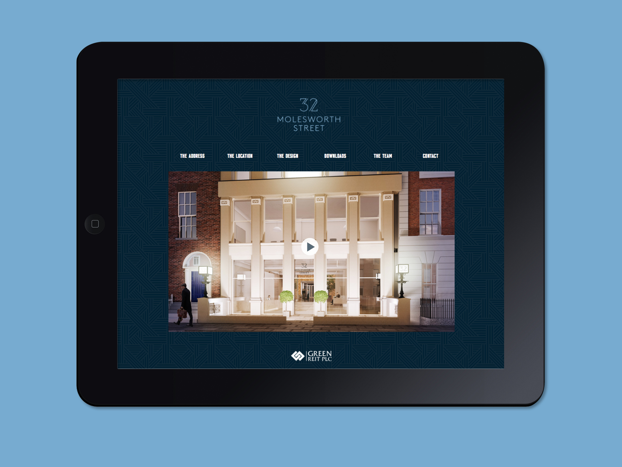
Website: 32molesworthstreet.com/
We were commissioned by Green Property to create a brand for their new high-spec commercial development at 32 Molesworth St. which would help market the property.
As part of the solution we crafted a solid and confident, yet sophisticated and elegant logotype, featuring a colour palette of midnight and powder blues. This logotype complemented the definitive confident messaging we created for them as part of the overall identity design. Throughout all the deliverables, we reiterated the idea that 32 Molesworth Street is ‘The Address’ – a unique building in a desirable location.
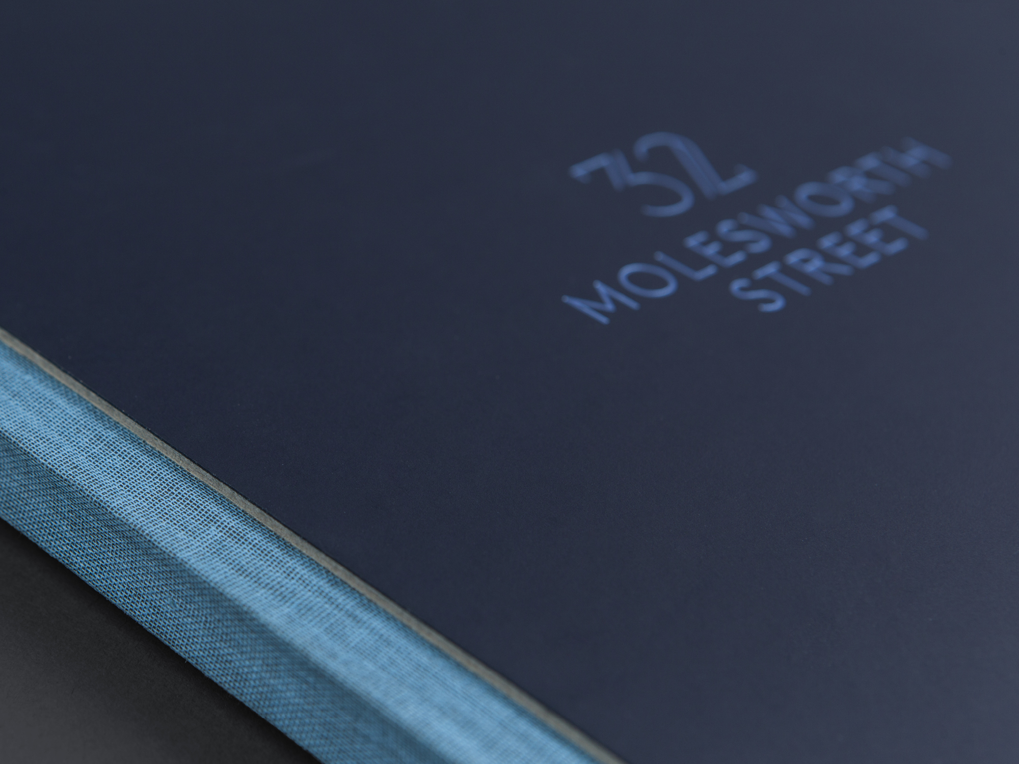
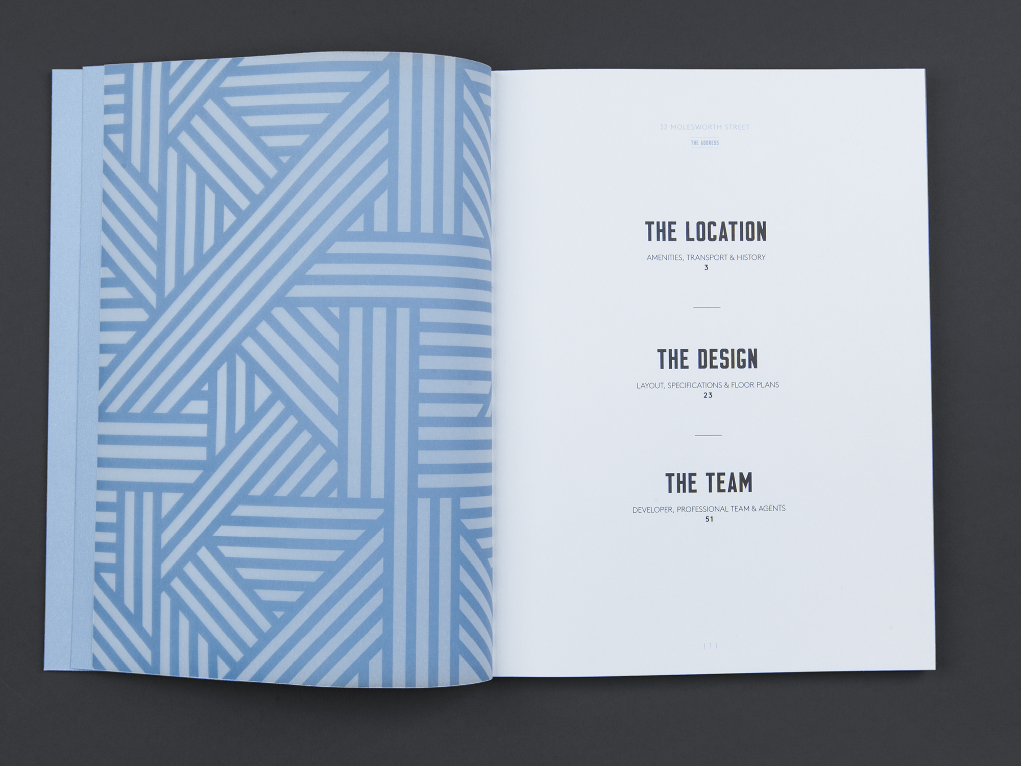
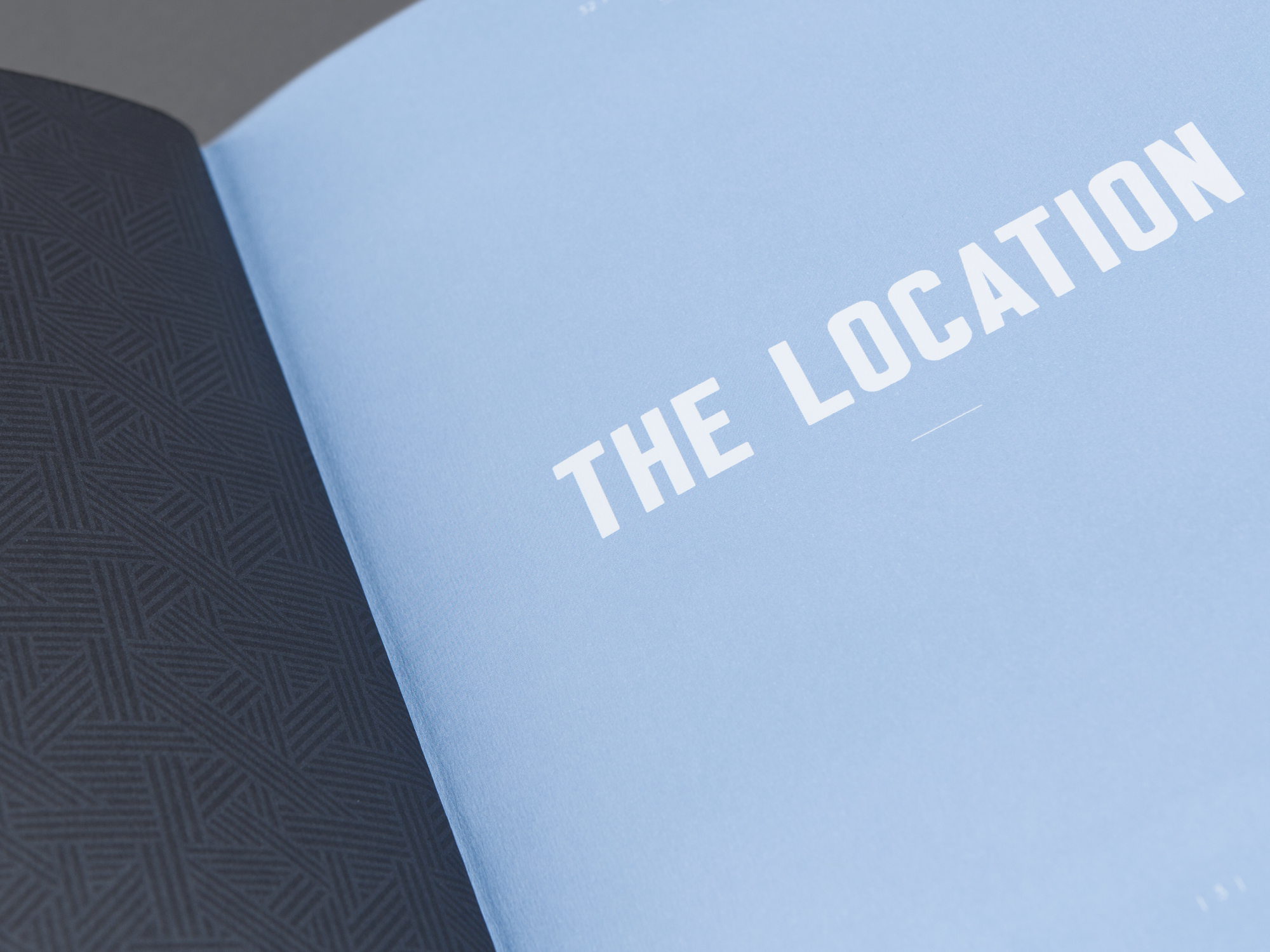
The brochure was designed using a combination of coloured, translucent and textured papers, to evoke a sense of tactile luxury. The cover incorporates light blue foil and the thread sewn brochure is finished with light blue binding tape. On the building exterior, we strived to create something different for the building hoarding – a powder blue wrap that combines the signature graphic pattern with confident messaging. At street level, the lower structure of the hoarding is finished in high gloss, with a large 32 cut out and outlined in blue LED strip lighting for extra impact at night.


