As a student, I hated brand guidelines. In my eyes they represented a rigid set of rules that I, like every other over-eager design student who thinks they know better, was eager to break. In particular, weighty, 200 page PDF style guides seemed to me like an utter waste of trees and were treated them an extra measure of distain.
Although to this day I have never created a PDF style guide longer than 10 pages (a feat which I am quite proud of), I’ve grown to truly love brand design. In particular I have found myself becoming increasingly involved in branding through interaction; a field where every touch, swipe, animation or sound can radically differentiate one brand from another from the next.
Today, we look at the field of interaction branding and how one goes about weaving it into the branding process.

Introducing branding through interaction
Chances are that you’ve experienced interaction branding already today. Remember the familiar inward sucking sound when you opened Skype this morning? Or the subtle fade out when you paused that track on Spotify when you were on the train? These subtle interactions are woven into almost every moment of our digital lives. For the otherwise visual communicator, branding through interactions offers us an exciting opportunity to build deep brand relevance that is impossible to achieve with a logo or graphical approach alone. Branding through interaction expands on existing brand values and interprets them in a meaningful way to the user.
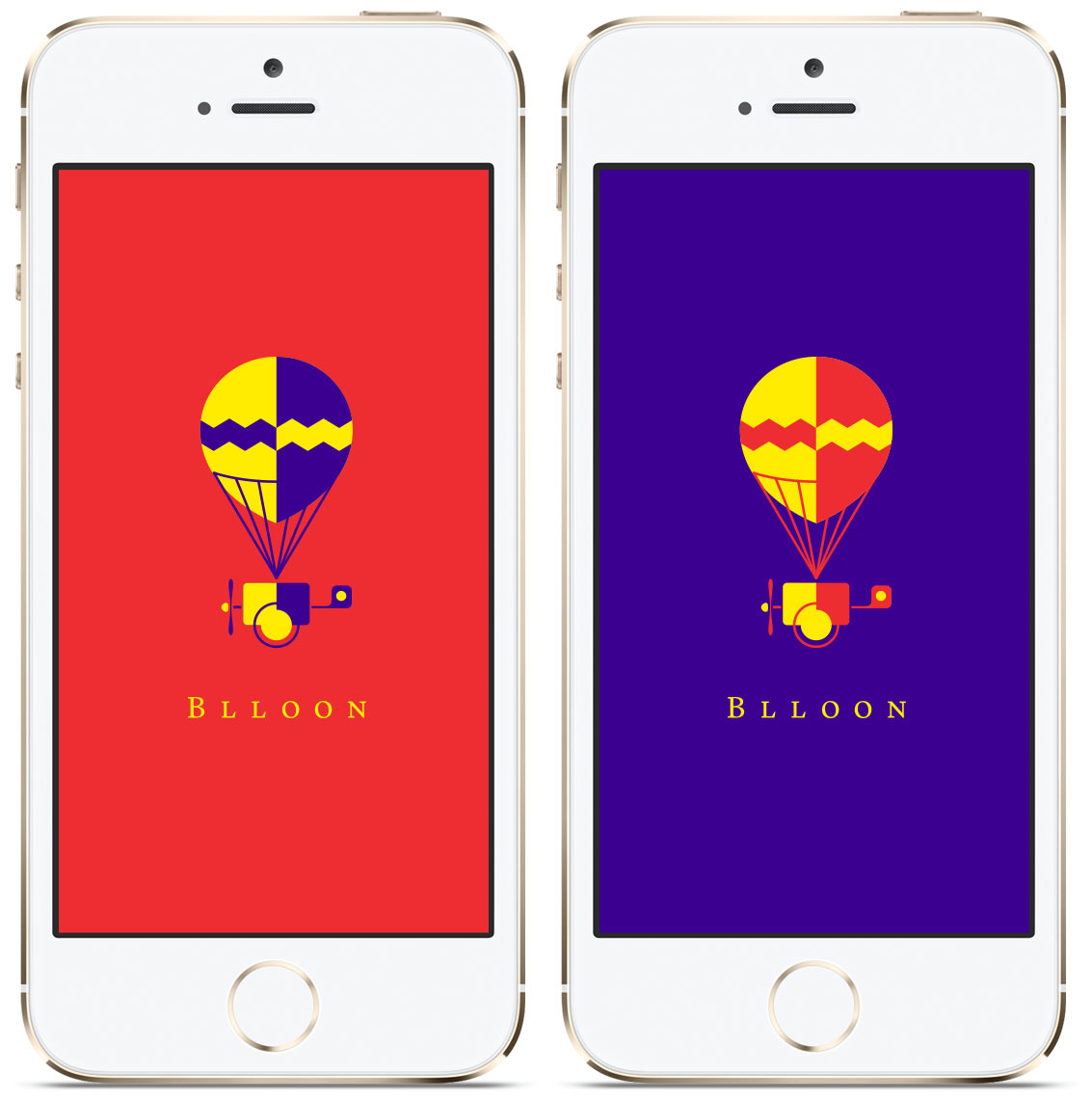
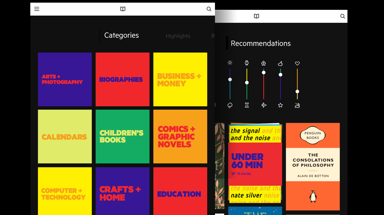
Recently, I worked on a branding project with the team at Edenspiekermann for a Berlin startup called ‘Blloon’ which was launching a new ebook subscription service (think Spotify for e-reading). Even though the visual brand style we developed was full of illustrations and vibrant colours, we knew that a one-to-one application of this visual style to a functional digital product would be a big usability fail.

Instead of showing our colourful illustrations of balloons everywhere, we decided to load the interface with spring and bounce. Touching the content tiles in the interface would result in a playful bounce and every interaction contained spring. In short, we interpreted the brand values and visual brand through touch and interactivity.

Brand Design, meet Product Design
One of the most exciting aspects about the field of interaction branding for the designer is that the line between the brand and the product itself is so blurred. Visual design and functionality are so deeply interconnected that it is virtually impossible to think of one without the other.
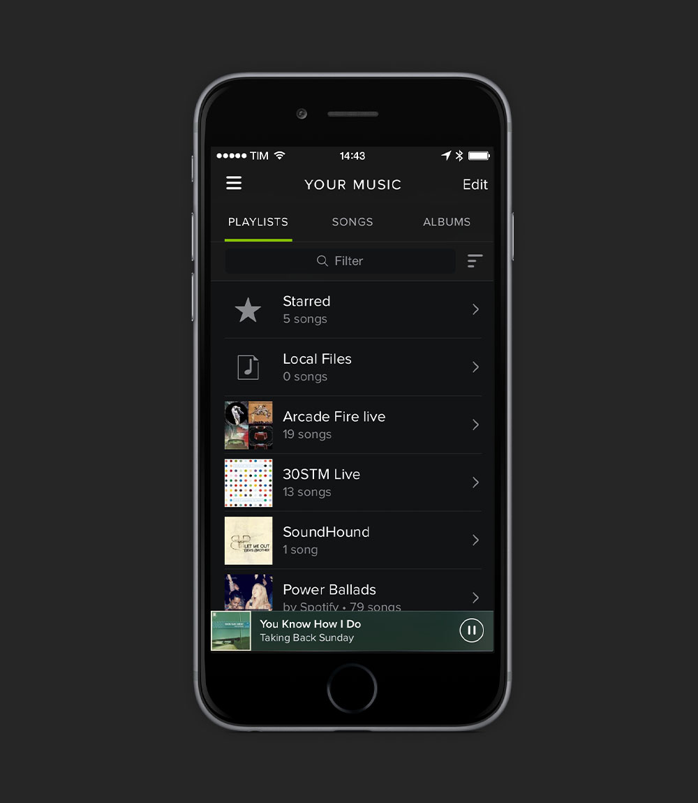
Think of Spotify. Once you go past the splash screen of the app, the branding is minimal. Also, consider that most users of the app are navigating (i.e. playing or skipping tracks) through their native OS lock screen, rather than inside the app itself, so opportunities for visual branding are dramatically reduced.
The solution to surfacing the Spotify brand? When a user presses “Pause” on a track on Spotify directly from the lock screen, instead of the instant cut in audio that the native iOS player default, the track subtly fades out. Once you hit ‘Play’, the track fades in again. It is an unintrusive, subtle but an unmistakable feature of Spotify. Consider how many times the user may take this action on a daily basis, each one a positive brand re-enforcement of the brand. And of course, the interaction is consistent across all platforms, so the user has the same experience with Spotify whether on desktop, tablet or mobile. The functionality and brand are tightly interwoven.

The devil’s in the details
The success of interaction branding lies in attention to the subtle details. With the average user touching their phone at least 150 times per day, subtle interaction details are quickly reenforced. However, even the smallest dose of heavy handedness quickly becomes irritating and can ultimately result in the deletion of the product or service from the users home screen. Most of us probably can remember an occasion where a new interaction on our favourite digital product drove us fucking crazy and brought us to point of ditching the respective service entirely. Let us not forget the recent Facebook Messenger fiasco.
Prototype, user test, release early, user test again. And repeat.
To achieve this delicate balance between functionality and branded interactions, there is no substitute for an iterative process. This means prototyping at an early stage, releasing frequently and early, and most importantly, having a solid strategy for frequent user testing.
Prototyping your interactions does not need to be a sophisticated process. There are a multitude of tools out there for this purpose. Ranging from basic tools such as Keynote, Proto.io to more sophisticated (but still very manageable for any designer) tools such as Origami for Quartz Composer or Framer JS, there is no excuse not to have something in the hands of your test users even before developers start work.
Testing frequently and incorporating feedback early is crucial to test how each and every interaction feels. For example, when does a simple swipe works better than a fancy transition? As brand designers, our role is to fully understand and respect the line between “unique” and “fucking annoying”.
All of this seem a bit off-topic for an article on branding? Not any more. Today’s brand designer working for digital products needs to wear many hats. To succeed in digital product branding we must follow a usercentered approach to design; rather than the previous ‘top-down’ way of working.
A shifting expectation of brand designers
The notion of what constitutes a brand, and therefore what constitutes a brand designer, is shifting. Brand design is no longer solely about enforcing consistency of application (such as colours or white space around the logo), but rather about coherency of relevance, attitude and delivery of the brand values. For these reasons, it is clear that brand designers of today, especially those working with digital products, must think beyond static forms and consider how brand interactions feel. Brands of today live through every touch, swipe and sound and all of these shape the users perception.
So, the next time a branding project brief lands on your desk, start thinking about how the application can work its way into the daily lives of your users through digital and interactions. The best part? There’s not a 200 page PDF styleguide in sight.