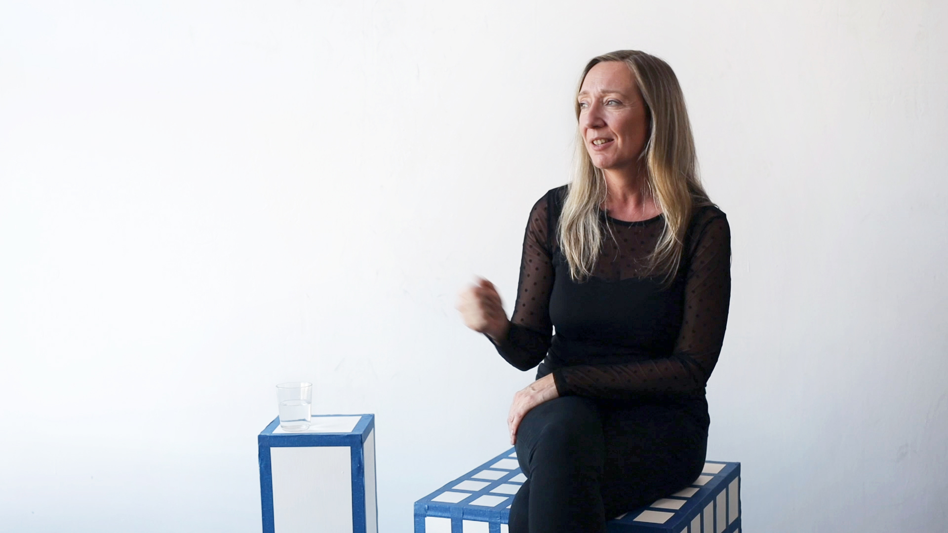
Work for the cultural sector is a significant proportion of the projects submitted to the 100 Archive each year. In order to understand the impact design has within the cultural sector, we chatted to curator and cultural manager Ann Mulrooney about commissioning and collaborating with designers in a number of institutions in Ireland. Watch the video clip or read the full interview below…
You come from a Fine Art background: can you tell me a little about your move into cultural management?
I trained as a sculptor originally in the Crawford in Cork and I went and worked as a metal worker in a foundry in the UK for a couple of years. Then I went on to do an MA in sculpture in the RCA in London.
While I was there, I'd always organised exhibitions. I didn't think about it as curation, it was more about creating opportunities rather than waiting for them. But when I was in the RCA I started to think seriously about curation, and I put together a proposed exhibition which ended up winning the Deutsche Bank Fine Art Award the year that I graduated, 2003, and as a result of that Deutsche Bank hired me on a freelance basis for emerging artists shows. So I worked with them for a year or so, and was working on projects in Ireland at the same time, and while I was still practising as an artist that pushed me into curating.
I think that I ended up in cultural management accidentally rather than by design. I was working freelance for a number of organisations and one of them was the Design and Crafts Council of Ireland and an opportunity came up to run the National Design and Craft Gallery which I applied for, and the rest is history as they say!
You directed and delivered significant communication and promotional campaigns while you were there, including the gallery’s visual identity and website. How did you approach this with regards to your ambition for the gallery?
Thinking about the relationship between design and the gallery being a cultural space, I suppose, firstly, I was fortunate that in the Design and Craft Gallery I had a lot of creative freedom to think about the identity. The visual identity of the institution is actually all wrapped up in its cultural identity and a lot of my role, in hindsight, was around defining the role of the gallery, so thinking about what its purpose was, what its strengths were, what was unique about it… For me it was very much about repositioning the understanding of craft, which at the time was thought about as hand-knitted socks or donkeys that you buy in tourists office and so on… So, actually starting to think about craft as a really fundamental part of our cultural DNA, because we have always expressed ourselves through objects, so when you start to look at it that way, at objects being this kind of cultural language that we have, then you get a sense of the role of the gallery actually being about really embedding that back into our psyche. So how I thought about the visual design was that it needed to be an expression of that, that it needed to manage to both touch on that cultural importance, but also be entirely contemporary in how it expressed itself in the world, because it needed to be relevant.
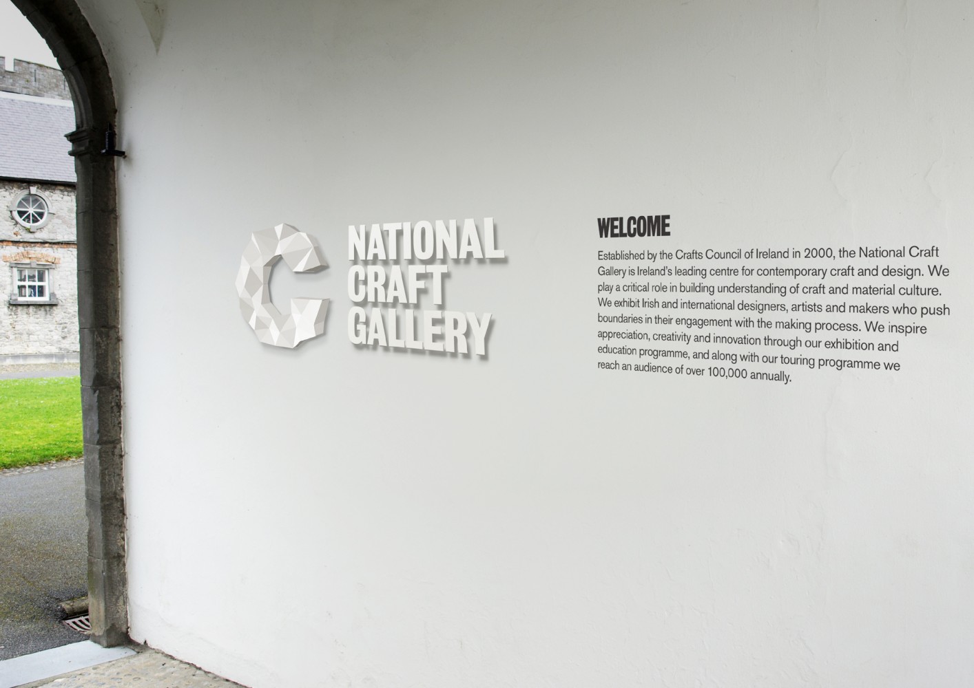
I was very fortunate to work with CI Studio, and they understood completely what I was talking about, I think partly because I come from Kilkenny originally, as does Mel O’Rourke from CI Studio, so we had grown up knowing the importance of the Kilkenny Design Workshops. And having that understanding of the difference that design can make. So we had a shared language right from the beginning I suppose. Naoise Ó Conchubhair did the work on the brand identity, which I thought was incredible, and again he had such a nuanced understanding of cultural identity because of his own background. I think it was an incredibly successful iteration: it’s over 10 years ago but it’s still incredibly fresh, incredibly contemporary, and still holds it own. That sense of a visual expression of cultural importance became the kind of grounding for all the other projects that happened from that point So whether it was an exhibition identity or website, they were drawing from that really strong work that had been done around the expression of the brand initially.
What was the reaction from stakeholders and the public?
Well, I don't know that anybody...there can't have been negative reactions. You can see how just how strong and successful it is as an expression. I think that generally speaking it was adopted really quickly, there was a whole suite of catalogues that were also very much in that family, as well as an exhibition and programming around the same subject, which is how to express the vernacular rooted in our psyche in a very contemporary way. There was a really nice layering or alignment that was running through them all.
You have worked with a number of different studios, so how directly did you work with the designers, in what way did that maybe shift from studio to studio?
The team in the National Design and Craft Gallery was extremely small so I worked very directly with the designers, which actually I loved because to be able to sit down with creative thinkers and have that conversation is very inspiring. I know when I started working with Atelier David Smith, in particular, I just found I would leave briefing conversations absolutely fired up with inspiration. So again, I was really fortunate to work with a designer who understood clearly where I was coming from, and who had the same shared sense.
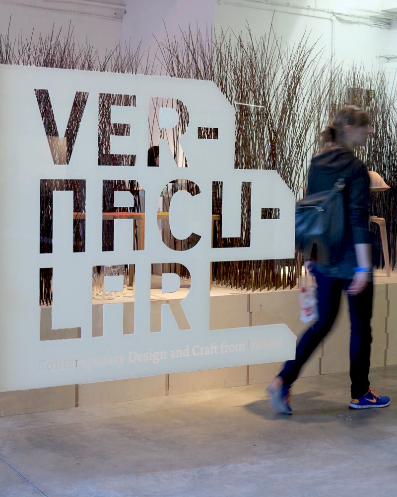
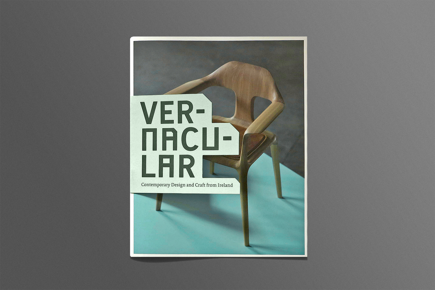
Vernacular was an exhibition of contemporary work that we brought to the London Design Festival, the whole thrust of which was actually about drawing from these vernacular roots that are very much connected to place and geography and landscape but again, in this timeless fashion. There was an integrity to the design process and David understood that so well and did an amazing job of bringing that out in a really fresh way. He really understood the objects, and the importance of the objects. As budgets are always tight, I did the art direction for quite a few of the photographs in the catalogue, but I worked with David on the photoshoot and it was amazing, because his design eye just brought it to this whole other place.
Through the focus on the identity of the gallery itself and through travelling exhibitions you grew audience numbers from 35,000 to 144,000 annually. How would you describe the role of design in relation to this success?
I think the role of design in the success of growing audience figures for the National Design and Craft Gallery is very much around clarity. So, if there’s that clarity of purpose, clarity of intent around the programming and it is visually expressed in a very integrated way I think that probably makes it easier for people to understand and to respond to. But also I think that just because of the nature of the identity we created there is a relevance and a resonance there… beautiful design catches your eye!
You came from that role then into your role as CEO and Artistic Director of Visual in Carlow, where you again addressed design and branding as an integral part of strategy and position. What was your vision for how design could be used to achieve Visual's goals?
The journey in Visual was quite similar in lots of ways as the journey in the NDCG, which is about understanding what the challenge is and understanding what the incredible potential or strength is. Whereas in the NDGC the incredible strength was around craft being a cultural expression of who we are, with Visual the challenge was, particularly at the time I took it over, was that it was perceived, even referred to in the press, as a Celtic Tiger folly, a kind of a white elephant left over from the boom years. And actually Visual is this incredible place, one of the most beautiful, if not the most beautiful artistic spaces in the country, it’s a really stunning building. And it’s in this very unique town, a town that has a very rich heritage in engineering and architecture and had fallen into hard times, so the challenge there was in building relevance and resonances, particularly with local communities. Design played a role in that again I guess, just in being able to give us that visual clarity of intent, showing the importance and the beauty of this building and how it connected outwards into the life of Carlow and beyond.
And again, I'm guessing you worked quite directly with the designers?
Working in Visual was different because we didn't have the publication budget that we had with the NDCG and also Visual had a history in its short life of producing really beautiful art books, but we just didn't have the budget for that anymore, so we had to be incredibly nimble.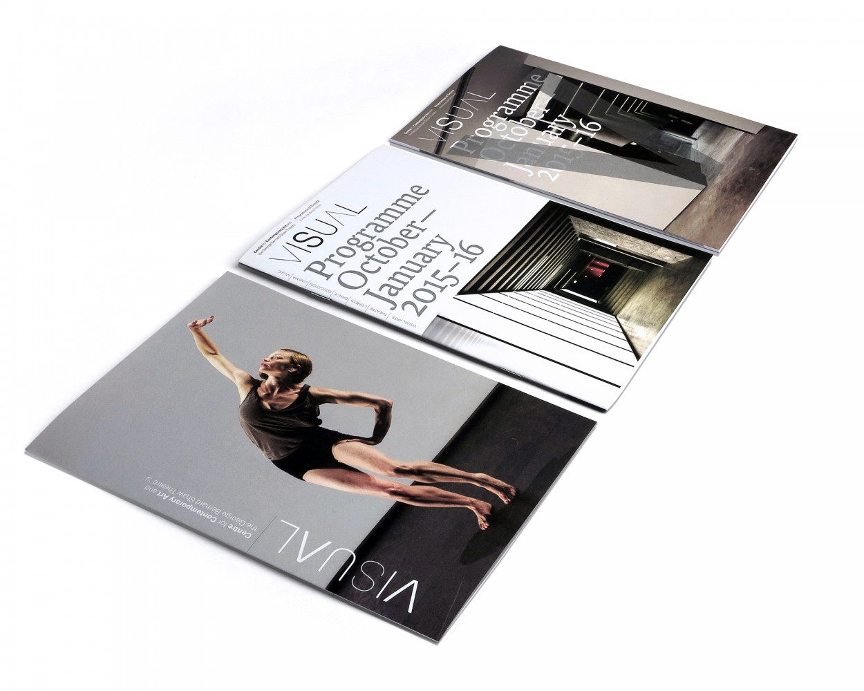
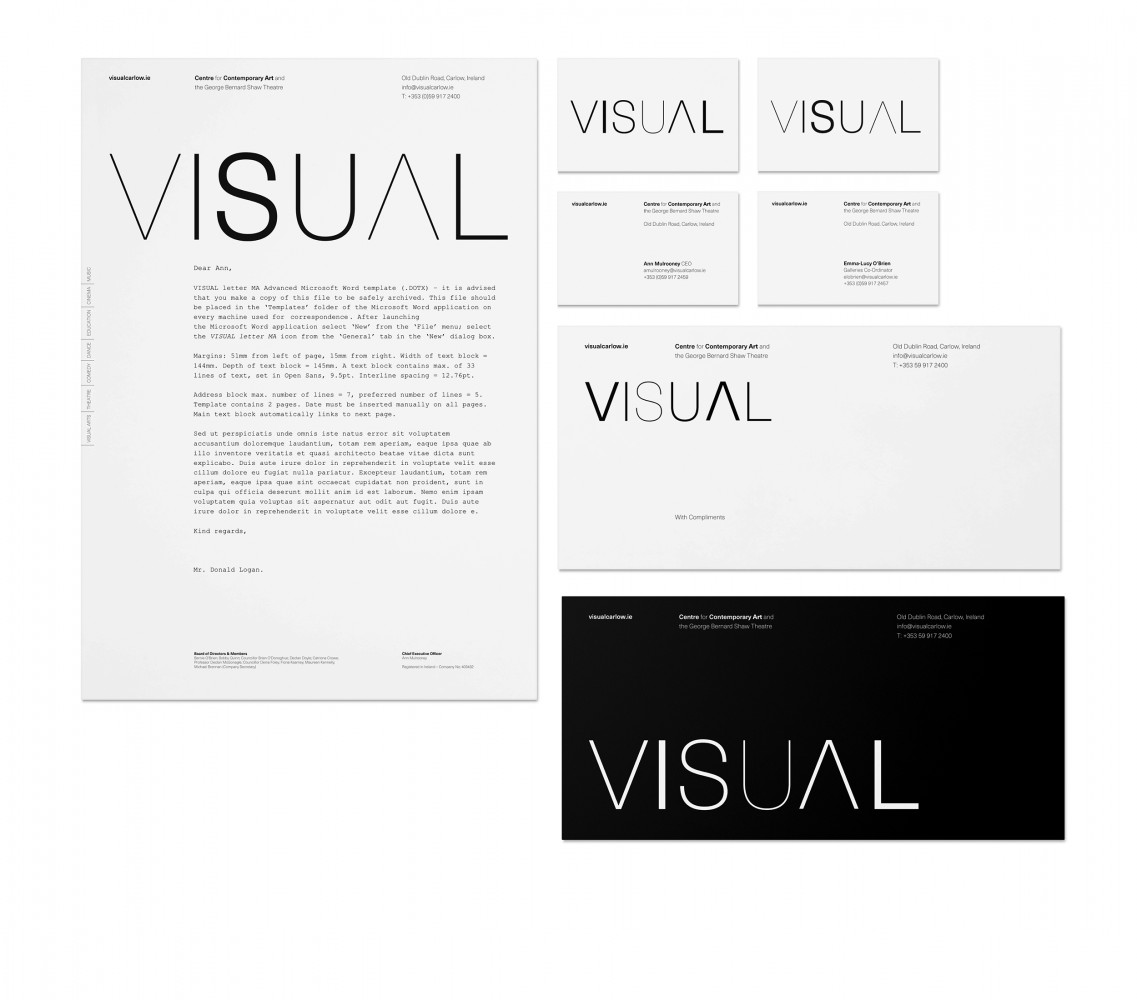
So again, Atelier David Smith really understood the constraints we were under but also understood the potential and the beauty of that space and wanted to reflect that in the identity. When I arrived in Visual there had been a long running split. There was a theatre and the galleries and there was sort of an identity split between both, at one point the catalogue produced every season had the galleries facing one way and the theatre the other way so you had to flip the catalogue if you wanted to look at what was on in the theatre, and turn it again if you wanted to look at what was on in the gallery. But it was all expressive of a lack of a cohesive identity which made it really challenging for people in the area to even build a relationship with it as an entity. “Which bit is this? The George Bernard Shaw Theatre or the Visual Centre for Contemporary Art?” And even that the titles were The George Bernard Shaw Theatre and the Visual Centre for Contemporary Art… that’s so long for anyone to try and connect to, so working with Atelier we were able to shorten it just to Visual and it was an expression of both the galleries and the theatre, both of them very embedded in place, and I think that again Atelier managed to do that very successfully.
Sometimes these things are very subconscious, people are interacting with them without necessarily being aware – would you have any kind of anecdotal ideas about how the population identified with the identity?
That’s a hard one for me to answer because it is anecdotal, it’s not like you can produce an evaluation with hard figures… I know because the theatre had that separate identity, people still thought of it as the George Bernard Shaw Theatre, and it was going to take time to get people to think of it just being Visual as an entity, rather than being separate factions within the building. But I think lots of people just call it Visual, so not having to call it Visual Centre for the Contemporary Arts, and The Bernard Shaw Theatre must have been an awful lot easier for everybody.
Something of a relief! Did visitor numbers increase?
Visitor numbers did increase. Obviously the brand identity is just one part of an entire process, but I guess what’s been fantastic is that in both institutions brand identity has really been part of the overall thinking around the institution, around what it’s purpose is, and so it’s been one of lots of things all traveling in the same direction, bringing people with it.
So can you fathom the idea of, even with minuscule budgets, a cultural organisation not commissioning design?
That’s a really hard question. To be honest it’s so incredibly difficult to run a cultural institution in a time of reduced funding and a lack of resources, and cultural institutions have been under-resourced for over a decade now and they survive because of the incredible commitment of the people who work in them and for them. So I wouldn't like to say anything about a cultural institution that chooses not to use identity or design because they are having to make really hard choices.
Moving to the Science Gallery, which is Dublin-based and has a long standing existing commitment to design and has its own design team: how have you found it working in-house on design projects compared to your previous experiences?
It’s definitely different: in the past I've had much more hands-on control but I think that’s because I've worked in much smaller organisations where one person routinely did the job of four. Science Gallery obviously has a much bigger team and it’s also more horizontal rather than hierarchical in terms of design making. So there is a lot of team input in exhibition identity and there’s a lot of expertise from understanding how audiences react to expertise around marketing and visual identity and so on. What ends up coming out of that exhibition identity is a shared expression.
I can remember Science Gallery Hack the City exhibition happening while I was in Carlow, I think that was literally a fairly pivotal time for design in Dublin. There was a lot of thought about applying for World Design Capital, there was also a lot of activity starting to happen and pop up in Dublin itself, I think maybe Granby Park happened the year after Hack the City, but all of it was sort of an expression of a much more engaged and participatory approach. I found that very inspiring and that thinking fed into the work that we did in Visual, which was very much about developing active participation and engagement in our local audiences in particular around planning and design, and having a say in the shape of our places.
I think that Science Gallery brings that a step further in that it’s not so much about engaged audiences, it’s actually about having this experiential public engagement into research, science and technology and that manages to communicate much more strongly than a more passive journey through a gallery space. So with Science Gallery there’s a very strong desire to develop agency, to empower, through starting those big conversations, creating a platform for those big conversations that can actually be quite provocative sometimes, and I think that sense of provocation, in the best sense of the word , comes across right through exhibition design over the years as well. You know, they are unexpected, they're frequently funny, they're certainly thought provoking and that’s very much again a reflection of the thinking that goes into exhibition programming. There’s a really strong correlation between the exhibition design and how the exhibition topics are mediated.
What’s on at the moment?
At the moment in Science Gallery we have an exhibition called Perfection, and it’s a bit of a watershed moment in many ways because Science Gallery is 11 years old this year. It has in the course of its life been the catalyst for an entire network of Science Galleries that are all embedded in research universities, and since 2012, since the beginning of that network forming it has been sending a lot out there into the world: templates for exhibitions, templates for design, templates for how to think about exhibition development etc. It’s been sending out exhibitions to over 2 million people around the world in its lifetime, and this summer, for the first time ever, Science Gallery Dublin has actually taken in an exhibition from Science Gallery Melbourne, so the network is starting to grow up and the exchanges are starting to become very rich and very reciprocal which is amazing.
What I find really interesting is that the exhibition is as relevant here in Dublin as it is in Melbourne, so these topics are big global issues and the idea behind Perfection is looking at the two ways we strive for perfection, one being for reasons of utility, and the other being for reasons of aesthetics. Obviously, striving for perfection can be a good thing, but it also carries lots of challenges and it’s important that we are really clear about why we are doing that and what the impact of that is on us as a society. The exhibition is a really good and useful way to open up that conversation, particularly among our target audience of young people who have so much pressure through social media, through exams, through school, college etc, through this pressure to appear perfect through the lenses that they share their lives through, and those are pressures far beyond anything I experienced when I was that age. So it’s an important topic to tackle in terms of mental health in particular.
And what have you seen emerge in terms of those big topics, such as climate change, socially engaged projects, the growth of tech, all of these evolving societal issues?
Our next exhibition is Plastic, which an unusual one for Science Gallery because usually the gallery is ahead of the zeitgeist but at this point plastic is something that we are all already thinking and talking about… So, the thing about plastic is that, of course, single use plastic is not a good idea, but at the same time plastic is also essential in other areas, particularly in medicine. It’s not that we should have a black and white relationship to plastic, it’s that we should develop a more mature relationship and figure out those nuances. We need to figure out when, for example, is bamboo more sustainable, and when is it less, and to do that we need the facts, we need to understand more, and have a much wider perspective.
I think Science Gallery does a really good job of getting that wider perspective, encouraging audiences to make up their own minds about where they stand. It’s not that we are some kind of didactic institution telling people how to live, really it’s about making sure that people have the information and the literacy and the ability to make their own decisions. That becomes more and more important with the rate of technological development increasing as it is. You know, we’re still only guessing about the impact of current and future technology, so our capacity to be better informed and to think our way through consequences, they're really important skills.
In some ways, when Science Gallery started up 11 years ago it was about building people’s capacity to understand science, to have a stronger science literacy, whereas it’s almost becoming the opposite now. What we need to do is to enable people to have the humanities-based understanding to be able to extrapolate consequences, to think about the ethics or morality or repercussions of particular choices, and I'm finding that a really interesting shift. There is a kind of a trajectory through Science Gallery exhibitions, their themes but also their design, where they become much more about the human condition and how science and technology impact that than around science and technology in itself, in isolation. That trajectory will be continuing, so what’s also exciting is that Plastic will be the first exhibition that we bring on tour around Ireland. We've toured all over the world, and now we're going to tour in Ireland which is wonderful, we have 4 wonderful artist commissions as part of that, which again, to be able to be commissioning work in response to themes is fantastic, so it’s starting to build an ecosystem and that’s part of our emphasis in the next years… is how do we support that ecosystem.
____
This article is part of a research project called Map Irish Design, undertaken by the 100 Archive and funded by the Creative Ireland Programme. The project explores how design affects life, culture, business and society in Ireland, as viewed through the communication design work gathered by the 100 Archive since 2010. See the project at map.100archive.com
