One of the reasons we’re developing an archive is to capture the connections, and reveal the context of Irish communication design. How can you build on something, or tear it all down, if you can’t see what it is? To start a conversation about the role of inspiration we asked four young designers to tell us someone close in age to them who has inspired them with their work.
We then asked that person the same question, and so on. Posted here is the first of these inspiration chains, we’ll post the other 3 throughout the week.
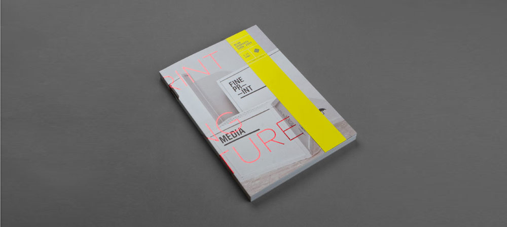
Eibhlin Doran chose Sean Mongey / NCAD Fine Art Degree show catalogue 2008
I’ve picked Seán because I like both his work and attitude towards design.The piece of work I have chosen of Seán’s is his NCAD Fine Art Degree show catalogue from 2008 and 2009 as this was something I referred to numerous times when I was working on my own final year project – the 2012 NCAD Vis Comm yearbook.
What I always really liked about it, was that despite the fact it was created five years ago (while he was a student) it still remains a strong piece of work both visually and functionally. This is something I really appreciate in design and hoped to achieve in my own work – I suppose time will tell! He has been a great person to chat to for inspiration and somebody whose work has always stuck in my mind.
Sean Mongey chose James Cullen / Pygmalion Posters
Having worked in the South William Street area for over three years it was always a delight walking by Pygmalion bar to see James’ latest graphic escapades. They were always stylish and unexpected with that enviable quality of appearing effortless.
After seeing them I would potter back to the studio with a renewed enthusiasm for what I was working on. You can’t beat that kind of inspiration.

James Cullen chose John Averill / Backlash
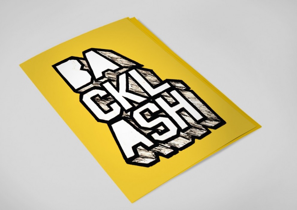
I have a particular passion for music-related design, this probably stems from going to clubs and gigs for the last 10 years and realising the impact that posters and good design can have. My first true clubbing experience was at seminal club night Backlash — which was held every Thursday in the basement of Wax from 2004–2006. The night is still talked about in revered tones, almost as a golden era or a bona fide peak of the Dublin clubbing scene.Many people became best friends there, or was a springboard for a passion for a certain strand of music that has never left them. When people recall it, the Backlash ‘brand’ for want of a better term, is something that is instantly memorable.
Jon’s graphics for the night impacted me largely due to the strange balance of refinement (razor sharp modernist typography and grids) and lo-fi (most posters and graphics were printed from A3 printers on bright yellow cartridge paper) that he created. The subtle mix of yellow, Helvetica and an electro-inspired rave mood was an effective design synergy. In many ways it harked back to the punk DIY methodology but had this rigorous attention to detail — in its design, but also its messaging. Backlash didn’t take itself too seriously and Jons’ wit and humour helped to really give the brand its personality.
Jon continues to do lots of great work creating visuals for his own nights, amongst other things. He is also the brains behind the ever dependable podcast series, Shock World Service — which is always worth checking out.
Jon Averill chose Pete Reddy / Everything
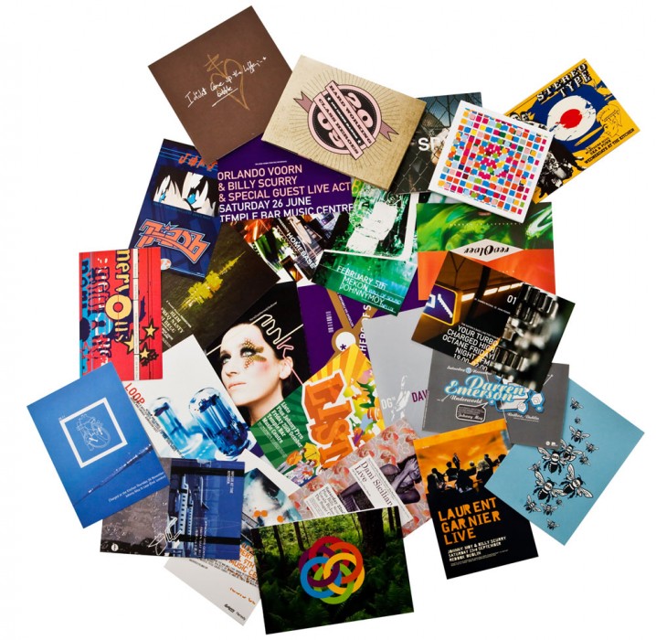
I’ve been surrounded by design all my early life but I think Pete’s work was the first time it really connected with me, at least in the context of the my own culture which was centred around the music scene that really began to find its feet in Dublin in the early 90s. Posters of footballers were slowly replaced by these strange 105mm x 148.5mm cards. I then started to discover the work of people like 8VO, Neville Brody & The Designer’s Republic, not ever thinking of it as a career but just enjoying this style they were creating that seemed completely alien & at the same time completely logical.
Looking back I can’t actually remember when I ‘became’ a graphic designer. I had begun to be involved in running events & took it upon myself to produce the graphics for them, over time learning how people connect with things & that this connection goes beyond just a single flyer or just a logo & how it can relates to the whole experience. That’s where it started for me really. It wasn’t until a decade later that I had any formal training.
I’d find it very hard to pick just one piece of work as he was so prolific at the time but I guess his work for Dublin promoters Influx is probably what connected with me most at the time.
Pete Reddy Chose Peter Maybury: CODE magazine (circa 1996–97) | A New Wave
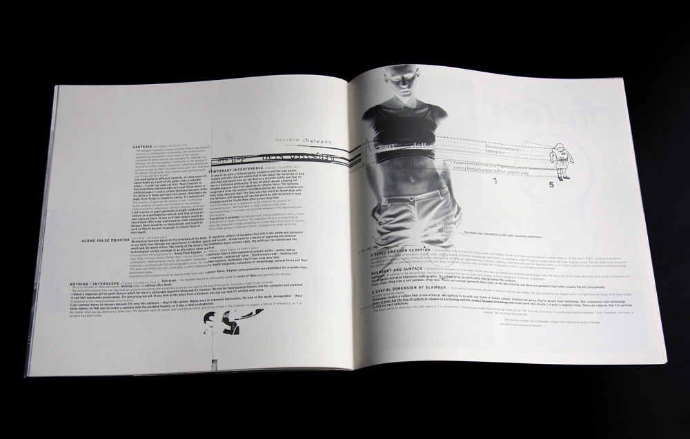
I remember seeing Peter Maybury’s CODE Magazine circa 1996–97 and thinking: finally, Dublin had its own graphic design scene. Not that there hadn’t been magazines and fanzines prior to this, but CODE was a pioneering step forward, its design pure cutting-edge. Sure, it had its influences, and yet its style and feel were very much its own — and excitingly so.
For me, it was all about the magazine’s design; the content was merely secondary. Remember, this was at a time when a visual sub-culture was kicking off in Dublin — one served by club culture essentially — and when creative minds were actively engaged in design and its presentation. It was also just before the drinks conglomerates such as Smirnoff and Heineken had begun to target club kids, sponsoring and ‘supporting’ clubs and other ‘youth’ events. All of which led to a second wave of design that, for the most part, appeared more compromised and corporate, directed as it was by bean counters and misinformed ‘marketing boards’.
At CODE, detail was paramount, and Maybury’s attention to it both fastidious and fascinating: metallic inks, two-colour formats, unorthodox paper stock, a slipcase for each issue — and guerrilla-type advertising by way of stickers and handbills! Who would have thought it! It really pushed things in a new direction, one where presentation was primary. This was certainly very striking at the time, and creatively invigorating. Although I’m not one for nostalgia, seeing my first issue of Maybury’s CODE made me think that bit longer about design, and push that bit harder towards its realisation. To me, that’s the real force and power of inspiration.
Peter Maybury chose Niall Sweeney: Gary Clail Poster
Niall Sweeney of course! Gary Clail poster or Orb Magazine, he’ll have fun finding images of those!
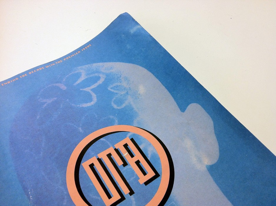
Niall Sweeney chose Tonie Walsh
Tonie Walsh — activist, archivist, maverick, radical, and promoter of the transformational and political power of dressing up and having fun. Tonie has been the key for many, many projects that we pioneered over the years – or a whole host of publications, performances, demonstrations, historical documentations, and moments of righteous joyful anger that have been pivotal in Irish social, political and legal changes in the past 25 years. Art-technology-music events like ELEVATOR, performance clubs like Powderbubble, major charitable movements like Alternative Miss Ireland that funded ground-breaking national HIV/AIDS projects when the government wouldn’t … from gay riots to drag parades – fighting for rights, justice and a better shoes size for all, Tonie has been a core inspiration of almost all of the collective self instigated projects that I am most proud of (AMI being one of the most significant), and been at the battle front on every occasion. You get the gist. There’s more to life than flicking the pages of creative review.

Tonie Walsh chose Niall Sweeney
Niall Sweeney, designer, polymath. I met my conscience, Niall Sweeney, walking along Grafton Street one mid-Summer’s day in the tawdry decade that was 1980′s Ireland. From the outset I saw an incandescent talent and personality that intrigued and challenged. I offered him fresh strawberries and some colour, this young buck invited me to see the world through picas, points, pixels and a very queer black. He never, ever, fails to surprise me. We have a sneaking (professional) regard for each other, although I wish I could be the better dresser. I love him dearly.