'Living in London, I think I became over-saturated with cool graphic design – flyers adorned with experimental typography and bookshops packed with beautifully designed zines from indie publishers are everywhere. At first, it was amazing and I spent a fortune. But it’s surprising how quickly you can become desensitised. Those influences can also start to permeate your own work and you could end up assimilating into a homogenised hyper-cool design dystopia. As a result, I’m trying not to look at much design at the moment, but I am watching a lot of David Lynch films...' DIT graduate Steve O'Connell spent a few years working in both London and Dublin, but has recently moved back to his home town of Waterford to focus on developing his own studio practice and get a bit of a breather from big city living. There he works on projects with a range of cultural clients as well as making short films, the first of which is due on Vimeo later this year and second of which is in the works.
Working in Waterford brings more benefits than you might initially think, and Steve explains why it works so well for him. 'Waterford has a vibrant cultural scene, which has endured despite the city being hit with the worst of the recession. There are a host of studios, galleries, venues and interesting collaborators to work with. It’s also inspiring to live in an environment where people have learned to do a lot with very little, which is definitely a lesson I try to apply to my own work. Being twenty minutes from the beach in one direction and the mountains in the other also doesn’t hurt.'

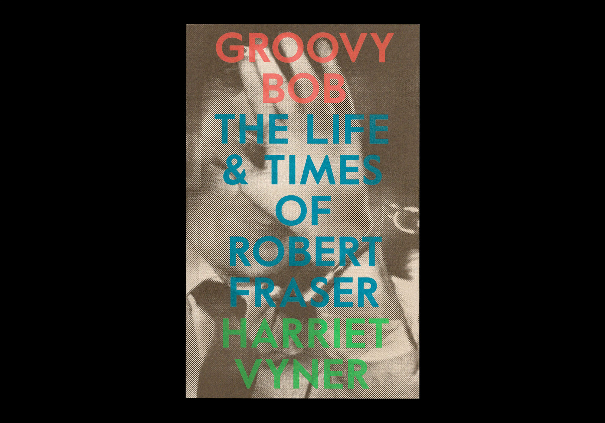
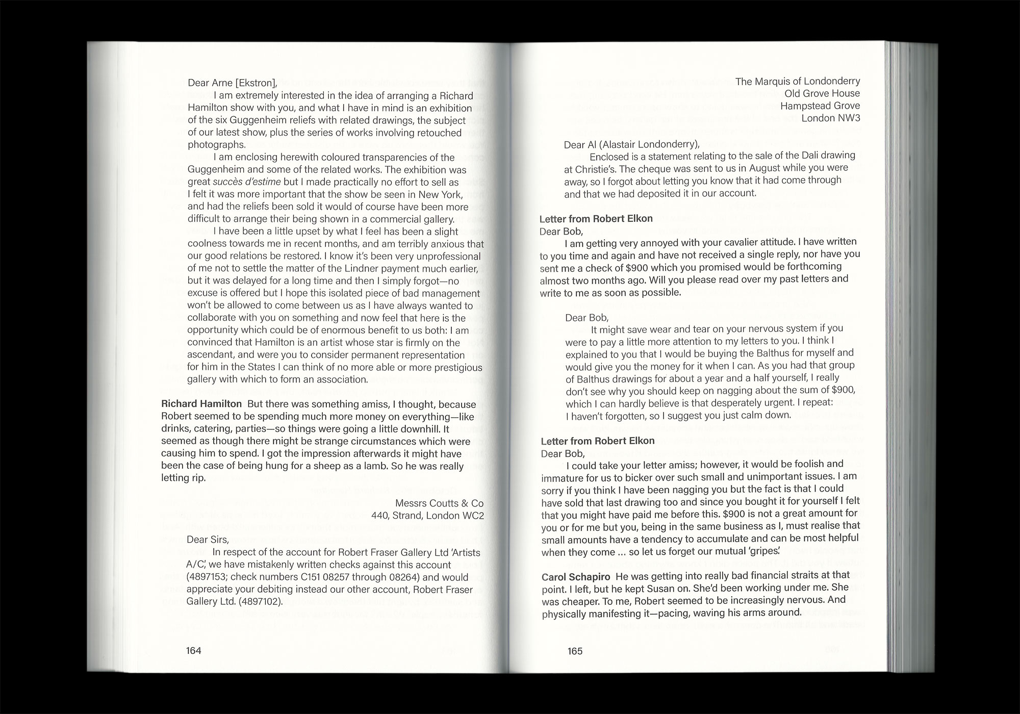
Cultural projects make up a decent amount of Steve's portfolio, as does publication design. One such project is Groovy Bob, The Life and Times of Robert Fraser by author Harriet Vyner. It is the biography of a controversial art dealer and by extension a portrait of 1960s counter-culture, with the narrative taking the form of an oral history made up of stories and quotes. 'I tried to evoke a sense of this multitude of different voices with subtle shifts in typography, the weight ranging from bold to light throughout the text. The tweed-meets-fluorescent cover uses an image from a press photographer showing Fraser handcuffed to Mick Jagger after the infamous Redlands drug bust.'

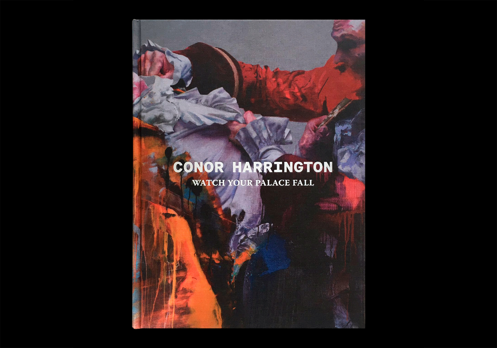
Another book project Steve tells us about is Watch Your Palace Fall, the first comprehensive monograph of the work of Irish artist Conor Harrington, and he talks about how rewarding it is to work with an artist on a project like this. 'Equally weighted between his gallery work and outdoor pieces, the design demanded two very different treatments, uniting the formal and informal. Changes in typography, paper stock and colour mark the differences between these sections, while bold use of large image details serves to unify the whole. It was an absolute pleasure to work on this book – I’ve been a huge fan of Conor’s work since seeing one of his pieces in Cork almost fifteen years ago. It was also great to have the chance to work closely with him on it, from concept-stage to production, as well as to work with Bobby Tannam who made a custom typeface for the cover.'

Steve has already worked on some great projects in great places, and as he embarks on this next stage of his career we ask about what he's learned so far: 'I think it’s important to be able to trust your gut. To become a competent graphic designer, you need to spend a lot of years learning rules. It can be hard to get back to some of the raw, emotional choices you might have made starting out. I’m trying to get back to a place where I can apply what I’ve learned without stifling the boldness of that gut reaction.'
Take a look at Steve's website as well as his submissions to the 100, including an impressive nine Archive selections.
