Dominic Stanley grew up in Clontarf, studied business in Waterford and worked as an accountant in Dublin for six years before a unique and challenging situation gave him the opportunity to change the focus of his career. “I was in my late twenties when I discovered graphic design as a career option. My accounting career was already well underway and I thought I had missed the boat. I remember thinking, if I had the chance to start again, I would study graphic design. At the age of 31 Dominic underwent a series of surgeries for ulcerative colitis, which forced him to leave his accountancy job. Making the best of a bad situation, he spent the time between operations and recovery getting his degree in graphic design. The path that led Dominic to design certainly wasn’t an easy one, but he persevered. He completed his graphic design degree in the Dublin Institute of Design in 2017 and has recently completed a masters in typeface design at the University of Reading.
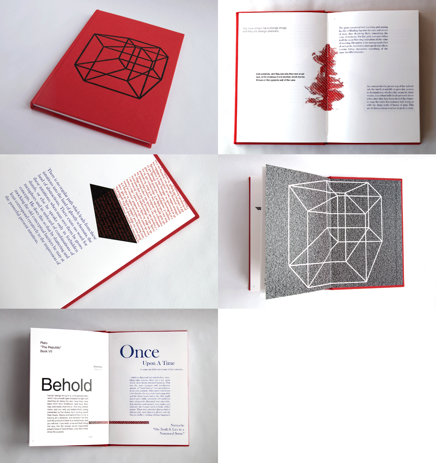
Dominic became particularly interested in typography during his final year in DID, while working on ‘A Typographic Manifesto,’ a book design project that was shortlisted by ISTD in 2017. The project focused on the premise that “the Internet is the 4th Dimension where stories are timeless.”

“I concluded that a book is a four-dimensional object, a ‘tesseract’ where Plato and Nietzsche are able to converse, even though they lived thousands of years apart. The book features text from Plato’s ‘Cave’ interacting with text from Nietzsche’s ‘On Truth & Lies in a Nonmoral Sense.’ In the background there are references to Laurence Scott’s book, ‘The Four-Dimensional Human,’ which is where the idea of the Internet being the 4th Dimension came from. Imagine one were to visit this world. How would they describe their experience when they returned? Typographers must create visual experiences on the page to awaken the minds of the readers.”
Following advice from his lecturers in DID, Dominic signed up for the TDi, a two-week type design workshop in the University of Reading. “I went with the idea that if I liked the course, I would consider doing the masters. Once I was there, I knew I was in the right place.” The MA in typeface design at Reading is a research-intensive course where students can develop their own type families under the guidance of established type designers. “I’ve learned so many things in the last year. The type industry is small and Reading is central to a lot of what goes on. We spent a lot of time in the type archives at the university and farther afield. Every week we would have lessons with Michael Twyman who would take us through his vast print ephemera collection, while James Mosley covered the history of type. The study of non-Latin typefaces with Fiona Ross also formed a large part of my studies.”

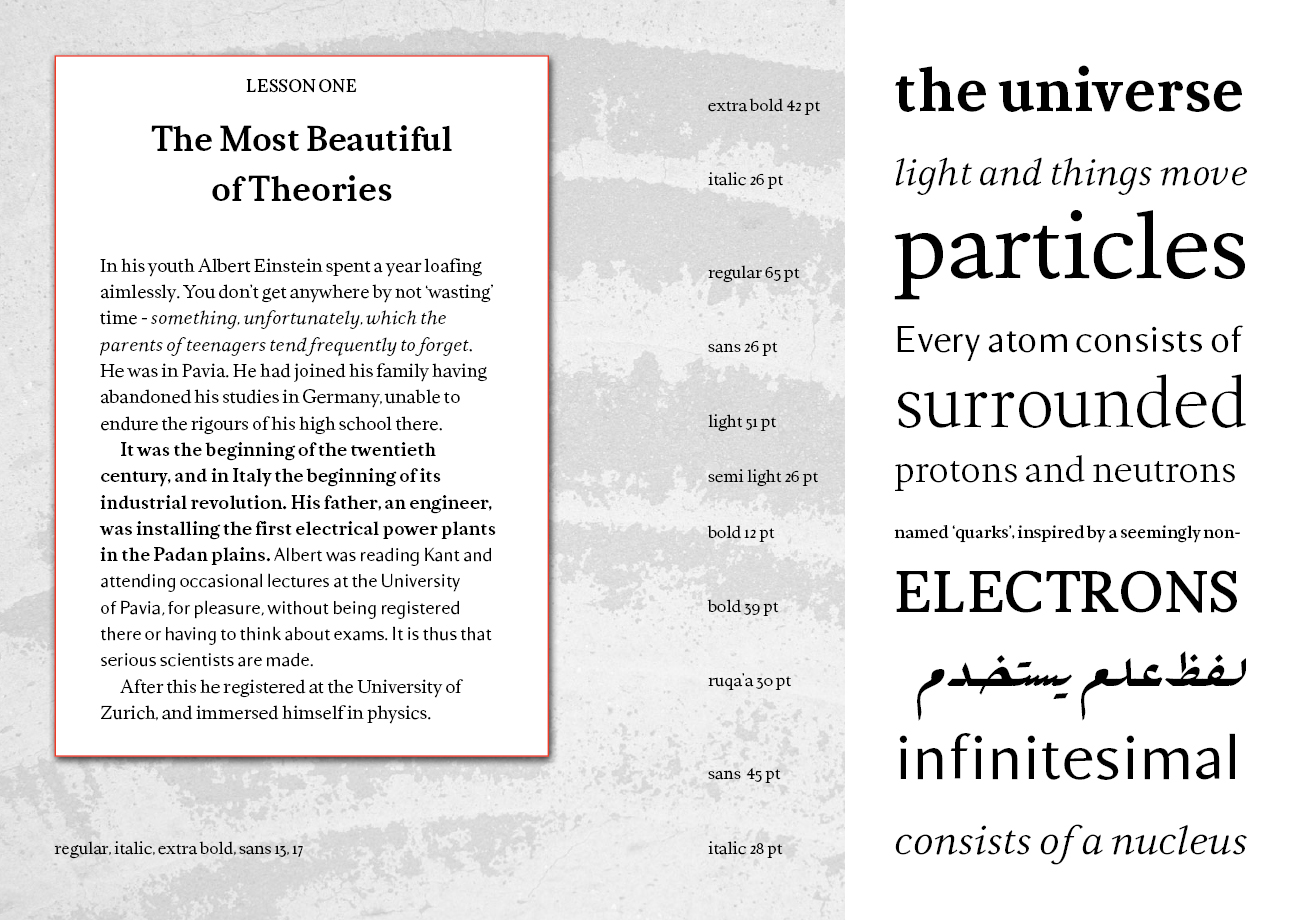
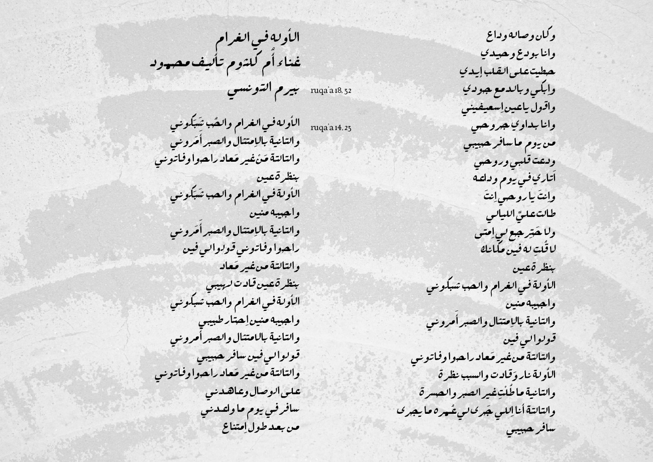
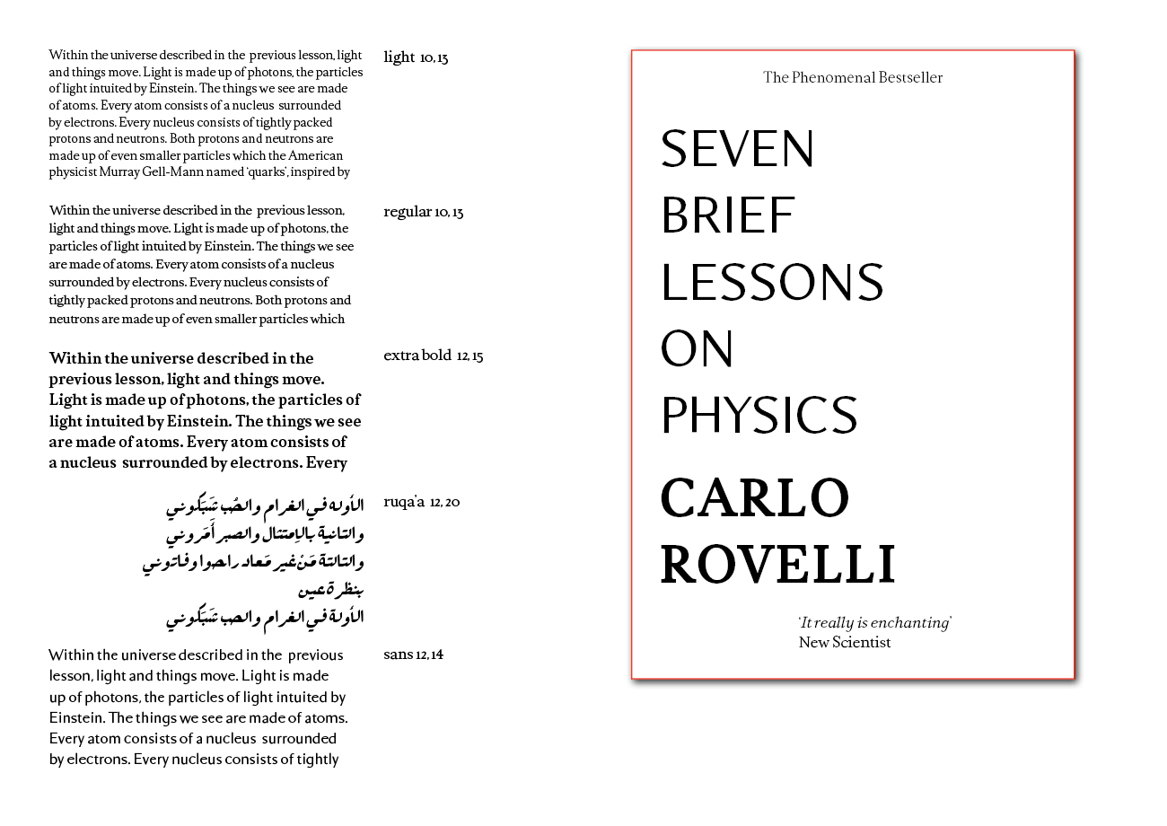
Over the course of the year Dominic has created Hayward, a type family designed specifically for printed novels. The family features five different weights: an italic, a sans-serif and a Ruqa’a style Arabic. As part of the design process Dominic was encouraged to work with an unfamiliar script or non-Latin typeface. “I chose Ruqa’a which is a handwritten style of Arabic. I based my designs on Arabic calligraphy, making sure that the type corresponded with the Latin characters of the family and that it could function as a text typeface.”
Dominic experimented by taking various angles and cuts from the Hayward typeface and implementing them in the letterforms of the Ruqa’a style Arabic. The key objective was to join both typefaces together harmoniously. He admits that the process was challenging, but ultimately rewarding. “I don’t speak Arabic and I can’t really read the script but I learned how it works. Most characters have four different forms, depending on where they appear in the word. My typeface was a simplified Ruqa’a, which means it links horizontally on the baseline. Most available Ruqa’a typefaces cascade and link in a different way. It was difficult for me to find typographical references to compare mine to. After a lot of trial and error and feedback sessions from my Arabic teachers, I managed to create a script that belongs in the Hayward type family.”

Dominic’s design process is both systematic and organic: “Type design requires a lot of testing, setting text in context, printing, fitting, kerning, printing again. The letters have to work in harmony in order to look like they belong to the same family. As I add more letters to the family, the typeface takes over. At a certain point, the typeface knows what it wants to look like and the rest of the letters are designed to fit into it.” When designing a type-family, he refers to existing typefaces with a similar style to what he is working on. In this way the new typeface design is “unique but also familiar.” One of the most significant design techniques Dominic has learned was during a renaissance type revival workshop. He has been using it as part of his design process ever since. “I try to describe the overall intended effect of the design using emotive and expressive words. If I am reviving a typeface, I don’t want to make a carbon copy, I want to capture the essence, to recreate the effect of the type. I get to work designing a few individual letters; usually ‘a, n, d’ first, making sure they share similar traits and measurements. Then I set them in blocks of text. I look at the characters working together and I go back to my original expressive words. Do those words describe the effect my letters are making?”

With rapidly changing technology and new design processes, the type design industry offers a lot of different possibilities. Dominic recommends checking out David Jonathan Ross’s ‘Font of the Month Club’ and the ‘Future Fonts’ project by Medium. “Typefaces traditionally take a long time to develop before they can be brought to market but these models allow designers to release fonts before they are fully complete. This allows the designer to stay in touch with the market and get a feel for the demand before deciding which fonts to fully develop.” Dominic says that although typefaces are often designed for a particular technology and type designers will often demonstrate potential uses for their typeface, ultimately it comes down to the designer to decide on the best use of a typeface.
We couldn’t interview a type designer without getting his take on variable font technology. Variable fonts consist of a single font file that behaves like multiple fonts. The font file features a central default style, usually the regular font, and a collection of master styles. These master styles allow you to make subtle adjustments to the weight, width, optical size and slant of the font as you work, creating infinite design outcomes. “I first heard about variable fonts when I began the type masters. They have become a hot topic of conversation at type conferences and in the design industry over the last year. They make fonts very flexible. You can easily resize them, stretch them and put them in motion. At the moment, variable font technology and what you can achieve with it is more important than the actual variable fonts themselves. Everyone is being encouraged to play with the technology and come up with new uses for it but there are no specific products yet. The companies that are developing variable fonts have created a solution for a problem that doesn’t necessarily exist yet. If designers can identify a market for variable fonts through experimentation, these companies will invest more in the technology.” He says that as variable fonts become more established, skilled type designers will become more involved in the production of variable fonts. Fundamentally, type designers will be able to create variable fonts that are rooted in the heritage of typography and that invoke some of the characteristics of historic type design and technology.
If someone out there is considering a masters in type design Dominic offers the following advice: “The best thing I could recommend is to take pen to paper and start experimenting and trying different things. In DID I was encouraged to experiment but I wanted to learn the basic rules first. When I began the type masters, I had only created one font consisting of 26 letters, all uppercase. I discovered Typecooker.net, which is a free website developed by typography lecturers in the Hague. It features a number of different typography briefs. For two weeks, everyday my friend and I would pick a word, go on Typecooker and pick the same brief. Once we completed the design brief, we would critique each other’s work. It was really helpful to give and receive that kind of feedback. It’s good to work with other people whenever you can.”
Now that he has completed the MA in type design, what does the future hold for Dominic? “After spending nine months learning about and developing a workhorse type family suitable for reading text at small sizes, I am dying to let loose and get working on some crazy display types. I made a start on a few different typefaces and logotypes, which I’d love to now develop and release quickly. It’s good to work on small, interesting design projects even while spending most of my time developing large type families. It helps me to stay creative and to remain up-to-date with trends in graphic design.”
Check out more of Dominic’s graphic design work here and visit his website www.stanleyfonts.com to find out more about the Hayward type family.