A surprising lack of historical information or critical reflection on his discipline prompted Irish illustrator and writer Philip Kennedy to take matters into his own hands. The result? Illustration Chronicles, a web project of staggering scale, looking at illustration from the past 175 years, one key piece at a time. I caught up with Philip to find out more...
What is Illustration Chronicles, and what prompted you to start the project?
Illustration Chronicles is an ongoing web project that explores the history of illustration. I launched it in May 2016 with the plan of telling 175 unique stories inspired by the images, illustrators and events of the past 175 years.
There were a number of things that prompted me to start it but the biggest one came a couple of years ago when I decided to do a master’s degree in illustration. I had come from an art history background and had assumed that being able to discuss my own work within a historical context was going to be important. I was surprised to find that history rarely made an appearance in the lecture theatre or in the studio. It was an even bigger shock to find that there were no real books about the history of illustration in the library. I feel that having a good critical framework makes you recognise the importance of your work and it makes you take it that little bit more seriously. It’s harder to do that when you can’t view it through the prism of time.
For me, illustration is a fascinating subject. Unfortunately it rarely gets the attention or awareness that it deserves. I’d like it to be valued more and have people find out that there’s more to it than just screen-printed drawings of pipe-smoking bears. Further to that, I’m concerned that this generation is placing too much of a focus on a culture of ‘likes’. Social media has been a terrific platform for illustrators to share their work but we’ve got to be careful that it doesn’t dictate the type of work that is being made. I’m drawn to illustrations that value ideas over style. It’s fine to engage with things on a superficial level from time-to-time but sometimes you need to also step back and try and take a look at the bigger picture.

175 years of illustration is a huge subject: how are you structuring the project?
Starting out I wasn’t really sure how far back I should go and what aspects of illustration I should cover. I was initially drawn to the idea of 175 years because it covers a period between the industrial revolution and our current information age. Quite a lot has changed over that time but I still feel that things remain surprisingly relatable.
In terms of structure I was inspired by the likes of A History of the World in 100 Objects (the podcast by BBC Radio 4 and the British Museum). I like the idea of telling a story by taking something which is relatively small and using it as a starting point for something bigger. For that reason, Illustration Chronicles takes one work from each year and uses it as a way to explore an idea, a culture or the work of a particular illustrator.
The site is also structured around twenty unique topics. My aim is to celebrate the diversity of the artform and so I’m trying to be as even-handed as possible. Having a range of topics is a good way to demonstrate just how rich and varied illustration can be.

While a huge amount of planning must have gone into Illustration Chronicles before you started posting, have you discovered anything, changed anything or been surprised by anything since the project went live?
That’s a good question! As you say, quite a bit of planning has gone into it so I’m thankful that there haven’t been any unpleasant surprises! I guess the one thing that has really stood out for me has been how much I’m getting out of writing the introductions to each topic. The focus for the site is obviously the last 175 years but I’ve found that it’s really interesting to take a look at a topic like satire or music and try and figure out where it all began.
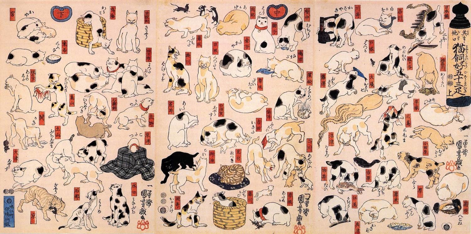
Recently I’ve started writing about animals. It’s a fun topic and it means there’s lots of great illustrations to share that I think people will really enjoy (rumour has it that the internet loves cats). But despite how much fun it is, it also brings about some really interesting questions. When introducing the topic I had to ask myself why are illustrations of animals fun? Why do they appear so often in our visual culture? How has our relationship with them affected the way that we depict them? These are all questions that I find really challenging but there’s something very rewarding in having to think about them.

Since the website launched you've already explored two topics: satire and music. What have been some of your highlights in those topics so far?
Satire seemed like a good topic to start on. My aim for the site is to celebrate the illustrators that have helped to define the past and satirical illustration is such a great way of getting an insight into the concerns of a particular era.
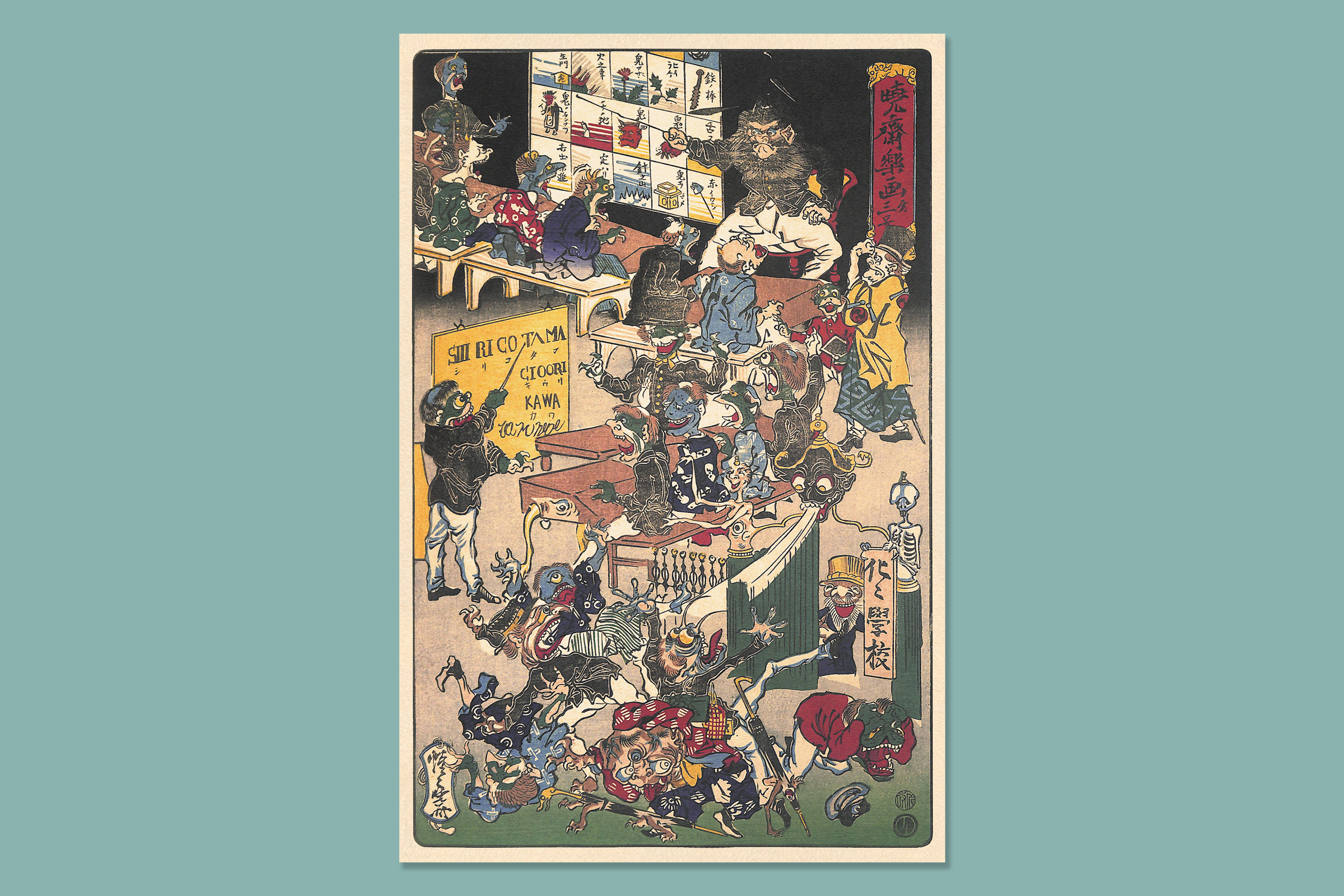
One of my personal favourites is a piece by the Japanese illustrator Kawanabe Kyōsai. It was made in 1872 and it pokes fun at the country’s education act. Kyōsai was an eccentric genius who loved nothing more than getting drunk, having fights and drawing epic fart battles. He was also highly critical of the Westernisation of Japan and so he illustrated this amazing print that shows traditional Japanese demons trying to adapt to a westernised school. Compared to the prim and proper Victorian illustrations of the time Kyōsai’s work is just so playful, expressive and energetic. I love it!
I’m also a big fan of music so being able to write about a couple of my favourite album covers was great. I’ve gotten to feature illustrations like Klaus Voorman’s cover for Revolver, Kate Gibb’s work for The Chemical Brothers and Jamie Hewlett’s band Gorillaz. It’s great to see so much diversity within each topic.

What are some of the topics, illustrators and stories we can look forward to in the future?
Well one of the perks of the project has been the fact that I have (or at least I like to think I have…) a good excuse to buy lots of old illustrated books. Recently I’ve gotten some gems from heroes like Ludwig Bemelmans, Richard Scarry and Charley Harper. I can’t wait to share stories about those guys and their work.
As for topics, I’m hoping to continue having an eclectic mix on the website. There’ll be stories from the war years, images from the world of fashion and tales from the early days of picture books (to name a few). It’s going to be great!
With 20 posts down, you have lots of material to start exploring and plenty more to look forward to. And I think it's safe to say that after some time spent on Illustration Chronicles, if you ever did before, you won't underestimate illustration again...
