When we last talked to you, you’d just finished a year at Fabrica. Did this set you off on a new path?
While I was at Fabrica, I developed a great interest in interaction and product design so decided to do a Masters in those areas. With this in mind, I applied to Design Products in Royal College of Art and was lucky enough to be accepted. I chose this course for one main reason; it wasn’t traditional industrial design and very much encouraged you to follow your own practice and exploration into the many facets of product design.
Did you always feel like you’d like to work in a different area of design?
No not at all. I think I craved learning more and expanding my skill set by being able to build software and hardware products. While I was working as a graphic designer, I enjoyed it immensely but I think I wanted to do more user-centred design work and make objects that people could interact with.
Does your background in viscom add anything to your work?
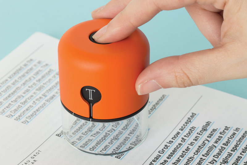
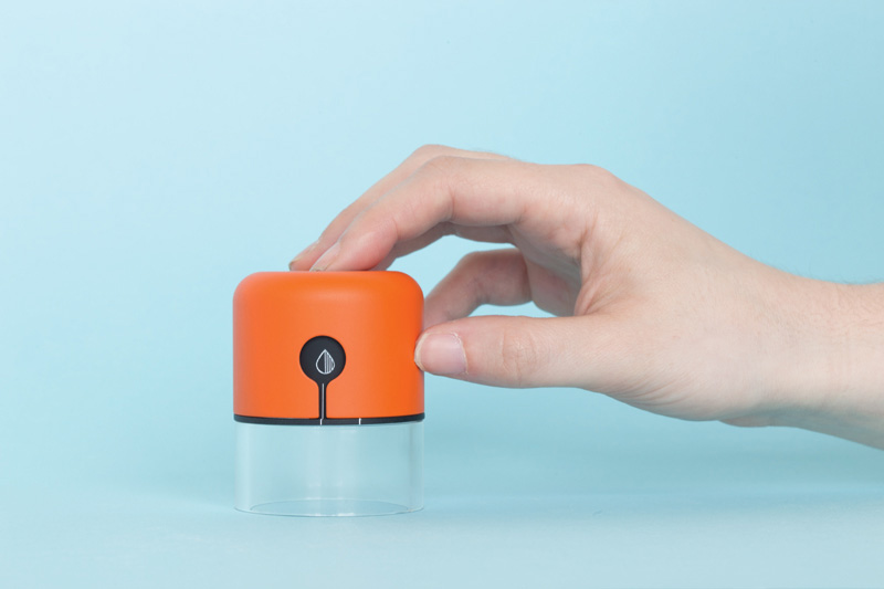
Yes, I feel it helps me to see clearly the importance of the communication of the interface and the form of a product. Whether that interface is tangible or graphic, it is the hierarchy of the elements that communicates how to use this product. For example, the use of a particular material or form can indicate/ inform a user how the product is used or what it’s purpose (so for instance with Spector, the perspex bottom half communicates to a user that this is to be placed on top of something and looked through).
In today’s climate of product design, our products are becoming more tech enhanced so they become harder to describe through their form and we are inclined to put them in a black box (examples being a router and hard drive). I think that having a background in communications gives me the ability to try to describe through form what a product does and how it is used. Another crucial aspect of visual communication, is the value of aesthetics and I think this has helped me greatly. Design is just as much about aesthetics as it is function. Having worked as a graphic designer previously, I know what it takes to make something beautiful, balanced and visually striking.
How does this undertaking this type of design project differ from your previous role as a graphic designer?
My design process begins with sketching out an idea using video. I will often start with designing the experience before designing the product or coding any software. Both my graduation projects began with short videos explaining the idea and demonstrating the interaction. Something I learnt as a graphic designer is the ability to never stop asking questions and this remains a vital role in my design process today.
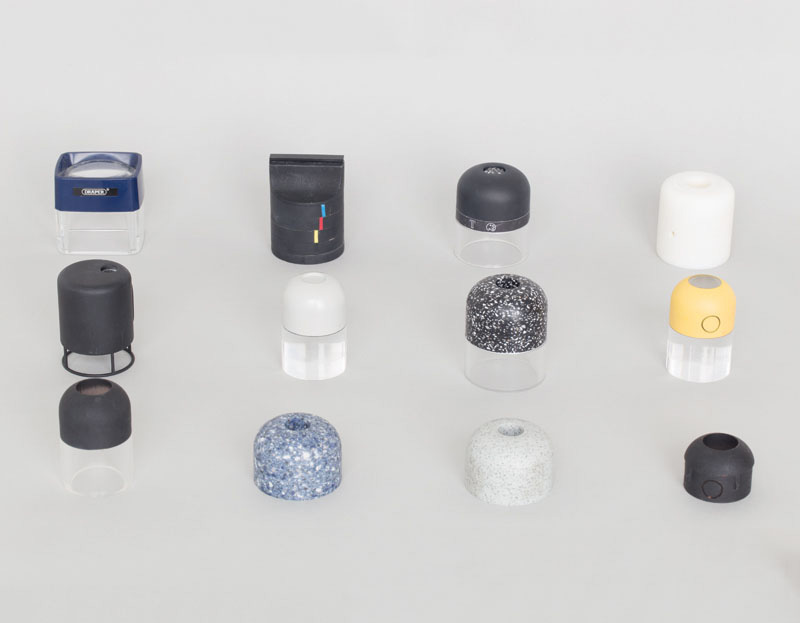
Using the videos, I can question if a certain product existed how people would use it and how it would affect other systems. Then I would go on to quickly prototype the product and sketch form factors. This might involve making some quick foam models or 3d printing some shapes while exploring the use of different materials. At the same time, I would begin to make a works-like model where I would often use an Arduino prototyping board and piece together bits of code. I often design two models, a works-like model and a looks-like model. This way you are not bound by the electronic components and circuitry but can explain the interaction using the works-like model.
Included in my thinking would be the manufacturing techniques of this product and how could be mass produced if required. Overall,I think my previous work experience tends to kick in full swing towards the end, when it really becomes about the aesthetics of the finished product and making something beautiful and pleasing to both eye and use.
Both of your MA projects seem like perfect tools for a jobbing graphic designer, how did they come about?
For Spector, I came up this idea as a result of my frustration with designing for print on screen. The appearance on screen does not transfer identically in the finalised print. You have no idea of scale of the page or typography and colours often visualise differently too. I came up with the idea if you are going to design for print on screen, why not start with print material? And why not make it interactive? As designers we always collect lots of nice samples for inspiration and I wanted to utilise these samples.
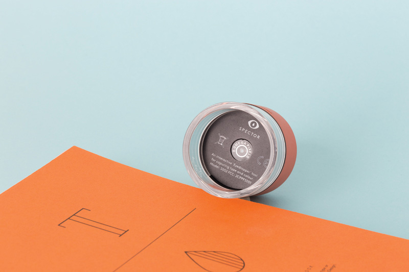
Spector software works as an Indesign plugin with a live feed to the camera. The hardware connects to the computer via bluetooth. The user presses the button on the device and takes a picture of the font with a macro camera and matches this picture to a font data base. It then changes live text in Adobe Indesign to that exact font, size, line and letter spacing. That way when it comes to printing you already know what its going to look like because you took it from a piece of printed material.
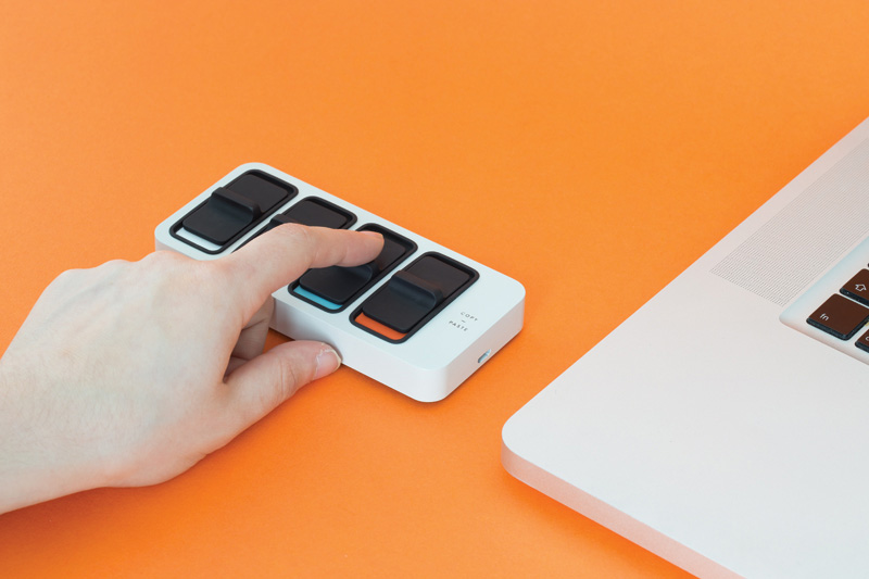
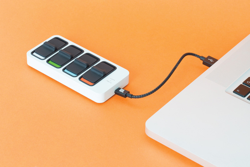
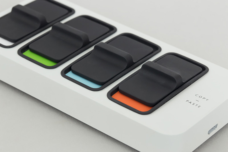
For MIMO, I was inspired by my mum and her repeated requests as to how to copy and paste. It made me question why we only copy one element at one time. Why not have ability to copy multiple elements at the same time? I did not want to create more keyboard shortcuts. I wanted to challenge the standard interface of the keyboard and create a product that mapped the interaction of catching (copying) and dropping something (pasting). This then led to my idea of why should it be temporary. Why not make it a permanent storage space? This way you can collect everything you copy and you will never lose it or paste over it.
The projects explore the space between analogue and digital behaviours. What’s the interest?
Spector and MIMO are tools that work with the computer that help digital workflow by connecting the physical and digital world together. They challenge the standard interface of a keyboard as the keyboard can sometimes fail us for specific tasks.
These tools are relevant today because products do not exist in one place anymore. They exist both on the screen and in the physical world. That is why, it is more important than ever to examine and design interactions that correctly map the digital task to the physical world.
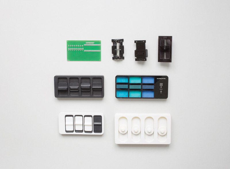
I am keen on the idea of physicalising digital concepts like copy and paste and eyedropper to help us understand the digital task better by creating a clearer mental model. It is well known that we understand objects better when there is tangible interface and there is a physical rather than graphic interface. This is due to the fact that we can map interactions to outputs in a very clear way and understand quicker and therefore remember it better.
I am definitely interested in moving away from the computer and working off screen. When I worked as a graphic designer, I found working at a computer every day really stifled my creativity. That is why I want to create tools that challenge the keyboard interface and move away from the computer. I think all designers work better with their hands and it is great to really encourage it.
What’s it like studying at the RCA? Did it change much about how you think and work?
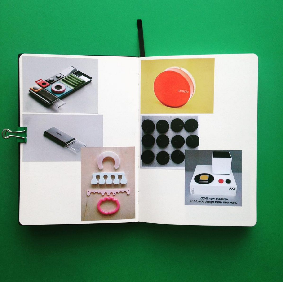
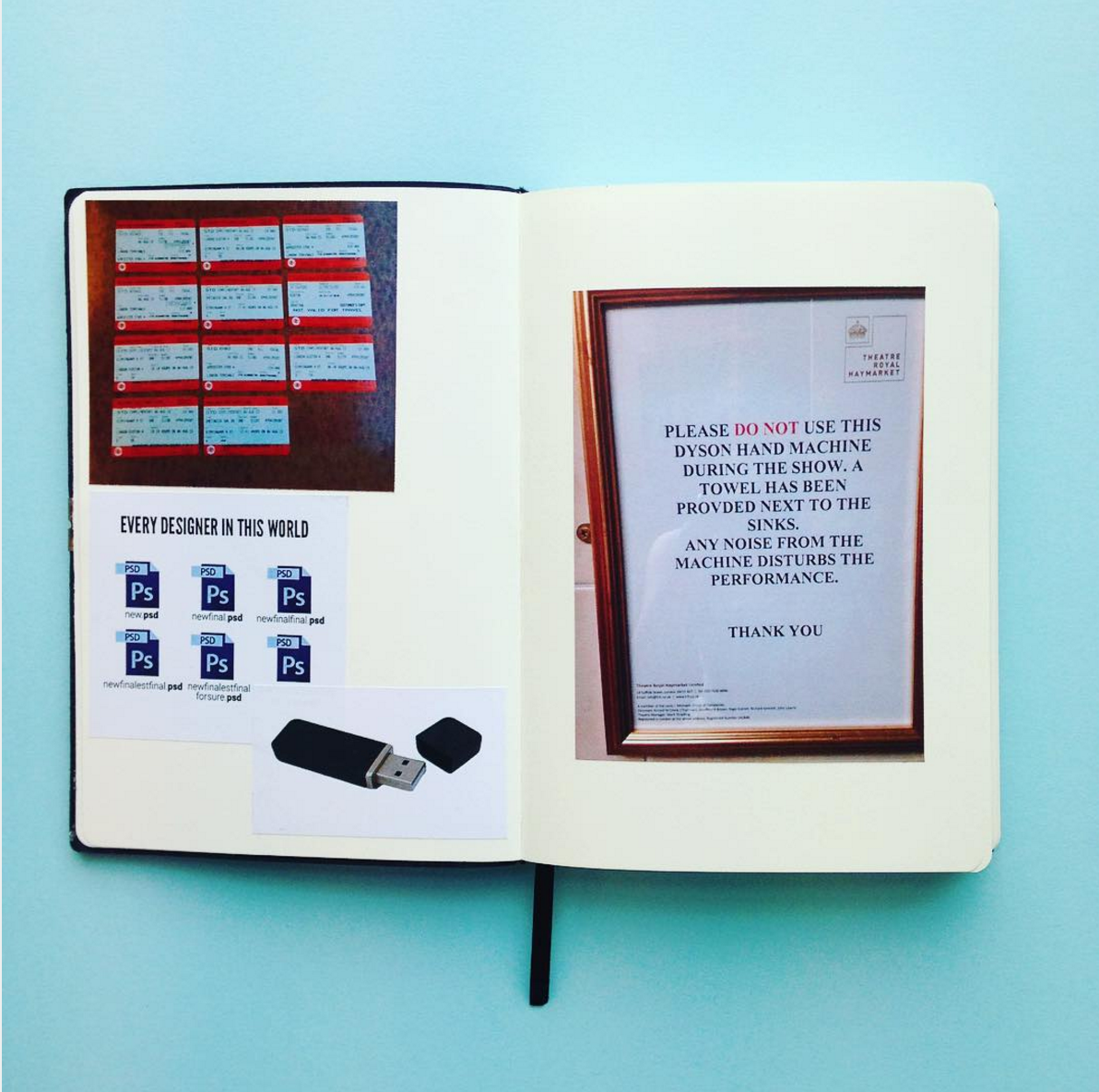
I remember being told on the first day of the RCA “you are going to live here”. I thought my tutor was joking – no he wasn’t! RCA is a fantastic place to study – it like any other college has its issues but I had a really great experience. I can not even begin to consider how much I have learnt. The course I studied, Design Products is split into 5 platforms which are groups of 8 to 10 students and lead by two tutors. Each platform has a different theme and challenges a different area of product design. I joined Platform 24,” Object Mediated Interactions”, a platform that is run by Durrell Bishop and Oscar Lhermitte. The platform is focused on the field of product design that connects new digital developments with our physical environment. It is about designing solutions that take the systems behind products as well as their real properties into account. Being taught by Durrell and Oscar really changed the way I think about products and how much frustration we put up with in terms of how we design interactive products today. During last summer, we kept a Love/Hate notebook, a simple exercise documenting objects, processes or interactions that we loved or simply hated with frustration. My hate side was a lot bigger than my love side, mainly because I documented so many little frustrations, the majority being issues with software and how we use it, hence why both my graduation projects ending up being centred around the computer.
The course you did - Design Products - seems purposely open. Are we moving to a more fluid definition of what we do as designers, and even how we work as designers?
I think as technology develops and changes the way we use products, designers have to adapt to that and many new job titles have evolved from that, primarily UX Design. I think it’s important as a designer to have a set of skills that are well developed but also have an interest and a good understanding of other parts of design. For me, it is very beneficial to have a broad set of skills because that way you can deal with all areas of a product and make sure it is a holistic experience for a user. That is why I developed a lot of the software side of my products to ensure that I know how to prototype an interface quickly and so help communicate an idea to a client or for that matter to the world!
In the end, it does not matter if you are a product designer, interaction designer or graphic designer, it all overlaps as the main premise is about making something beautiful that functions well.
What’s next?
After taking a month off, I have just started work in a studio called Map Project Office. I freelanced for them previously so I know that we have a similar design process and a lot of the work overlaps with my ideas. As for my own personal projects, due to the overwhelming response to Spector, I have decided to keep working on it and developing it. It is primarily the software element that needs further development and so I am working with another interaction designer to write the algorithms for font, kerning and leading detection. I hope to bring it to market with the help of Kickstarter in the next year or two so fingers crossed.
